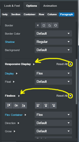
One of the cooler recently added features to the UI was the "reset all" option that appears when the stock settings are changed in the Look & Feel, Settings and Animation panels. I like this option, but I find that more than once I've accidently clicked on it when I meant to expand/collapse a section within the option panel by clicking the little triangular arrow, which can lead to quite a bit of time lost in some cases. My suggestion, as pictured below, is to move the arrows over to the left, at the end of the text describing each section, and then the "reset all" can go fully right justified. This will keep it more in line with how the rest of the UI looks as well.
I like the idea of the “reset all” though. I wouldn’t want to lose that setting completely. Is there a possibility of adding it as a button below each section with the usual safety message pop up in place or something? It is a convenient setting that I was unaware of (ya I know, get out of the coding mindset and explore the settings more lol). Would like to still have that ability in some way.
I like the idea of swapping sides, it is more in line with the rest of the app setup. Couldn’t the 2 just be swapped as Printninja suggested? Even without a safety dialog it will have less mishaps as the structure will be more correct with how the rest of the app settings are set up. Less mistaken identity issues.
By all means keep the "reset all" feature. Just move the arrow over. I have to (embarrassingly) admit I was clueless that you could click the text to expand the section. I thought you HAD to click the arrow.
After looking at that a little more now, wouldn't that be better if that Reset All was actually more button looking than an arrow? That would probably fix most of the issue if people realized that they were clicking a button, not opening a section? Just a thought :)
I think you're confused. The arrow doesn't execute the "reset all" operation. It expands the respective sections to display the options in those sections (Responsive Display, Flexbox, etc...) Clicking the text "reset all" is what causes all the settings to be reset. The problem I'm trying to alleviate by moving the arrows is that they are currently TOO CLOSE to the words "reset all" and sometimes when I've gone to click the arrow to expand the section, I've inadvertently hit "reset all" and lost many minutes of work.
Giving this another bump, since @Martin saw it at least once and agreed with it.
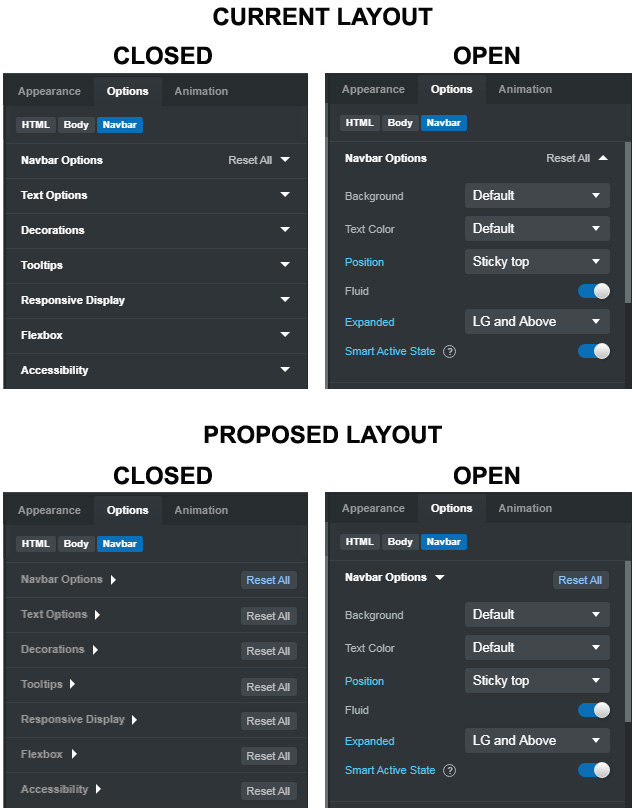
To reiterate, we want to keep the KEEP the "reset all" feature, but move the arrow to the left so it sits right after the particular heading of options that are shown when the arrow is clicked. I've created an image of my proposed changes...
The various options should all be slightly gray unless opened
The arrows should move to the left, so they come right after the Option in question, and should appear and function like all the arrows on the sub-options. CLicking either the text or the arrow would open the menu.
When an option panel is open, the Option title should turn from gray to white, indicating it's "actively being used."
The "reset all" text should become a button with text, and always appear on the right side of the Option menu, whether it's open or closed
The text in the reset all button should turn blue whenever any of the Options in that menu have been changed from their stock settings. Otherwise it should remain gray.
We should be able to reset all the Options by clicking this reset all button, even without opening the Options menu.
This way, at a glance, one can tell which Options have had changes made even without opening the panel. The "reset all" is not a clear button, and a good distance from the arrows, so there is no accidental clicking when trying to expand the Options. The small arrows next to the Options are now consistent with how all the other arrows work in the program, and the colors of the various bits of text are also inline with the other aspects of the UI.
Lastly, it would be nice if there was a right-click setting at the very top of the main Options tab, that allowed one to expand-all / collapse-all.