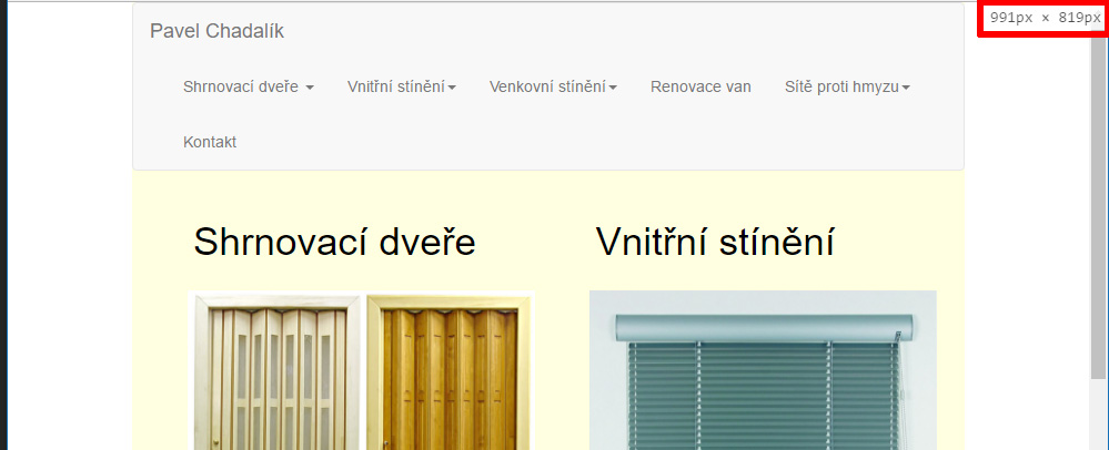
At a resolution of 992px is it still OK
Here I would like to adjust the width of a menu to the next picture.
At a resolution of 992px is it still OK
Here I would like to adjust the width of a menu to the next picture.
The developers of Bootstrap suggest that you change the LESS variable for @grid-float-breakpoint which it defaults to 768px (@screen-sm-min). So on their site they give you a tool to make those changes which you can then download the css/js etc.. and use. However, it's not just a snippet of CSS, so if you want to go that route? http://getbootstrap.com/customize/#grid-system
You'd probably change the value @screen-sm-min to maybe @screen-md-min for @grid-float-breakpoint. Then download and import the bootstrap.min.css to your project.
The other things that I've tried I got close but when clicking the menu, it made the menu open and then immediately it would collapse again.
Saj
Then I found this site https://coderwall.com/p/wpjw4w/change-the-bootstrap-navbar-breakpoint, The second example I think gets you what you want.
Here is the CSS I tested out.
@media (max-width: 992px) {
    .navbar-header {
        float: none;
    }
    .navbar-left,.navbar-right {
        float: none !important;
    }
    .navbar-toggle {
        display: block;
    }
    .navbar-collapse {
        border-top: 1px solid transparent;
        box-shadow: inset 0 1px 0 rgba(255,255,255,0.1);
    }
    .navbar-fixed-top {
        top: 0;
        border-width: 0 0 1px;
    }
    .navbar-collapse.collapse {
        display: none!important;
    }
    .navbar-nav {
        float: none!important;
        margin-top: 7.5px;
    }
    .navbar-nav>li {
        float: none;
    }
    .navbar-nav>li>a {
        padding-top: 10px;
        padding-bottom: 10px;
    }
    .collapse.in{
        display:block !important;
    }
}