2 navigation rows in navbar

Hi all,

I’m relatively new to BS but I’ve searched lots of places but can’t seem to find an example in BS how too set up a navbar with two rows of navigation. I’ve built this nav from scratch but unfortunately it’s not responsive, when you reduce the width of the browser it shows two separate hamburger menus… any help would be greatly appreciated.

for the one you want expaned all the time

Ah cool! I’ll try that thanks!

@floydmanfloyd
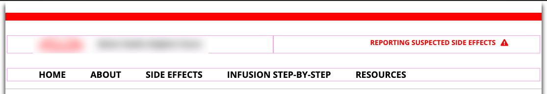
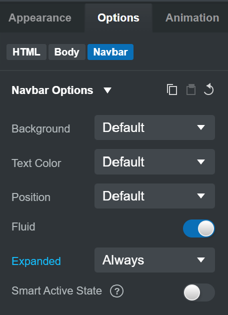
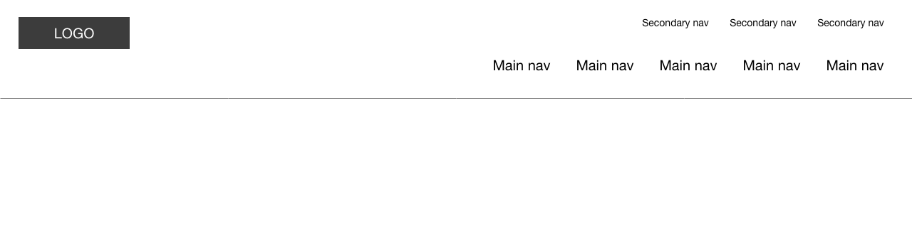
Hi, I realised I probably didn’t explain myself clearly. How can I set up two rows of navigation. See attached images of a website and also when it’s resized into a mobile. Is there a way of doing this in Bootstrap Studio?


You need to add a row and two columns to your navbar and put a nav in each column

Like this:

<nav class="navbar navbar-light navbar-expand-md">
    <div class="container-fluid"><a class="navbar-brand" href="#">Brand</a><button class="navbar-toggler" data-bs-toggle="collapse" data-bs-target="#navcol-1"><span class="visually-hidden">Toggle navigation</span><span class="navbar-toggler-icon"></span></button>
        <div id="navcol-1" class="collapse navbar-collapse">
            <div class="row ms-auto">
                <div class="col-12">
                    <ul class="navbar-nav float-none float-md-end">
                        <li class="nav-item"><a class="nav-link active" href="#">First Item</a></li>
                        <li class="nav-item"><a class="nav-link" href="#">Second Item</a></li>
                        <li class="nav-item"><a class="nav-link" href="#">Third Item</a></li>
                    </ul>
                </div>
                <div class="col-12 order-md-first">
                    <ul class="navbar-nav float-none float-md-end">
                        <li class="nav-item"><a class="nav-link active" href="#">Secondary One</a></li>
                        <li class="nav-item"><a class="nav-link" href="#">Secondary Two</a></li>
                        <li class="nav-item"><a class="nav-link" href="#">Secondary Three</a></li>
                    </ul>
                </div>
            </div>
        </div>
    </div>
</nav>

I have added a component on the online library called “pooi navbar”

1 Like

Awesome! Thanks Richard I’ll give that a go!