When I put the site in cellular mode and change something, shouldn’t this change be in cellular mode only? Because for me it changes in all available resolutions, how do I fix this could someone help me?
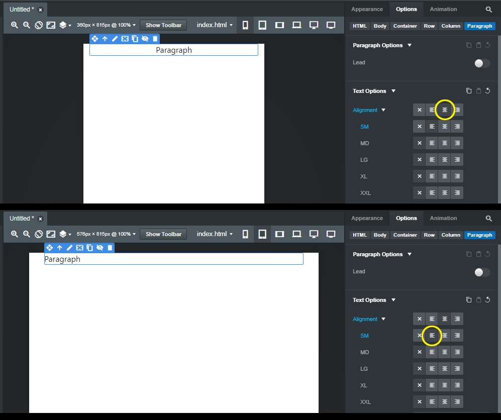
Not necessarily. Bootstrap is a mobile-first framework. This means the expectation is that you design your website starting at the XS screen size, and then modify components and elements as required at each breakpoint (SM, MD, LG, XL, XXL)
If you set an option on a component at the XS size (what you’re calling “cellular mode”) it will carry forward to the other screen sizes unless you change it.
In the example below, I"ve set the paragraph’s text to center at the XS breakpoint, and I’ve set it to start at the SM breakpoint. It will stay set to start all the way up to the XXL size unless I were to change it.
1 Like
When you have issues like this, the first place to go is the Docs which cover most things that people have problems with or don’t know how to use the app. This doc covers your question and more.
https://bootstrapstudio.io/docs/designing-responsive-pages.html#the-bootstrap-grid
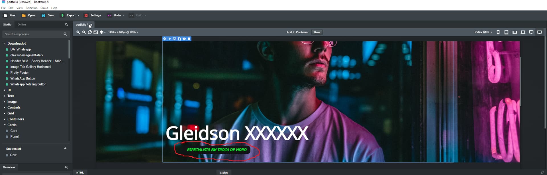
Maybe I didn’t know how to express myself correctly, but through the image you will be able to understand more what I want to express. Where it is marked in red is not positioned correctly according to the size of the screens, how can I correct this, please.

Yep we understood it, both answered it a little differently, but with the same results 
I would like the green text to be positioned equally on all screen sizes.
I will read and see if I understand the documentation you told me to read, thank you very much!
It’s impossible to tell from a screen shot how the green text is being positioned, so there’s no way to explain how change its position. You would need to upload your website so we can see the code.