I can not create a device-responsive design
Whenever it comes to mobile devices.
How to video guide or just a step-by-step explanation how to do it?
I can not create a device-responsive design
Whenever it comes to mobile devices.
How to video guide or just a step-by-step explanation how to do it?
Did you watch the videos, and read the tutorials?
The whole point of using the Bootstrap framework and this software is that it creates mobile-first, responsive designs automatically, without you having to do a ton of hand-coding using flexbox and CSS grid rules.
Any website built with Bootstrap Studio is going to be responsive by default, and have a mobile device site version of your page. You simply have to make sure your layout and content look good at each of the different breakpoints.
It sounds like you are lacking a basic understanding of what Bootstrap Studio does.
Honestly, I am baffled by your post.
I apologize for saying that it is strange for me to receive such an answer.
If there is a question then probably something is not working.
And make yourself big confused - does not help solve the problem.
If you expect to get help with your problems using Bootstrap Studio, you need to be able to convey what your problems are in comprehensible English - which is clearly not your first language.
You asked,
How to video guide or just a step-by-step explanation how to do it?
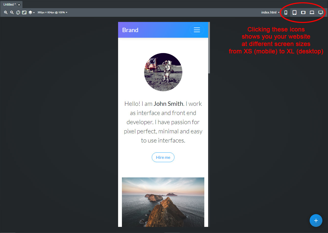
Here you will find such resources…
These are the tutorials and videos available explaining the use of this software, and how to build a basic website page. Have you watched and read them?
I can not create a device-responsive design Whenever it comes to mobile devices.
This does not make any sense, because as soon as you create a new website in Bootstrap Studio, it is automatically responsive, and has sizes available from mobile to desktops. The whole point of using Bootstrap is that the responsiveness is built-in.
Thanks for an in-depth answer, but it not works for me. Mobile display does not change automatically as it should.
No matter, I will find solutions on my own.
Be sure you are checking on your phone for the results and not on a browser on your computer. Resizing your browser to the smallest width for testing will not always give correct results.
Load your site in your phone to check it more correctly.
If you cannot even get the website to display properly at the XS size in the Bootstrap Studio workspace, then the most likely explanation is that you have changed some of the default Bootstrap media queries/breakpoints in your custom CSS.
I would recommend you start by disabling the custom CSS file, and see if your website displays properly at the XS size with a completely stock Bootstrap CSS file.
Also, how did you build your site? Did you start with one of the program’s built-in templates, build your site from a blank page, or are you attempting to import code and styling from an existing website?
At this time, there are simply too many unanswered variables and questions to diagnose your problem.