The Responsive Embed component is an easy way to add responsive videos to a BSS website. There are options for the Aspect Ratio, but there is no option for specifying a poster image. Is this something that could be added?
Put a video component inside a div with the classes ratio ratio-16x9, you can make the second class as a custom option with all the ratios in a dropdown menu.
That’s it, now you can add a poster image to your HTML video in a responsive div
That’s basically what I did (I just didn’t make any custom options.) I just figured if the Responsive Embed Component had an option to add a poster image, it would make it more betterer 
1 Like
The Responsive Embed component is for any type of media to embed in an iframe not just videos. if you embed an image then there is for sure no need for a poster image lol
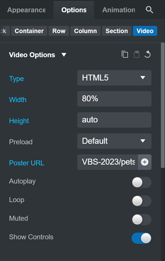
Excuse me for jumping in here, but if I understand correctly, I believe I have done what you want to accomplish using the built-in HTML5 Video Component which allows for a poster image to be selected.
When inserting the video component, the system will assign width and height in pixels.
Do not use these absolute values (px) for width and height.
Use a percentage for width, “auto” for height and video will resize to device screen size.
In this example the original video dimensions are 1280 x 720 pixels and I “downsized” it to 80%.
Here is a link to the web page and as you can see, the video (near the bottom) resizes nicely depending on the device screen size.
You shouldn’t have css values in your html code like height="auto" or width="80%" you can have it as inline style like style="width:80%; height:auto; or in a stylesheet as a class.
Thanks for that info.