Somewhere between Bootstrap 4.5.2 and 4.6, the behavior of the Bootstrap navigation bar has changed. Nav items used to wrap to a new line if you reduced the screen width without allowing a collapse to the hamburger menu.
Now, the nav items themselves stack vertically, and they never wrap to a new line. This is quite annoying because it will actually cut off the navbar items if there are too many, which is absolute NOT what a responsive framework should do. Perhaps this can be changed with a flexbox setting?
I don’t know if this is a Bootstrap Studio issue, or a Bootstrap Issue, but I suspect it’s a Bootstrap Issue. It makes no difference if you use BS4x or BS5x.
See attached animation. Can anyone else confirm this?
Okay, update. After experimenting with flexbox settings, I’ve found the original behavior can be restored by setting Wrap on the Nav component to Wrap.
I cannot for the life of me imagine why the Bootstrap developers would opt to remove this behavior, since without the Nav component set to Wrap, Nav Items can get cut off or overlap other components if they happen to be set to No Wrap in the text options, or you use a non-breaking space.
Not sure if this is an oversight on the part of the Bootstrap Developers, or they actually want it to behave like this, but I think if it’s the latter, it was a poor choice. A responsive framework should never cut items off the screen. Fortunately, I only have a couple of websites that I have to fix.
I have noticed that the BSS app does not always show visually what the Nav’s will do either. It’s always been a little bit quirky with showing realistic resizing, but the app sure has changed a lot of things with this last update that messes with the preview window. Many things don’t look at all like the real site does, and Nav’s seem to work fine for me on an uploaded version of the site, just not in BSS or when Previewing in the browser.
I too thought one of my client’s sites was broken for the Nav, but when I tested it on my phone it worked as it should work so … dunno what’s up on this.
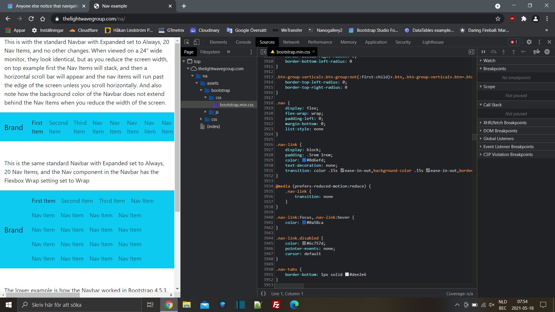
As a test, create a new document, add a Container and drop a standard Bootstrap Navbar into it. Set the Expanded state to Always, and then keep adding nav links until they “overflow” the width of the Navbar. You’ll see that instead of wrapping to a new line in the Navbar, the website will just get a horizontal scroll bar added to the bottom.
It’s not limited to the Bootstrap program or preview window. Here it is on a live, exported website.
I reported it. I think this was something they missed when they updated Bootstrap from 4.53 to 4.6 (and higher.) A responsive framework should never produce a horizontal scroll bar under normal usage. This change broke two of my websites navigation menus.
Fortunately, I habitually check my sites at every screen size whenever I do an update.
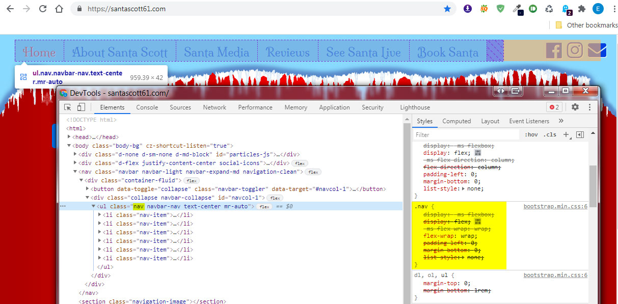
Okay, I think I’ve figured out the problem. The Nav portion of the standard Bootstrap Navbar component in Bootstrap Studio no longer has the .nav class applied to it by default.
If I manually add the .nav class to the Nav component via the Attributes panel, the Nav Items work as they always did (wrap as opposed to stack.)
Yet, when I examine the bootstrap.min.css file that is generated by Bootstrap Studio on export, I cannot find below class or CSS anywhere in the file…
And yet it can still be added from within Bootstrap Studio to the Nav component. I’m very confused now. If it doesn’t exist in the bootstrap.min.css file, then where is it coming from???
You can go to my website which was last updated in December of 2020, and see the above for yourself. But when I open the site In BSS now, there is no .nav class on the Nav component. If I add it manually, the Nav Items work like they always did.
@martin can you shed any light on this? Is this a bug, or something that is unique to the BSS studio software, or an issue with Bootstrap?
Still doesn’t explain why .nav class is now missing from the Bootstrap Nav component, but when you add it manually though the attributes panel, the Nav Item behavior changes.
The nav class is used only in Bootstrap 3. In BS4 and BS5, this class is not used, and hence Bootstrap Studio does not add it.
So at least at the moment, the app generates the correct classes on navbars and navs. Maybe there had been a bug in previous versions of the app where this class had been added. Or maybe it’s a leftover of a BS3 to BS4 conversion. In either case, adding flex-wrap yourself will fix the issue.
I would agree with printninja that the class was removed by Bootstrap Studio when the changes of Bootstrap 4.5.2 and Bootstrap 4.6.
I know because I updated a 4.5.2 project that had the nav class on the navbar as described but I only updated one page which is now 4.6 (just noticed) and it has the nav class removed only on that page. The other pages that have 4.5.2 still have the class.
And there is a .nav class in Bootstrap 4. If you use .nav with .navbar-nav it has the same css just adds the additional flex-wrap: wrap setting without the !important setting. If you want to leave the .nav class off and use the class .flex-wrap then you will get the wrap!important that you only need.
It’s a minor problem with a simple enough solution (now that I’ve figured out what’s going on.)
I just feel that (at least as far as the Bootstrap framework itself goes,) the stock behavior of the Navbar should not cause the Nav Items to “stack” or produce an overflow on the x-axis (resulting in a horizontal scroll bar.) Since older versions of Bootstrap had the Nav Items wrapping to a new line (thus keeping the website “inside the viewport”, this is what one would expect in future versions.
Confirmed, I can fix this from within BSS / options. SO in collapse mode things float to the right using the Flex options and everything is inline-flex contained. Does not seem to interfere with ms-auto in the navbar-nav. So works nicely both collapsed and open toggled.