This will be a Z index error with your design, rather than an error with the application.
Would you be able to share the HTML code for your Navbar and the container that contains your blog components and I might be able to point out the issue.
You can also try adding the class z-0 or z-n1 to the blog loop component to put it behind the Navbar. Or try changing the Navbar position options by selecting it, opening the options panel on the right, and then try choosing fixed top, or sticky top.
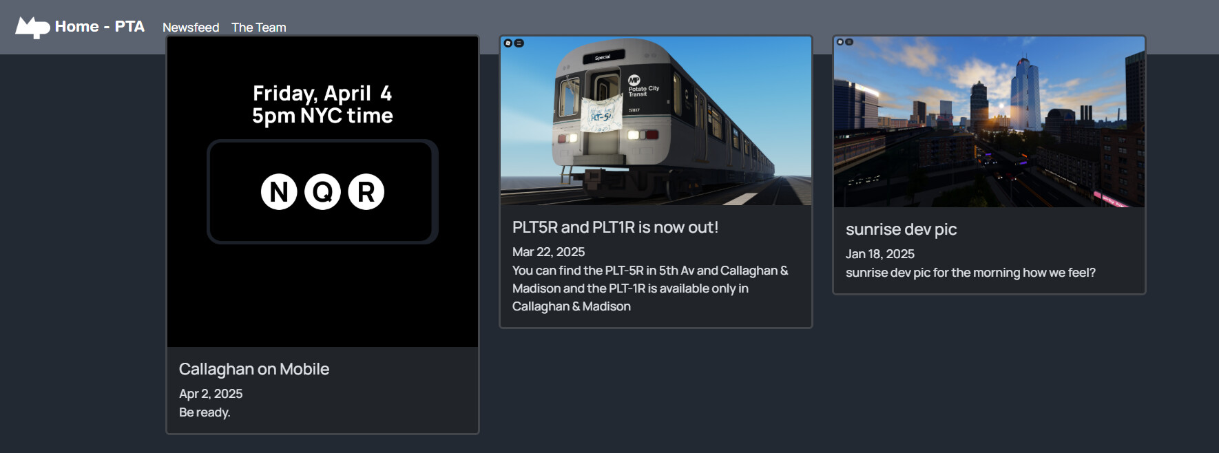
Navbar HTML
<div class="container-fluid"><a class="navbar-brand d-flex align-items-center" href="#">
        <div class="ms-2" style="margin-bottom: -17px;">
            <p style="font-family: 'Helvetica Rounded Bold';"><img src="PTAFavicon.png" width="46" height="30" /> Home - PTA</p>
        </div>
    </a><button class="navbar-toggler" data-bs-toggle="collapse" data-bs-target="#"><span class="visually-hidden"></span><span class="navbar-toggler-icon"></span></button>
    <div id="navcol-2" class="collapse navbar-collapse">
        <ul class="navbar-nav">
            <li class="nav-item"><a class="nav-link active" href="newsfeed.html" style="font-family: Manrope, sans-serif;text-align: left;">Newsfeed</a></li>
        </ul>
        <ul class="navbar-nav">
            <li class="nav-item"><a class="nav-link active" href="staff.html" style="font-family: Manrope, sans-serif;">The Team</a></li>
            <li class="nav-item"></li>
        </ul>
    </div>
    <div class="collapse navbar-collapse"></div>
</div>
Blog Container
<div class="row" data-bss-type="blog-loop-base">
<div class="col" data-bss-type="blog-loop-item">
<div class="card"><a href="news/NQR-Mobile.html"><img class="card-img-top" src="mobile_callaghan.png" /></a>
<div class="card-body"><a href="news/NQR-Mobile.html"></a>
<h1 style="font-size: 21px;font-family: Manrope, sans-serif;">Callaghan on Mobile</h1><time datetime="2025-04-02" style="font-family: Manrope, sans-serif;">Apr 2, 2025</time>
<p class="card-text" style="font-family: Manrope, sans-serif;">Be ready.</p>
</div>
</div>
</div>
<div class="col" data-bss-type="blog-loop-item">
<div class="card"><a href="news/PLT-Update.html"><img class="card-img-top" src="RobloxScreenShot20250321_205627741.png" /></a>
<div class="card-body"><a href="news/PLT-Update.html"></a>
<h1 style="font-size: 21px;font-family: Manrope, sans-serif;">PLT5R and PLT1R is now out!</h1><time datetime="2025-03-22" style="font-family: Manrope, sans-serif;">Mar 22, 2025</time>
<p class="card-text" style="font-family: Manrope, sans-serif;">You can find the PLT-5R in 5th Av and Callaghan & Madison and the PLT-1R is available only in Callaghan & Madison</p>
</div>
</div>
</div>
<div class="col" data-bss-type="blog-loop-item">
<div class="card"><a href="news/sunrise-newport-sneak-peek.html"><img class="card-img-top" src="RobloxScreenShot20250117_210548848.png" /></a>
<div class="card-body"><a href="news/sunrise-newport-sneak-peek.html"></a>
<h1 style="font-size: 21px;font-family: Manrope, sans-serif;">sunrise dev pic</h1><time datetime="2025-01-18" style="font-family: Manrope, sans-serif;">Jan 18, 2025</time>
<p class="card-text" style="font-family: Manrope, sans-serif;">sunrise dev pic for the morning how we feel?</p>
</div>
</div>
</div>
</div>
Sorry for the late reply