Hello 
I have a specific layout structure in-mind for a an app I am currently working-on. I faced some difficulties achieving the required layout. I’ve already searched for hours on my own, but eventually, I need some professional assistance. I would love if read your ideas and thoughts about my problem.
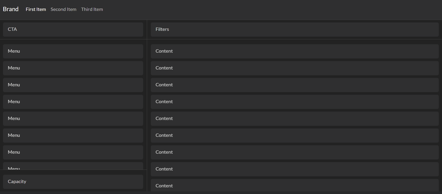
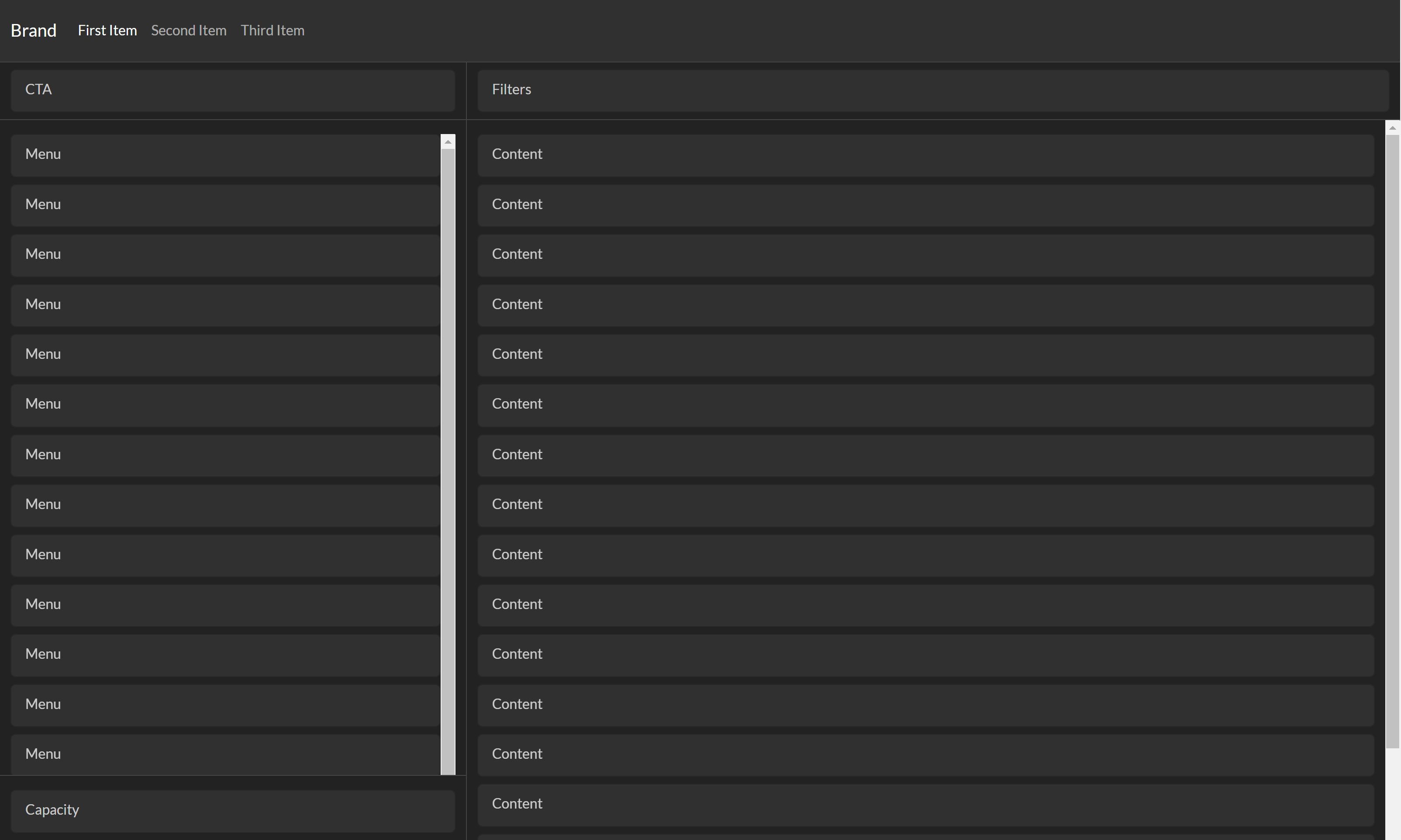
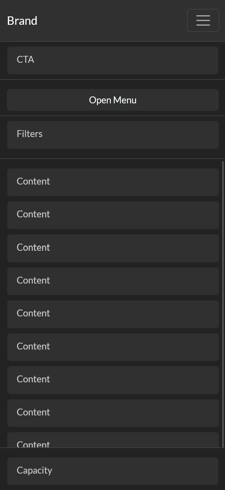
I attached a skeleton of current progress I made using Bootstrap Studio so you can get a clear idea of my vision. And here is a list of features I need to implement
-
#sidebar and #main must fill the full height of the page
-
#cta must be fixed on the top of #sidebar
-
#cap must be fixed on the bottom of #sidebar
-
#menu must fill the full height of #sidebar
-
Content inside of #menu must be scrollable
-
#filters must be fixed on the top of #main
-
#content must fill the full height of #main
-
Content inside of #content must be scrollable
(Image)
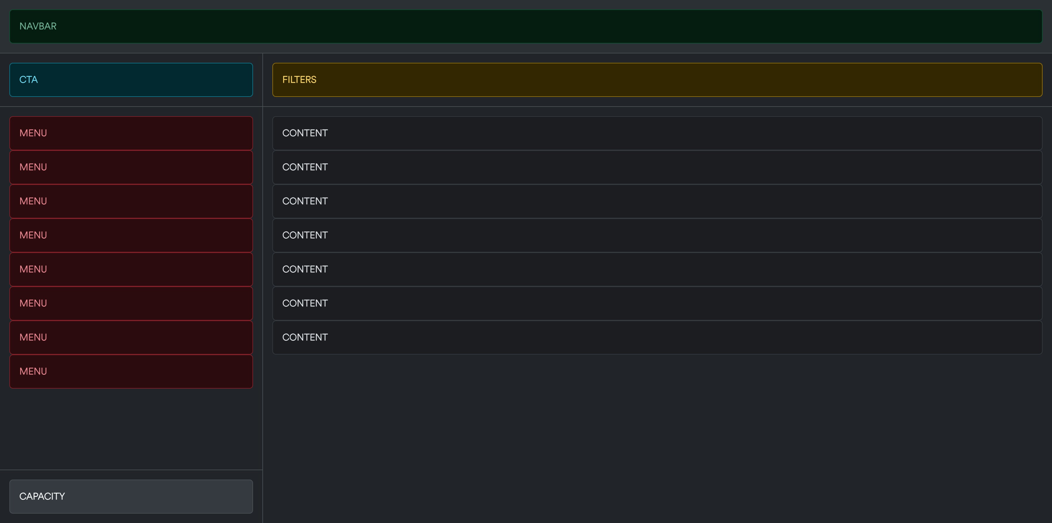
(Code)
<body class="vh-100 d-flex flex-column scroll-none">
    <div id="navbar" class="row g-0 p-3 bg-body-tertiary border-bottom">
        <div class="col">
            <div class="alert alert-success m-0" role="alert"><span><strong>NAVBAR</strong></span></div>
        </div>
    </div>
    <div class="row g-0 flex-grow-1">
        <div id="sidebar" class="col-3 d-none d-lg-flex flex-column border-end">
            <div id="cta" class="row g-0 p-3 border-bottom">
                <div class="col">
                    <div class="alert alert-info m-0" role="alert"><span><strong>CTA</strong></span></div>
                </div>
            </div>
            <div id="menu" class="row g-0 flex-grow-1 p-3">
                <div class="col overflow-auto">
                    <div class="alert alert-danger m-0" role="alert"><span><strong>MENU</strong></span></div>
                    <div class="alert alert-danger m-0" role="alert"><span><strong>MENU</strong></span></div>
                </div>
            </div>
            <div id="cap" class="row g-0 p-3 border-top">
                <div class="col">
                    <div class="alert alert-light m-0" role="alert"><span><strong>CAPACITY</strong></span></div>
                </div>
            </div>
        </div>
        <div id="main" class="col d-flex flex-column">
            <div id="filters" class="row g-0 p-3 border-bottom">
                <div class="col">
                    <div class="alert alert-warning m-0" role="alert"><span><strong>FILTERS</strong></span></div>
                </div>
            </div>
            <div id="content" class="row g-0 flex-grow-1 p-3">
                <div class="col overflow-auto">
                    <div class="alert alert-dark m-0" role="alert"><span><strong>CONTENT</strong></span></div>
                    <div class="alert alert-dark m-0" role="alert"><span><strong>CONTENT</strong></span></div>
                </div>
            </div>
        </div>
    </div>
</body>
Feel free to adjust or modify my code as you like, recommendations regarding anything is very welcome. Thank you all.
EDIT: Figma Design visualisation link has been added