Hello Bootstrap Studio devs.
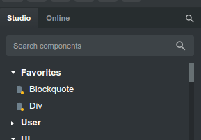
to search for a component there is the studio and online tab,
Is it an idea to also add a favorites tab?
then I can place components there that I need a lot (div, conainer, heading, paragraph) and so on
Hello Bootstrap Studio devs.
to search for a component there is the studio and online tab,
Is it an idea to also add a favorites tab?
then I can place components there that I need a lot (div, conainer, heading, paragraph) and so on
Thank you for the suggestion! You can already add components to the Favorites group. Is your suggestion to move this to a separate tab?
Hello Martin,
Ahh, now i see how to make an Favorites folder, right click and ad to Favorites…
that’s why I had an idea to create a separate tab for Favorites, but maybe it will still be possible in the future?
I’d be in favour of this, it would tidy up the elements tab. It would be nice if in the favourites tab you could create categories to put your favourites under. I have dozens saved. Some are for particular sites, some are empty elements like an empty Card element. And some are completely custom.
I’d also like the online tab to be where the components I’ve downloaded be found too.
Maybe add an area for code snippets in there as well for JS & CSS & whatever.
I like the new Version 7 updates, Bootiful!
@martin
It would be great if we could organize the favorites manually (instead of alphabetically) and maybe even give them their own colors.
Thank you for the feedback, guys!
I think that moving Favorites from Components to a separate tab would have some benefits. This also applies to the User group and Downloaded groups. This will make more people aware that these features exist and make it easier to organize your library.
However there is a big drawback as well. It will make finding a specific component more difficult. You won’t be sure which tab to search for and will have to remember the exact tab where each component lives.
We’d like to think this through better before making any changes. Do share your ideas here, we would love to hear them.
Maybe the search could search all the tabs?
As soon as the user searches, it clears the side panel. And then shows the results under each tab category.
Hi everyone,
I think it would be great if the component UI in Bootstrap Studio also included icons. Icons make it easier to identify components at a glance. Examples of this kind of implementation can be found in other design tools, where icons are used to quickly distinguish between different types of elements.
What do you all think?
I feel like it would take longer to find something that’s needed because of the number of components currently available.
If there were only a hand-full of components, sure. But everything is already separated and if you need to find something, it’s quite quick by just a search or looking under the respected folder / dropdown.
This is just my take on it. ![]()
Thank you for your input. I understand your concern about the potential clutter due to the large number of components.
However, I believe that adding icons could actually enhance the user experience by making it quicker to identify frequently used components visually. Icons can provide an immediate visual cue, reducing the need to read through lists, especially for those of us who work with a standard set of components regularly.
Moreover, icons could be optional and toggled on or off based on user preference, catering to both those who prefer a cleaner interface and those who find visual aids helpful.
What do you think about this approach?
Hi, I’m in favour of icons to make it easier to find your way around.
On the other hand, if there are too many parameters to manage, it makes the interface too cumbersome.
And you risk ending up with a gas factory.
Okay, you do have a point as it does help visually, and it would be possibly good for accessibility. Since I’ve seen this too on a few other tools and it does kind of help. But even with a togglable format, it would be still a bit much due to the number of components and I don’t think there’s enough icons for each component type.
Since there’s already an option to “Add to favorite” for components, these would be your “regularly used components”, basically. This would also help from having to read through the list, as they’re in your favorites and readily available.
But there would probably need to be a large number of users who want this before the BSS Team even considers it. Unless they already have, and that’s why we don’t have it because it didn’t work out (but I don’t know if they did consider it or not).
I personally like the current layout, as I work from a laptop and it’s easier for me to just search the component and drop / drop it. I still feel like it would still be too much to scroll through. as the image you added showing the icon-like components do take up some space.
I understand the concern about managing too many parameters, which could make the interface cumbersome. However, Bootstrap Studio is designed primarily for those who do not have extensive coding knowledge. Most new users might not be familiar with the names of components, and icons can significantly help in identifying them more quickly.
While developers can easily navigate the Bootstrap Studio app, it’s important to consider the perspective of UI designers and graphic designers. By incorporating icons, we could make the platform more accessible and attractive to a broader audience, including new UI designers and graphic designers who might consider purchasing Bootstrap Studio products.
Here’s an idea: Keep the most basic components visible on the left panel, while hiding more advanced components. There could be a customization option to add any advanced tools to the basic view, with options to move components up and down or reset their positions. For inspiration, take a look at how “Adobe Illustrator” UI implements these features.
What do you think about this approach?
I can see the idea behind this.
I’m guessing something like this?
→ Searches: “Card”
v Favorites
Card
Custom Card
v Studio
Card
Card Group
Feature Cards
ETC…
the v is a dropdown, similar to:
![]()
Yeah, exactly! That’s great!
Icons could be useful, but giving us the ability to add color to the favorites folders, and the components in them, would allow for much simpler organization and recognition at a glance. It would likely require a lot less work on the part of the devs.
Also, being able to place them in the order you prefer (as opposed to alphabetical) would be very helpful.
This format will be good while searching for components.
Maybe the option to have icons or not?


