Can't get text aligned left for both collapsed and expanded navbar dropdown

big_screen_menus

As you can see their alignments or justification differ (of the text) in the dropdown menu items. Here is my navbar.css:

@media (min-width: 992px) {
  .navbar-brand {
    font-size: xx-large;
  }
}

@media (max-width:991px) {
  .navbar-brand {
    font-size: x-large;
  }
}

@media (max-width: 991px) {
  .btn.btn-primary.text-nowrap.text-center.d-flex.float-end.justify-content-lg-end.align-items-lg-center {
    font-size: smaller;
    padding: 3px;
    border-radius: 8px;
    margin: 3px;
  }
}

@media (min-width: 992px) {
  .btn.btn-primary.text-nowrap.text-center.d-flex.float-end.justify-content-lg-end.align-items-lg-center {
    border-radius: 11px;
  }
}

.nav-item.d-lg-flex.justify-content-lg-end.align-items-lg-center {
  margin: 0;
}

@media (min-width: 992px) {
  .nav-item.d-lg-flex.justify-content-lg-end.align-items-lg-center {
    margin-left: 3px;
    margin-right: 3px;
  }
}

.navbar-brand {
  margin-right: auto;
}

.dropdown-menu.dropdown-menu-dark.show.dropdown-menu-end {
  float: left;
  background-color: var(--bs-blue);
  color: var(--bs-white);
  border-radius: 8px;
  margin: 0px 5px 0px 0px;
  font-size: smaller;
  border-radius: 8px;
  min-width: auto;
  text-align: left;
  margin-top: 3px;
}

@media (min-width: 992px) {
  .dropdown-menu.dropdown-menu-dark.show.dropdown-menu-end {
    background-color: var(--bs-blue);
    color: var(--bs-white);
    border-radius: 11px;
    margin-top: 5px;
    margin-left: 0px;
    border-radius: 11px;
  }
}

@media (min-width: 992px) {
  .active.d-xl-flex.align-items-xl-center.btn.btn-primary {
    background-color: var(--bs-blue);
    color: var(--bs-white);
    border-radius: 11px;
  }
}

@media (max-width: 991px) {
  .active.d-xl-flex.align-items-xl-center.btn.btn-primary {
    background-color: var(--bs-blue);
    color: var(--bs-white);
    border-radius: 8px;
    font-size: smaller;
    padding: 3px;
    border-radius: 8px;
    margin: 3px;
    float: right;
  }
}

I am pretty proud of the result so far: I have media queries, etc. I made this entirely inside of BSS. However, I need some help making the text alignment consistent across the two media queries. It’s not high priority though, so I will put this on my back burner for now.

Frankly I still don’t understand what the friend wants and what the purpose is, it seems to me that he is having a lot of work for simple things that the BSS itself using the Bootstrap classes already solves.
As stated above, I don’t understand what you are needing.


<header>
        <nav class="navbar navbar-light sticky-top">
            <div class="container"><a class="navbar-brand" href="#">Brand</a><button data-bs-toggle="collapse" class="navbar-toggler" data-bs-target="#navcol-1"><span class="visually-hidden">Toggle navigation</span><span class="navbar-toggler-icon"></span></button>
                <div class="collapse navbar-collapse" id="navcol-1">
                    <ul class="navbar-nav navbar-nav-scroll ms-auto" id="mainNav">
                        <li class="nav-item"><a class="nav-link" href="#">Nav Item</a></li>
                        <li class="nav-item dropdown"><a class="nav-link dropdown-toggle" id="navbarDropdown" href="#" role="button" data-bs-toggle="dropdown" aria-expanded="false">First Item</a>
                            <ul class="dropdown-menu" aria-labelledby="navbarDropdown">
                                <li href="#">Item 1</li>
                                <li class="dropdown-divider" href="#" hr="">Item 1</li>
                                <li href="#">Item 1</li>
                            </ul>
                        </li>
                        <li class="nav-item"><a class="nav-link" href="#">Second Item</a></li>
                        <li class="nav-item"><a class="nav-link" href="#">Third Item</a></li>
                    </ul>
                </div>
            </div>
        </nav>
    </header>
1 Like

I’m not understanding how what you said or the code you put down is relevant to my question. To clarify, everything in my menus is done how I want it, except that the text is aligned left in one version and right in the other. I’d like everything aligned left.

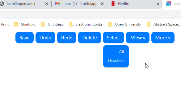
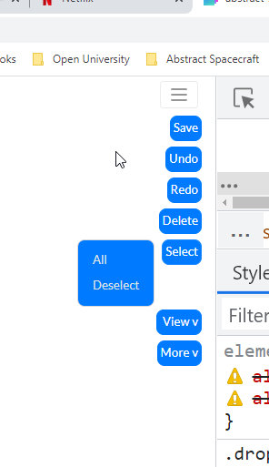
The two versions are split by a 992px min-width media query. I forgot to mention that. The larger buttons clearly for that media query CSS and the smaller button corresponds to the default or max-width 991px CSS block.

I’ve tried:

text-align:left;
text-align:right;
justify-content:left;
justify-content:right;
align-content:left;
align-items:left;
etc.

And tried these in many different parts of the HTML hierarchy. So… hopefully that clears up what I’m asking. Please edit your post. You probably know how to fix this ie :slight_smile:

Thank you, my friend!

I confused the questions, you had asked another one from a group of buttons in a menu, that was the one I didn’t understand the purpose of.
Not understanding what the friend needs, I really can’t help.
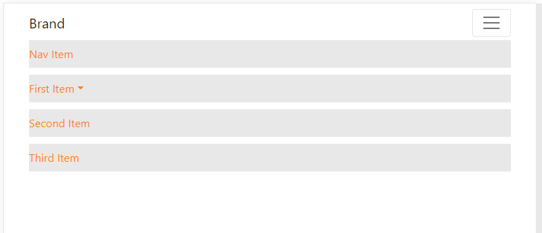
Are you inserting buttons into a navigation bar?

1 Like

Are you able to see the images? In one image, the dropdown-menu items’ text are aligned left (this is the min-width: 992x media query) and it’s working somehow naturally from some other setting I did. Anyway, when the screen enlarges out to the default (or complement) media query, the text is all of a sudden aligned right (the dropdown-menu items’ texts of a dropdown-menu within a drop down, that’s within a nav-item, within a nav, finally within a navbar.

Here’s the current HTML:

{% load static %}
{% load django_bootstrap5 %}
<!DOCTYPE html>
<html>
 <head>
  <meta charset="utf-8"/>
  <meta content="width=device-width, initial-scale=1.0, shrink-to-fit=no" name="viewport"/>
  <title>
   abstract-spacecraft
  </title>
  <link href='{% static "bootstrap.min.css" %}" %}" %}' rel="stylesheet"/>
  <link href="https://fonts.googleapis.com/css?family=Lato:300,400,700,300italic,400italic,700italic" rel="stylesheet"/>
  <link href="https://fonts.googleapis.com/css?family=Indie+Flower&amp;display=swap" rel="stylesheet"/>
  <link href="https://cdnjs.cloudflare.com/ajax/libs/font-awesome/4.7.0/css/font-awesome.min.css" rel="stylesheet"/>
  <link href="https://cdnjs.cloudflare.com/ajax/libs/simple-line-icons/2.4.1/css/simple-line-icons.min.css" rel="stylesheet"/>
  <link href='{% static "user_home_tabs.css" %}" %}" %}' rel="stylesheet"/>
  <link href="https://cdnjs.cloudflare.com/ajax/libs/animate.css/3.5.2/animate.min.css" rel="stylesheet"/>
 </head>
 <body>
  <nav class="navbar navbar-light navbar-expand-lg navigation-clean-button" style="/*position: absolute;*/width: 100%;">
   <div class="container">
    <a class="navbar-brand" href="/" style="font-family: 'Indie Flower', serif;color: var(--bs-indigo);font-size: xx-large;font-weight: bold;">
     Abstract Spacecraft
    </a>
    <button class="navbar-toggler" data-bs-target="#navcol-1" data-bs-toggle="collapse">
     <span class="visually-hidden">
      Toggle navigation
     </span>
     <span class="navbar-toggler-icon">
     </span>
    </button>
    <div class="collapse navbar-collapse" id="navcol-1">
     <ul class="navbar-nav me-auto">
      <li class="nav-item">
      </li>
      <li class="nav-item">
      </li>
     </ul>
     <button class="btn btn-primary" id="save-button" style="padding: 3px 6px;border-radius: 8px;" type="button">
      Save
     </button>
     <div class="btn-group" role="group" style="margin: 4px;border-radius: 10px;">
     </div>
     <button class="btn btn-primary" id="centre-view-button" style="padding: 3px 6px;border-radius: 8px;" type="button">
      Center
     </button>
     <div class="btn-group" role="group" style="margin: 4px;border-radius: 10px;">
     </div>
     <span class="navbar-text actions">
     </span>
    </div>
   </div>
  </nav>
  <iframe sandbox="allow-same-origin allow-scripts allow-popups allow-forms allow-modals" src='{% static "quiver/src/index.html" %}' style="height:83vh;width:100%;border:none;overflow:hidden;">
  </iframe>
  <script src="https://cdnjs.cloudflare.com/ajax/libs/jquery/3.4.1/jquery.min.js">
  </script>
  <script src="https://cdn.jsdelivr.net/npm/bootstrap@5.1.3/dist/js/bootstrap.bundle.min.js">
  </script>
  <script src='{% static "bs-init.js" %}" %}'>
  </script>
  <script src='{% static "connect_quiver_gui.js" %}" %}" %}'>
  </script>
 </body>
</html>

If you can, save and attach the project here on the forum for me to test it on BSS.

1 Like

That’s a good idea, I have a github account with a repo containing the .bsdesign file.

This is the image of the project you made available.

1 Like

Should be other pages in there such as Pages/cd_editor/diagram_editor.html which is the HTML above that I posted prior. BTW, that is a super wide monitor you have!

yes the monitor is ultra-wide.
I just found this file there, try to attach it here on the forum, it’s easier.

If you drop a Button Group onto your dropdown-item and set the type to vertical in the options panel.
Try this CSS

.btn-group-vertical > button {
  text-align: start;
}

@media (min-width: 992px) {
  .btn-group-vertical > button {
    text-align: end;
  }
}

here is an example
https://young-hat-6695.bss.design/

resize the window to see the text-align change at 992px width

1 Like

@kuligaposten I am liking this solution. Thank you! The text is now centered, but that works for me, since the menu buttons also have centered text. :grin: