Carousel Indicators Colour

Hi,

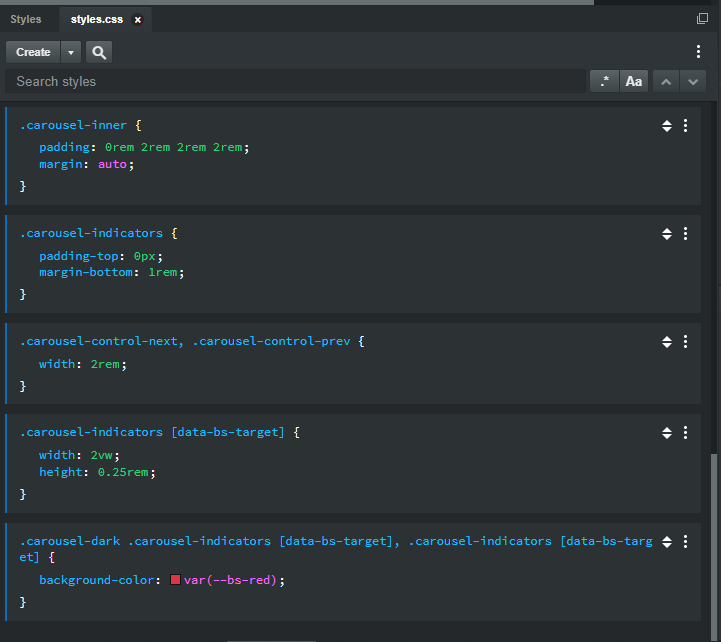
I have spend quite some time googling on how to change the active carousel indicator colour. By default it almost white and the active one is light gray. I have tried adding a custom CSS with the following:

.carousel-indicators .li{
    background-color: #f00;
}

but, this doesn’t seem to work and is struck out. My page is white in background and hence unable to see the indicators. From the left pane, i select the “Indicators” after dragging carousel and change the “font colour”, but that doesn’t seen to anything. Can someone please help?

I found a way to change from white to gray. That’s some progress. However, it change only from light theme to the dark theme colours. I still cannot set my own colours to the indicators.

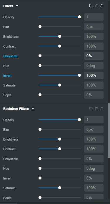
Select “Indicators”, in the “Appearance” section on the right, scroll down to the filters and then slide “Invert” all the way to the right and the indicator colours become visible in a white background.

Hiya Srimanth,

In order to help you better please tell us which carousel you’re trying to use, which version of BSS you’re using, which platform (windows/mac/linus) and version, and give a link to the uploaded site so we can see the code.

I don’t have a public site yet. It’s on my local machine on a windows VM. I am using BSS version 5.3.3.

Just click on “New” design with a blank canvas on BSS and drop the “Carousel” into your code. The left and right controls are by default white. The indicators are also white.

When i drag the “Invert” from the “Filters” section in the “Appearance” pane, the controls and indicators go dard (dark theme). However, they are only from light to dark. However, i want the indicators color (at the bottom of the carousel images / text) to be red or some other colour.

try with this

.carousel .carousel-indicators li {background-color: red;}
.carousel .carousel-indicators li.active {background-color: blue;}
1 Like

Thank you so much. I created a new css file and works perfect. I guess, i missed the “.carousel” before the indicators. Initially, I was trying to figure out so many options via the UI.

I have now changed it to the following:

.carousel .carousel-indicators li {  background-color: gray; }
.carousel .carousel-indicators li.active { background-color: var(--primary); }

Against a white background, this now works a charm! BSS community and forums are great and the users make it simple superb. I have started enjoying BSS now.

1 Like

Well done @srimanth
Now you can change the color of the next and prev arrows yourself and show us how you did it

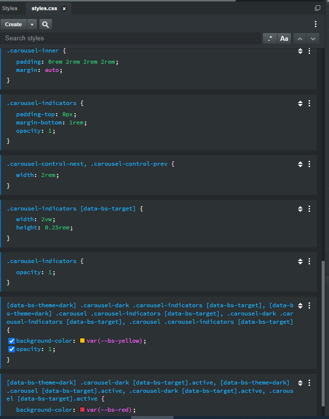
Just to mention, there is a new class added in Boootstrap 5 to the .carousel called .carousel-dark which will invert the colors for the default white fill.

1 Like

Changing the “Prev” and “Next” is a little more tricky as they are SVG images. However, its simpler to use “Font Awesome” icons via BSS.

  • Search for “Icon” on top left
  • Drag it under the first Span under “Previous” and “Next”
  • Double click on the icon and search for “chevron” and select the “right” and “left” accordingly.
  • Change colours of the chevrons from UI or any styling

In addition, you’ll have to remove the existing svg for the controls with the following CSS:

.carousel .carousel-control-next-icon, .carousel-control-prev-icon { background-image: none; }

You might also want to update BSS to 5.5.4 as well, some nice new features came with that as well as the updated BS 5 beta being added as well.

@srimanth
or you can make your own arrows in a shape and color that you like and get a unique look on your slider. add this to your custom css

.carousel-control-next-icon {background-image: url(your-next-icon.png);}
.carousel-control-prev-icon {background-image: url(your-prev-icon.png);}
1 Like

I’ve been finding more and more I prefer to use SVGs for images whenever possible. PNGs can get muddy when shrunken down, or pixelated when enlarged on very large displays, or shown on very hi-resolution screens.

SVGs (when created properly) are usually close in terms of file size, and they look a lot better when the image is responsive, and has to shrink very small, or grow very large, especially if it has small text, outlined letters, thin strokes, etc… I’ve slowly been replacing a lot the PNGs on my websites with SVGs.

Here’s one site where I just recently redid the client’s logo and all the info graphics as SVGs.

https://protectinteriorservices.com/

1 Like

Hi kuligaposten,

I ran across this older thread, and your answer here, while trying to do the same as the OP - Change the indicator colors on the Carousel.

I placed the css in my styles.css:

.carousel .carousel-indicators li {background-color: red;}
.carousel .carousel-indicators li.active {background-color: blue;}

However, it doesn’t change the color of the indicators.

I was wondering if perhaps it’s because BSS now (3 years later) uses button’s instead of ol/li?

I found out how to change the width and height of the indicators:

.carousel-indicators [data-bs-target] {
width: 2vw;
height: 0.25rem;
}

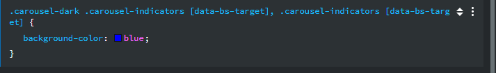
and tried putting the background-color change in there, to background-color: red;
however, that wound up changing all indicators (active or not) to an aqua color.

I’m using BSS 6.6.1.

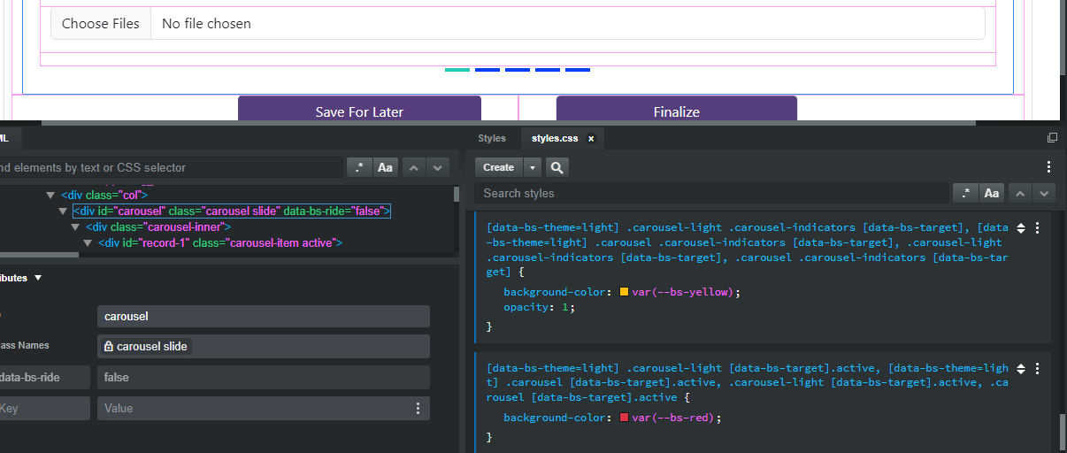
How to change the active, and not active, Carousel indicator colors now?

@we5inelgr

To change the background-color for both carousel-dark and carousel-light to red
you can add this css

.carousel-dark .carousel-indicators [data-bs-target], .carousel-indicators [data-bs-target] {
  background-color: var(--bs-red);
}

if you want dots you can add this

.carousel-indicators [data-bs-target] {
  border-radius: 50%;
  width: 15px;
  height: 15px;
}

The carousel-indicators has an opacity of 0.6
and the active class change the opacity to 1

Thanks for the reply and suggestions. Really like the example on how to change to dots (or circles) for the indicators.

However, when I add the css for red, the indicators are an aqua color again.

When I change the css to simply blue, the indicators are yellow now

I’ve not run into this issue with colors on any other component. Just these Carousel Indicators.

Thoughts on what might be causing this?

P.S. Just in case, I’m including these Appearance settings for the Indicators:

Add this and you should have yellow dots and the active red

.carousel-indicators {
  opacity: 1;
}

[data-bs-theme=dark] .carousel-dark .carousel-indicators [data-bs-target], [data-bs-theme=dark] .carousel .carousel-indicators [data-bs-target], .carousel-dark .carousel-indicators [data-bs-target], .carousel .carousel-indicators [data-bs-target] {
  background-color: var(--bs-yellow);
  opacity: 1;
}

[data-bs-theme=dark] .carousel-dark [data-bs-target].active, [data-bs-theme=dark] .carousel [data-bs-target].active, .carousel-dark [data-bs-target].active, .carousel [data-bs-target].active {
  background-color: var(--bs-red);
}

Adding that produces this now, shade of green for active and blue for inactive (I haven’t changed the default rectangles to dots/circles just yet, wanted to get the colors working first):

I checked the theme and the Carousel is set to Default
Screenshot 2024-03-06 154334

And root is set to Light
Screenshot 2024-03-06 154539

So I changed the css to reflect light, but it still shows those same colors (colors different than what is being defined)

@we5inelgr

The css I posted above is for both light and dark color mode, so you shouldn’t change it.
here is an example with red and yellow indicators

Yeah, I’m not sure what’s going on here or why the color’s won’t show correctly, but If I copy and paste your css exactly as is, I wind up with different colors:

All the carousel css is here (only the last, closing bracket doesn’t show as it’s off-screen):

Still, I’m getting the aqua (active) and blue (not active) colors instead.

If you have inline styles on the indicators buttons they will override the css class. Open the browser’s devtools highlight the indicator buttons and see from where the colors comes

1 Like