Hello everyone. While my carousel screens look perfect in xl sizes, I want to design and show them a little smaller in xs and md sizes. Example: Like Boostrap Studio slider indicators. How can I do that? old
[image]
Hello everyone. While my carousel screens look perfect in xl sizes, I want to design and show them a little smaller in xs and md sizes. Example: Like Boostrap Studio slider indicators. How can I do that? old
[image]
Your image did not attach to the post, but I presume you want to change the width of the indicators so they’re not as wide on smaller viewports.
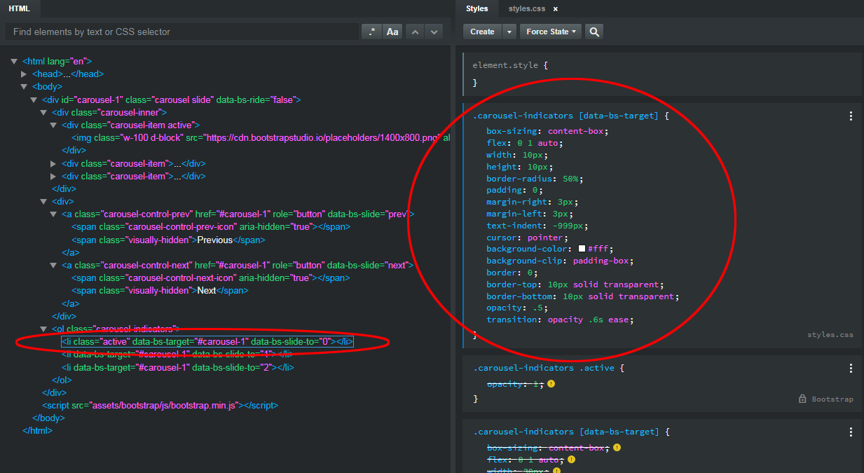
There are no options for changing the appearance of the indicators in the Carousel options. In order to do this, you would need to change the actual CSS rules that style the indicators. If you highlight indicators component, then go into the HTML panel and expand the line <ol class="carousel-indicators"> you can then select the <li> element below it, which will display the relevant CSS class in the Style panel which needs to be changed, which is this one…
.carousel-indicators [data-bs-target] {
  box-sizing: content-box;
  flex: 0 1 auto;
  width: 30px;
  height: 3px;
  padding: 0;
  margin-right: 3px;
  margin-left: 3px;
  text-indent: -999px;
  cursor: pointer;
  background-color: #fff;
  background-clip: padding-box;
  border: 0;
  border-top: 10px solid transparent;
  border-bottom: 10px solid transparent;
  opacity: .5;
  transition: opacity .6s ease;
}
So to change the width of the indicators, you’d create a copy of this class in your custom CSS file, and change the rule width: 30px; to a different value. For example, this…
.carousel-indicators [data-bs-target] {
width: 2vw;
}
Would give you indicators whose width sizes proportionately with the width of the viewport.
You could even change the appearance of the indicators altogether. For example, this would give you round indicators…
.carousel-indicators [data-bs-target] {
width: 10px;
height: 10px;
border-radius: 50%;
}
The position of the indicators themselves within the Carousel is controlled by a different class…
.carousel-indicators {
  position: absolute;
  right: 0;
  bottom: 0;
  left: 0;
  z-index: 2;
  display: flex;
  justify-content: center;
  padding: 0;
  margin-right: 15%;
  margin-bottom: 1rem;
  margin-left: 15%;
  list-style: none;
}
If I wanted the indicators to display below the Carousel (instead of inside it,) I could add the following to my custom CSS file…
.carousel-indicators {
  position: absolute;
  right: 0;
  bottom: -50px;
}
To have discreet control over some aspects of the Bootstrap components, you need to learn the CSS styling language.