When you encounter such positioning challenges, just post the examples here in the forum, and someone will usually explain what you need to do.
You can absolutely create a Bootstrap website with BSS (Bootstrap Studio) without writing any CSS or HTML, but it helps quite a bit to learn CSS so you understand what is actually taking place when you style different elements through the visual user interface (Appearance and Options panels.)
One thing that can help you better understand the program (which is not clearly explained in the Docs) is that there are two basic ways to style components.
The first is by using the Appearance panel settings. These setting create inline CSS rules that are applied to the selected component(s). You can see these rules added as inline CSS in the Attributes panel. They show up under the field Class Names. They will have the word “style” in the Key field, followed by the actual CSS rule(s) in the Value field.
Styling your components via the Appearance panel basically does what would ordinarily be considered the “heavy lifting” of manually coding a website. They create the CSS rules you would otherwise have to type out by hand in an editor. But, because they apply the rules as “inline CSS” (meaning they are directly inside the page HTML), you want to “extract” them to external stylesheets. This ensures you don’t end up with HTML pages that have hundreds of inline styles (this is very undesirable from a development POV.)
The second way you can style components is via the Options panel. What you need to know about the Options panel is that all the setting here use Bootstrap utility classes to change the function or appearance of a component. Bootstrap Utility classes are simply pre-made CSS classes that are built into the Bootstrap framework via the main Bootstrap CSS stylesheet (bootstrap.min.css).
These Utility classes save a developer time by making it easy to add styling to the components without having to type common CSS rules over and over. For example, if I want to align the text in a paragraph to the center, rather than having to write a custom rule like
.text-center {
text-align: center;
}
I can simply click on the paragraph, go into the Options panel, go to the Text Options > Alignment and click the center icon. This will add the Bootstrap Utility class text-center to the component, and the text will be centered. Many Utility classes have breakpoints built into them. For example, the Utility class text-md-center would align the text to the center but only from the medium breakpoint up. The beauty of the Options panel is that it allows us to easily apply different Utility classes at different breakpoints (screen sizes) visually. By expanding the arrow next to the Alignment options, you can change the alignment at different sizes - for instance, centered on XS and left-justified (Start) on LG.
Being able to change different options at different breakpoints is crucial to being able to create a responsive website that looks correct on different screen sizes. Suppose I want to have three pictures next to each other on a desktop screen, but stacked vertically on a phone screen. This is easily accomplished by using Column width options at different screen sizes.
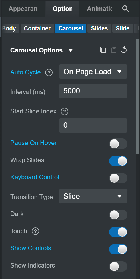
Also, you should know that the settings in the Options panel will change depending on the selected component because different components are designed to accept different utility classes. For example, selecting a P (paragraph) component will present you with different options than selecting a Column component, or a Button component, or a Carousel component.
When you select a component and change its settings in the Options panel, you will see the Utility class(es) added in the Attributes panel in the Class Names field. Classes added in this manner will have a dark gray background, and there will be a little lock icon at the start indicating they cannot be changed.
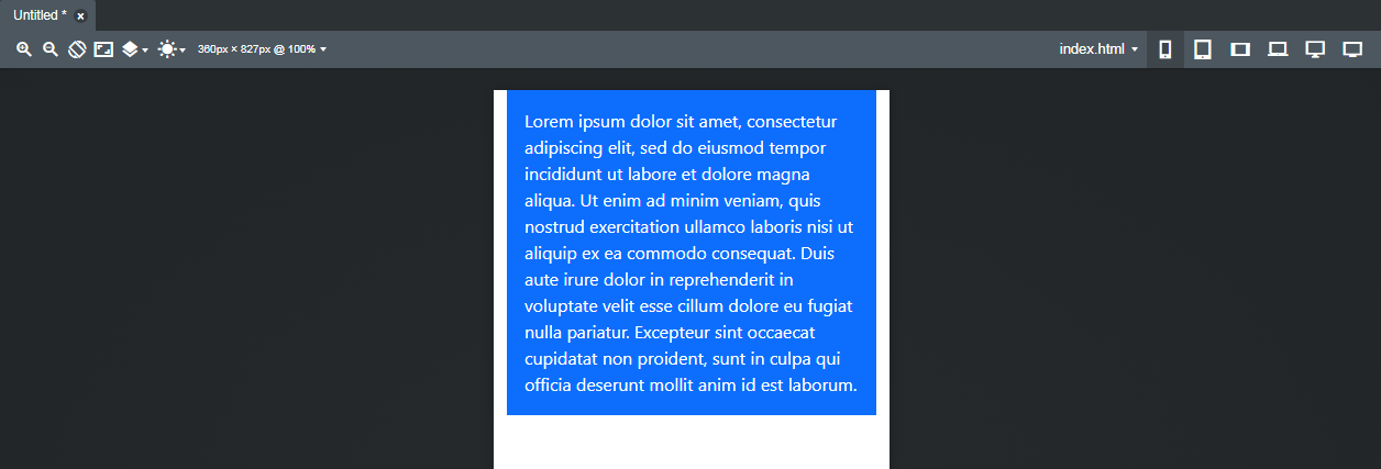
You can also add utility classes (or your own custom CSS classes) yourself manually by typing the Utility class (or your custom class) name directly into the Class Names field. So if I wanted to create a blue box with a paragraph in it with white text, and some padding around the text, I could select the paragraph and type bg-primary p-3 text-white into the Class Names field and I’d get this…
And I never had to write any CSS!
So it’s kind of imperative to learn what all the different Bootstrap Utility classes do if you really want to have a grasp of building a website using the Bootstrap framework. If you don’t learn the Utility classes, it doesn’t really make sense to use Bootstrap. There are “cheat sheets” available online to help with this (for example… Bootstrap Utility classes.)
Regarding your frustrations with alignment - yes, many components are set to “start” (left) by default. Bootstrap used to use “left” and “right” to denote alignment on most components (which is what CSS uses) but now it uses “start” and “end” because they wanted to have the framework follow Flexbox conventions (Flexbox also uses “start” and “end” to denote alignment.) Personally I feel this was a mistake, but it is what it is.
To get a grasp of how to align things in Bootstrap, you definitely want to take the time to learn how CSS Flexbox works. Many things in Bootstrap (and Bootstrap Studio) can be aligned using the little alignment icons. For example, if I want every single text component that I put into a column to align to the center, I can select the column, go to the Option panel, Go to Text Options > Alignment and click the center icon. Because CSS “cascades” all the child objects placed in the column will now inherit the center alignment applied to the column. This could even be done to a Row, a Container, a Section, or the entire Body of the page. But alignment only works for certain things (like paragraphs, headings, buttons, images.)
In many cases, you need to use Flexbox settings to align components, and Flexbox actually gives you quite a bit more power over positioning than the older methods of floats and margins. Floats and margins are still available in the Options panel, but Flexbox is just a better solution. I would highly recommend you visit this website and do the exercises. It can take a little while to grasp how Flexbox works, but once you understand it, you’ll use it constantly.
To conclude, I would recommend you…
- Read the BSS Documentation from start to finish, and perhaps more than once. Honestly, it’s not the greatest, but it’s a LOT better than what we have a few years ago.
- Watch ALL the videos on Bootstrap Studio’s YouTube channel and try building a practice website along with the video (it helps if you have two monitors. If you only have one monitor, try using a phone or laptop or tablet to play the video while you work on the website.) This taught me a lot when I first started with the program. Some of the videos are outdated and refer to older version of both the software and Bootstrap, but they can still help you get a basic understanding of the program.
- Study the Bootstrap documentation. This can seem daunting, so do it in pieces as you need to learn things.
- Learn CSS. There’s simply no way around it. Understanding CSS will greatly increase your ability to make dynamic, custom websites in Bootstrap Studio that don’t look “Bootstrappy.”
- Avail yourself of W3 Schools Bootstrap tutorials. They’re free, easy to understand, and geared towards beginners.
- Use the search feature in the BSS Forum. There are tons of helpful posts (like this one
 ) by many helpful people in our community. We are a pretty tight community and help each other out. If in doubt and totally stuck, search the forum or post a question.
- Watch videos on YouTube on Bootstrap and CSS. You can, of course, do a paid course, but I found there were more than enough free resources online and on YouTube to teach myself both things. It may involve a lot more trial and error, so it’s up to you if you want to spend time or money.
- Create a Stack Overflow account. Stack Overflow is the place to go for answers to all the things you can’t find answers to using Google or any other the other resources I’ve mentioned. I’ve learned a LOT from threads on Stack Overflow.
Hope this helps you out (and others.)