moovida
November 18, 2021, 7:10pm
1
Hi, this has to be really simple, but I was not able to find how to do this.
I am not able to change the text of the Link in the Nav Item of the (closed) drawer. In the attributes I can’t find it. In the html text viewer it is not editable.
So what is the workflow to change the text? Or to open the drawer, where I assume I could just double click on it?
Thanks!
moovida
November 18, 2021, 7:24pm
2
I have been able to do it, even if it is not the right way.
I click on the edit button. Then assume it entered the text item. Ctrl^A to select the text and write the new text. All in blind mode.
But I know there is the right way to do this
jo-r
November 18, 2021, 7:55pm
3
You need to select the dropdown of the menu either in the Preview or better done in the Overview pane. Needs to be the dropdown component. Then you’ll see the menu at the top of the Preview window to open and close the dropdown.
moovida
November 19, 2021, 7:59am
4
Thanks for your reply.
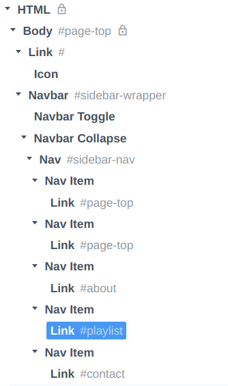
I am not sure I understand what you mean. My menu tree looks like:
I do not have a dropdown.
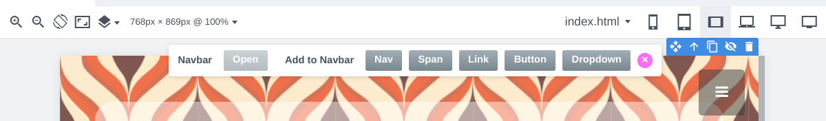
If I select the navbar I get a menu, but the Open is not enabled:
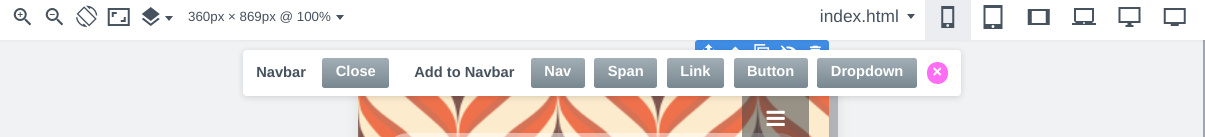
The open button gets enabled when I select a small device screen, but when I push it, it changes to close, and nothing else happens:
Also, in the preview window, if the device size is small, the menu is empty:
And if I make il larger, the menu comes back:
I just used one of the templates to start with, since I am a beginner in this. So I am not sure if I could have broken something.
Thanks for any help.
joroson
November 19, 2021, 11:54am
5
Could you publish it to the sites platform so that we can see what issues you are facing. It will be easier to give you some help that way.
There is a guide on how to do it here Publishing Your Website Online
moovida
November 19, 2021, 1:17pm
6
Done here: https://theoldtube.bss.design/
I assume the studio project might better help? In case I can send that also.
Quick Hack… Change this line:
<div class="collapse navbar-collapse" style="background: #ef714c;">
to
<div class="collapse navbar-collapse" style="background: #ef714c;display: flex !important;">
If you want to go into something less hacky, then you will need to find the css that is taking the display flex off
joroson
November 19, 2021, 1:40pm
8
I wonder if you are mixing the navbar with an off-page canvas or something like that.
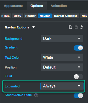
At the moment your navbar is set to expand at MD and above. I think you want it to be expanded always.
At the moment bootstrap is collapsing the menu below MD and that is what is making all your links set to “display:none” on smaller screens.
moovida
November 19, 2021, 1:48pm
9
@joroson : The MD and above was the default of the template. Didn’t touch it.
But setting it to always definitely fixes the disappearing issue, thanks.
@richards : I tried it, but nothing changed. What is the hack supposed to do?
Thanks for you help.
Strange, I’ve tested it twice and it worked ok.
Your css in bootstrap.min.css has
@media (min-width: 768px)
.navbar-expand-md .navbar-collapse {
    display: flex !important;
    flex-basis: auto;
}
Below a width of 768px this will be turned off
@moovida , looking closer at this @joroson is correct the default classes on the nav should be:
navbar navbar-light navbar-expand
you have:
change it back to navbar-expand and it works fine without any additional css
gabby
November 19, 2021, 3:20pm
12
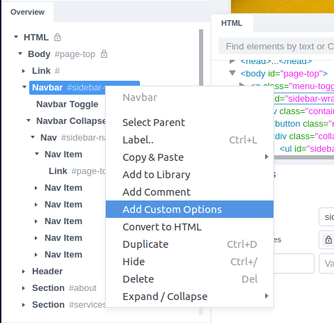
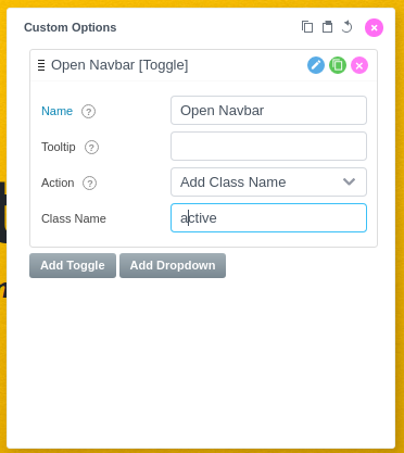
As the way the Navbar opens in this template is not standard, the Open button won’t work. But you can make your own Open option. Right-click the Navbar component in the Overview panel and click “Add Cusotm Options”.
The Navbar is expanded when it has the class active, so let’s add a Toggle that adds this class:
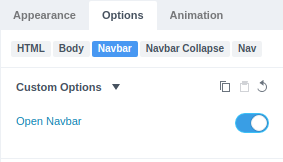
Now you can open/close the Navbar from the Options panel:
1 Like
moovida
November 19, 2021, 3:30pm
13
@gabby , this finally solves my in-studio issue. Thanks a ton. I can finally double click and see what I change.
@richards thanks a ton. Yes I figured that nothing had changed because I had already applied the changes of Joroson.
Thanks everybody.