Hello, my webiste has a widht by default. I want to change it to increase the widht.
If i change the width in body and HTML the sections are aligned to the left.
How can i change the global width?
thanks
Hello, my webiste has a widht by default. I want to change it to increase the widht.
If i change the width in body and HTML the sections are aligned to the left.
How can i change the global width?
thanks
Bootstrap websites are meant to be responsive. By default, the width of the body is going to be be 100% of the width of your viewport. Sections are also 100% of width. The width of containers are controlled by the predefined breakpoints.
Older websites that used absolute positioning had fixed widths. If you set the body to a fixed width, then yes, the elements inside it will float to the left unless you add something like margin: 0 auto; to the body.
Basically, there’s no reason to set a width on a Bootstrap website. It defeats the whole purpose of using a responsive framework like Bootstrap.
Hi @printninja , thanks for your answer.
In this case i am using Startup Modern template that include the boostrapstudio software. And this template has fixed with as you can see here.
Any idea?
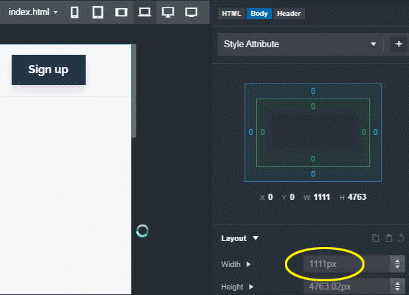
It appears you’re not grasping the basic concept of responsive design. The Width constantly CHANGES depending on the width of the screen (viewport.) This is the entire basis of responsive design. There is no fixed width. The contents/layout of the site will change and reflow according to the size of the device on which the site is viewed.
Refer to the .gif below. Note how as I make the website wider, the Width number (circled in yellow) changes. Also note how the highlighted screen icon at the top (the small images to the right of the text index.html) switches from the LG icon to the XL icon once the width exceeds 2000px. If you click on those icons, your website will change it’s width to the size determined by the different breakpoints.
What exactly is it that are you trying to do that is making you want a specific width on your site?
thank you so much… i appreciate your time.
The problem is with wide screens. What i want is to make the central content wider, not too much.
In attached screenshot you can see my website in a large monitor, the website stays in the center. I want to make it a little wider.
I hope you undestand me better now. Thank you again
In your css put this:
body {
max-width: 1200px;
}
Change the number to whatever fits best for you.
You can also do this by percentage, but either way you will need to most likely add some media queries to adjust the responsiveness. I do this a lot also.
The alignment issue is something you will need to check the container settings for.
You can add this to a css-file
.container {
  min-width: 80%;
}
no need for media queries or other adjustments
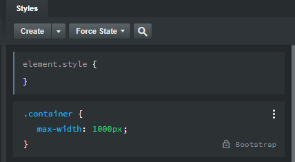
For some reason, the BSS developers chose to limit the maximum width of the containers in the Startup Modern theme to 1000 pixels wide (whereas the standard Bootstrap Container has a max width of 1320 pixels at the XXL screen size.)
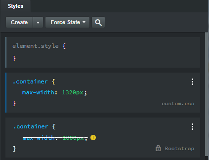
You can easily increase the width of the containers in this theme by clicking the three vertical dots at the right of the rule, copy this rule to a new CSS stylesheet (I named it custom.css for this example), and change the max-width value to 1320 (or whatever width you want) like this…
Note that when you preview the site, you will see that the width of the content in the Hero section will not have become wider. This is because the column width is set to 8 at the MD breakpoint in the Column Options. You’ll need increase that number to see that content use up more of the available horizontal space in the container. The rest of the content on the page will take advantage of the new, wider container width.