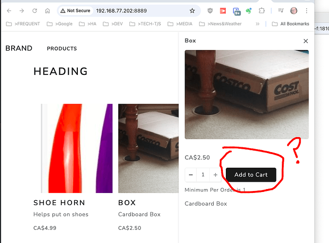
It’s a bit confusing to have to click “add to cart” a second time (user thinks they are adding it a second time), so I’m wondering if either of the first page could say “select” instead, or if the second page could say “Confirm” instead of “add to cart” again?
You can use the following CSS:
.ref-product-preview .ref-button {
  position: relative;
}

.ref-product-preview .ref-button::after {
  position: absolute;
  top:0;
  left:0;
  right:0;
  content: "Confirm";
  text-align: center;
  display:inline-block;
  background: inherit;
  padding:inherit;
  border-radius: inherit;
 }
I don’t know if the ref-product-preview is used anywhere else (it doesn’t seem to be) but keep an eye out on your system.
Well that does work right now, thanks a lot!
If you don’t mind me asking, what was the process that you went through to find that?
First I checked to see if it could be done using the language localisation json, but the “Add to Cart” goes across all the buttons. Then it was a choice of using CSS or JS.
Using dev tools in chrome I could see that the button had a class of ‘ref-button’ so styled the CSS to overlay a faux button over the top of the original button.
.ref-button::after {..}
That worked, but for all ‘Add to Cart’ buttons, so again using dev tools, I found the off canvas had a class of ref-product-preview.
So adding that to the css only affects ref-button within ref-product-preview
.ref-product-preview .ref-button::after {..}
Thanks for sharing your thought process! This might help me troubleshoot a little further next time I run into this kind of thing!
Sorry I’m quite late to this, but you can change the “Add to Cart” text in the options.
Just click on the Product List, and on the right hand side choose “Options” and at the bottom of the Product List options is the “Add to Cart Text” configuration, and you can type the text you want to appear on the button in here.
