There is a way to fix / modify the two items Choose File and No File Selected in the File Input Component of the Form? As you can see, the two items are too close.
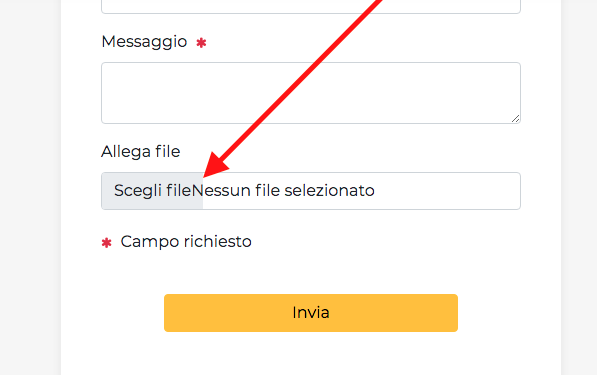
There is a way to fix / modify the two items Choose File and No File Selected in the File Input Component of the Form? As you can see, the two items are too close.
Does it appear like this in Bootstrap Studio, or only when you export and open it in a browser? It’s likely it can be fixed with a bit of CSS. We could give you some directions if you share a link.
Both;
same situation in Bootstrap Studio and when published.
I see it a little different. Am on MacOS Big Sur using Firefox. Is still not right, but better.
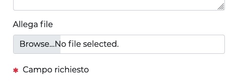
remove the form-control class from the file input (might have to do this as custom code)
you may want to add the w-100 and rounded-2 classes just for style
then add this to your style sheet
::-webkit-file-upload-button {
  -webkit-appearance: button;
  background: rgb(170,163,151)!important;
  margin-right: 20px;
  padding: 10px;
  border: 0;
}```

you may have to tweak a bit to suit your design, you will probably have to check in various browsers/operation systems, but hopefully it points you in the right direction.We were able to track down what’s causing the issue. It’s a bug with our templates (it doesn’t affect regular Bootstrap 5). We will fix it in our upcoming update.
OK, thank you, waiting for next updating 