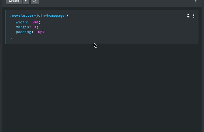
Pretty much what the title says. I was trying to click outside of the edit area where I just made changes since the app requires you to do so to activate many new changes and I noticed that when I clicked anywhere under the last class in a css page it made a new class of whatever your last created class was.
Typically the blue line shows up where we click on it to do this and typically it only shows up when we mouse over it. I don’t recall it ever doing this, but if I’m honest I could also say I may never have done this before and that could be why I didn’t notice lol. I usually click in the next class in the Styles window or box in the attributes panel if I’m editing it in there. I very seldom have only a couple classes in a style sheet so I haven’t really clicked under them either often or ever to notice this … or … lol
Anyways, here’s a video, hope it helps. In none of the clicks was I anywhere near the blue line, yet no matter where I moused in the blank area below the last class, it lit it up. Doesn’t seem to me it should be doing that.
It very well could be, just caused me a bunch of issues yesterday as I was doing a new project and had only 2 classes in my custom CSS file and was trying to click outside the area of the classes I was editing and instead of just updating to the browser, it kept creating classes so I had to click somewhere else on the screen/window to update the classes without this happening. Could be by design, may have thought this would be helpful. I’m just sayin’ it’s not lol,.
I agree. It’s like back when the toggle switches in the option panel could be switched by clicking the background area to the left of the switch, instead of just clicking ON the switch. I was constantly accidentally toggling things because I’d randomly click in what I thought was “dead” space after entering a URL or something. It was driving me bonkers when I couldn’t figure out why toggles kept “changing on their own” and then I discovered what was happening, stopped clicking in those areas, reported it, and the devs fixed the problem.
I wish they’d move the arrow that expands the various sections in the Options panel so they sit just to the right of the section’s title, instead of all the way on the right side next to the words “Reset All.” I can’t tell you how many times I’ve accidentally hit “reset all” when all I wanted to do was expand the section. It would make perfect sense, since every other word (ex “width” “offset” “alignment”) that has an associated dropdown arrow, has the arrow right after the word. The UI should be consistent, and this would eliminate the problem of klutzes like me accidentally “resetting all.” I even made Martin this nifty graphic to show how much nicer it would be…
…and he said it was on their to-do list, but getting BS 5 out was their main priority. Hopefully, now that BS 5 is it’s out, this will get some love.
Sorry didn’t mean to hijack your post jo. Your issue is certainly valid. Things should not just “happen” when you click in empty spaces. That’s a thoroughly undesirable UX. I think the reason this happens is because software developers often don’t use the programs as intensely as the users. I’m sure it’s not intentional. They get too busy working on the next new features, and rely on us to bring up useability issues.
It has always been this way, but maybe we should change it. I see how it could be annoying if people want to click on the blank space only so that they focus out of the css editor.
Yeah, have been checking out some other apps for images and such and have found that most of them adhere to the same trigger area for the last one as they do for the others. Would definitely be better if it only triggered within a small area above and below the last class/id blue line. Like I said, it’s really the first time I’ve actually come across this, but I’m sure it will happen again. With all that empty space it’s a perfect place to click outside your edited area to get the changes to take effect. At least that was what I expected lol. Imagine my surprise when I tried 2 or 3 different clicks and ended up with 2 or 3 more classes added lol. Eeks!