I have and feel those EXACT same concerns. My thinking is, “websites were built to be viewed on monitors, not screens the size of a baseball card!” But the world has changed, and like it or not, depending on the industry, 70%-80% of website traffic is now coming from mobile phones, so not only is it mandatory to rehabitualize yourself to think in terms of “mobile first” but also to consider the UX on a mobile device is going to be quite different from a desktop, so you, me, all of us developers just have to bite the bullet and accept this is where things are now.
A simple example is breaking up page sections. On desktop the info that fits in the “above the fold” area used to be the gold-standard in terms of user-engagement. Five years ago, everyone was saying, “ya gotta grab them in the area above the fold because statistically, less than 30% of people scroll to the bottom of a desktop page. people don’t like to scroll.”
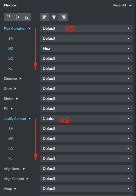
That’s no longer the case. Scrolling is not only an accepted practice, it’s EXPECTED. Users on phones are actually now conditioned to scroll to see the next “chunk” of information, so mobile-first development also means finding ways to break up your content into chunks in the neighborhood of 500 to 700 px in height, and then making them distinct from the next chunk that follows. This is stuff we never gave a thought to on desktop. It’s a whole new ballgame.
And then there’s the speed factor. Lazy loading is super-important on mobile because you don’t want people having to wait more than 2-3 seconds for the mobile site to allow interactivity. On desktop, you had both the luxury of generally higher speed connections, and no data caps. So when you design for mobile-first, you have to think efficiency, file size, tapping (as opposed to clicking and hovering), so all the stuff we worked so hard to create on desktop with nice CSS hover effects and rollover actions is all meaningless on a phone where there’s no mouse pointer.
I still have a tendency to start my sites at full desktop size (old habits), but I spend a LOT of time making sure the mobile experience is at least as rewarding and engaging as the desktop, even though it might not have as many cool features. It’s just something you have to force yourself to do, because the new generation of web developers are not just using phones to visit websites, they’re even using them to BUILD websites!