I am always grateful for your help. It’s been a month since I started Bootstrap.
I have some questions about the menu in the Grayscale template. I’m studying, but I didn’t understand.
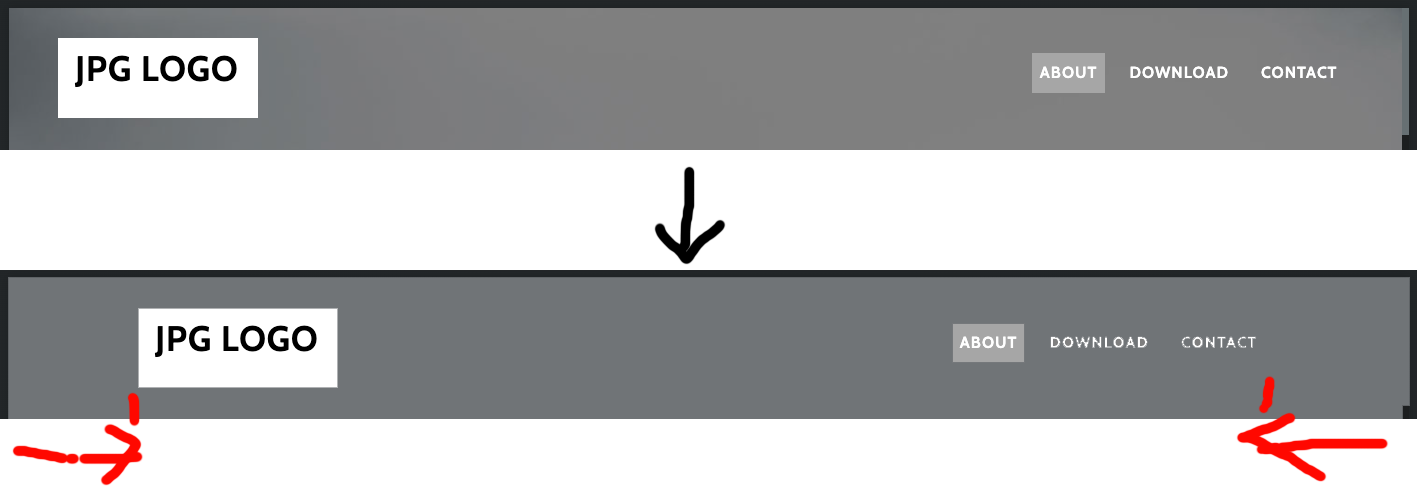
When the number of menu items is few, the logo and menu will spread horizontally. Do I just adjust only the margins of each part to solve it? But I need to adjust all the responsive. Is there any other method?
When changing to a toggle menu, the menu will appear with the width and color of mainNav. Is it possible to expand only Navbar Collapse while keeping the color of mainNav as it is? Is it impossible without making all the toggle menus in JS?
If I click the toggle button when there are many menus, the page will be almost hidden when I view it on my iPhone. If I want to display a menu with a short name only on the right side, is there no choice but to use JS?
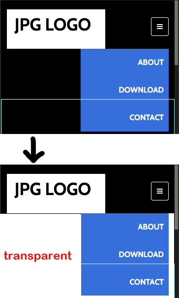
Is it possible to create a menu like the one below with CSS while using Navbar?
That was exactly what I wanted to do! It’s perfect when the menu appears from the right side. I’m parsing your sample but it’s a lot of code and I still don’t understand. If I change it to a toggle button at the size of a smartphone, I can do what I want!!
The first tag of Nav Item (Link) hover white. The hover color I specified from the second menu.
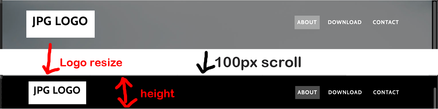
If I scroll once and return to the top, all will be the specified hover color.
In the beginning, the first Nav Item > Link had an active class. So I duplicated the second link menu and put it in the first Nav Item (Link). But no matter where I look in the CSS, I can’t find a whitening designation.
 I downloaded it immediately. This time, I was able to learn two ways: using JS, CSS only. Thank you very much!
 It’s perfect when the menu appears from the right side. I’m parsing your sample but it’s a lot of code and I still don’t understand. If I change it to a toggle button at the size of a smartphone, I can do what I want!!