I bought this amazing BSS a few days ago. After that, I was pleased that the app was updated twice immediately!!
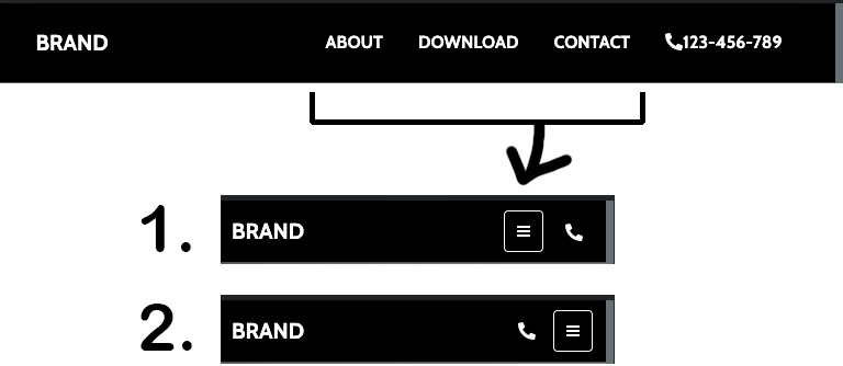
By the way, I am customizing the Grayscale template. I would like to create a phone number link in addition to the Nav Item and lay out the phone icon button next to the Toggle button when the screen gets smaller.
I only study BS, CSS, JS for 2 weeks… I searched the forums and the internet, but couldn’t find anything close to my wishes. Is my hope very difficult? I would like 2 if possible. Please help me.
Vou responder em português do Brasil
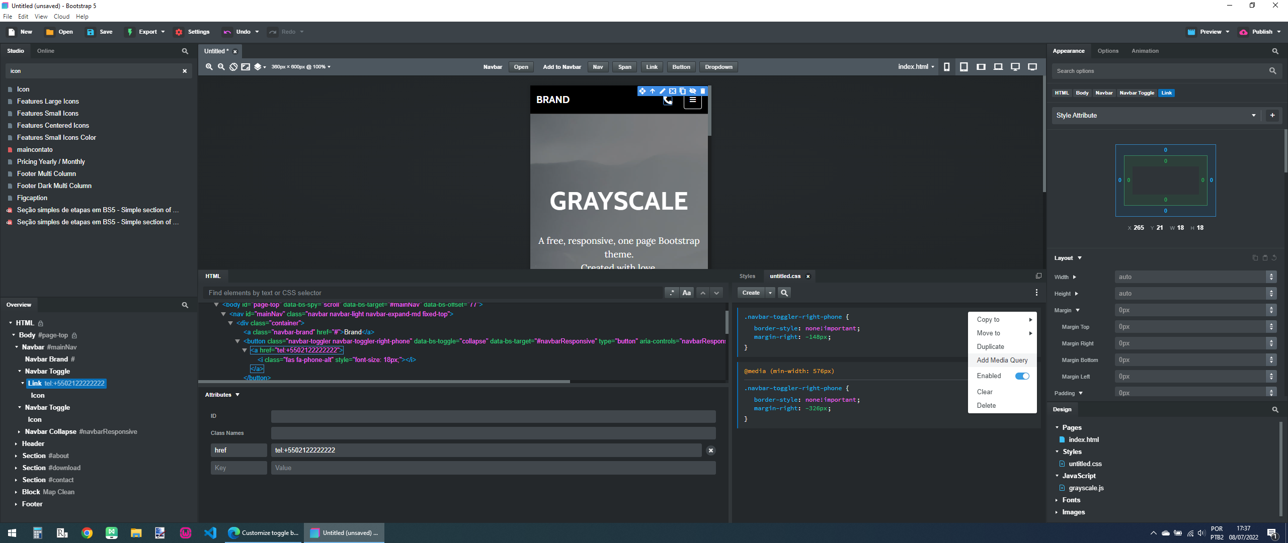
Duplique o Navbar Toggle, apague o icone do segundo, coloque um link e dentro do link um icone, no link você coloca o número do telefone conforme o exemplo tel:+5502122222222, onde 55 é o código do país, depois o código de área, neste caso é o 021, em seguida o telefone.
Você também vai precisar ajustar o CSS para este icone conforme a imagem abaixo, note que para incluir a consulta de tamanho você precisa criar o CSS para o item e depois clicar conforme a imagem.
Talvez seja mais fácil remover a borda do toggle, adicionar um link e dentro dele um ícone e ajustar os espaços entre eles.
Se quiser pode adicionar borda nos ícones e ajustar conforme desejar
Expand the Navbar in the Overview panel (lower left) and from the Studio panel drag a Link component in between the Navbar Brand and Navbar Toggle. You will see an underlined word Link appear in the center of your Navbar.
From the Studio panel, drag an Icon component into the Link component (you will see a star appear after the word Link.)
Double-click the star and change it to a phone icon of your choosing.
Double-click the “LINK” text and delete it so only the phone icon remains.
With the link still selected, go to the Options panel and under Link Options > URL enter your phone number (ex. tel:5556667788)
With the Link component still selected, in the Options panel expand the Responsive Display settings, expand Display and set MD to None.
Scroll down to Flexbox. Expand Flexbox settings and change the last setting - Margin Auto - from Default to Start
Go to the Attributes Panel and in the Class Names field add the utility class “me-3” (no quotes) This will add space between the link and the Navbar toggle.
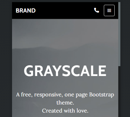
The finished result should look like this.
If you’d like the phone icon to be a bit bigger, from the Overview panel select the Icon inside your Link, go to the options panel and change the Font Size to Font Size 2
Thank you for your reply. I was able to make rough changes and place scroll to top buttons using the template. However, even after trial and error, navbar did not come to my hope. But it was solved now.
Wow! Thank you very much!
Nothing happened when I double-clicked on the downloaded file. BSS bug? However, I look at the “component” keyword in printninja’s post, I understood that the file should be imported into BSS. Your component and preview are perfect! And that was a reference for what I had to do!!
@gilmar san
Eu queria saber se eu precisava adicionar CSS. Felizmente, consegui entender com o arquivo do componente e o procedimento. Talvez o conselho de Gilmer também seja bom. Vou tentar quando tiver tempo. Obrigado do Brasil.
With the help of richards san, my hope came true. But I had to study how it works. Thanks to you, I was able to understand the details of how to set it up! This time, I learned that there are tabs for settings everywhere. Arigato-gozaimasu!
Thank you all! I thought for a week to make this. It may be easy if you ask everyone. But I wouldn’t have a remember deeply or chance to other discoveries.
When I add a phone number to Nav Item, the phone number is displayed in the toggle menu. Therefore, from the richards’s advice, I duplicated the Nav Item on the right and set its class to “d-noned-md-block”. There may be a smarter way. I’m not sure if it’s "d-noned-md-block”…
And I was able to turn the toggle button into an animated button with CSS and JS. I imported a sample that switches to “X” when clicked with the JS button. Then I copied all the Navbar Toggle classes in the template to the button I wanted to switch to. and it works!
If you want a phone number displayed in your Navigation menu, you shouldn’t add it by duplicating a Nav Item. Nav Items are for navigating to other places on your website.
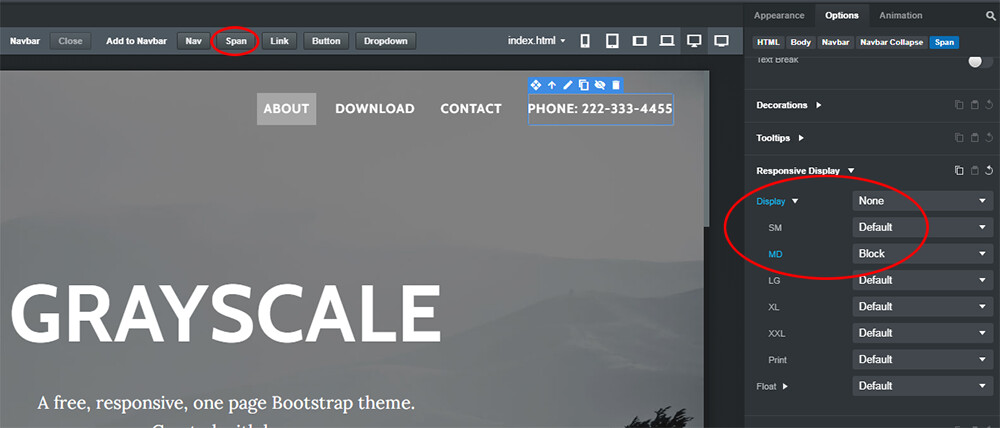
A phone number can be added just by selecting the Navbar Collapse component in the Overview Panel, and then in the top menu where it says “Add to Navbar” just click Span. This will add a editable text field to the Navbar after your Navigation items that you can change to whatever number you want. You can style it through the Options Panel, add some space to separate it from the links with the Bootstrap utility class ms-3, and to prevent it from displaying when the menu collapses to the mobile size, just set the Responsive Display Options to None on XS and Block on MD
Apart from that, the menu closes when I click anywhere other than the menu or toggle button.
/// When you click everywhere in the document
$(document).click(function (event) {
  /// If *navbar-collapse* is not among targets of event
  if (!$(event.target).is('.navbar-collapse *')) {
    /// Collapse every *navbar-collapse*
    $('.navbar-collapse').collapse('hide');
  }
});
These are working. However when I have the menu open, if I click outside the toggle button or menu, the active class doesn’t work, so the toggle button icon doesn’t change. How can I combine the two JS? I’ve searched and tried various things, but it doesn’t work as I expected.