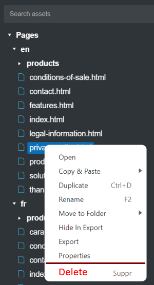
Hello, In the page context menu, the “Delete” item is too close to “Properties”.
A separator between the two items and possibly the red color would be a slight improvement in ergonomics.
Hello, In the page context menu, the “Delete” item is too close to “Properties”.
A separator between the two items and possibly the red color would be a slight improvement in ergonomics.