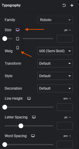
I’m looking for a setting to specify font sizes for mobile and desktop versions, just like in WordPress Elementor, I couldn’t find a place for something like this in Bootstrap Studio.
You’ll need to use CSS for this, below is an example of each of the break points that Bootstrap uses for different screen sizes.
/* =========================================
   Extra Large devices (≤1200px)
   Bootstrap: xl breakpoint
========================================= */
@media (max-width: 1199.98px) {
    html {
        font-size: 17px;
    }
}

/* =========================================
   Large devices (≤992px)
   Bootstrap: lg breakpoint
========================================= */
@media (max-width: 991.98px) {
    html {
        font-size: 18px;
    }
}

/* =========================================
   Medium devices (≤768px)
   Bootstrap: md breakpoint (tablets)
========================================= */
@media (max-width: 767.98px) {
    html {
        font-size: 19px;
    }
}

/* =========================================
   Small devices (≤576px)
   Bootstrap: sm breakpoint (phones)
========================================= */
@media (max-width: 575.98px) {
    html {
        font-size: 20px;
    }
}

/* =========================================
   Extra small devices (<576px)
   Bootstrap: xs (default mobile)
========================================= */
@media (max-width: 400px) {
    html {
        font-size: 21px;
    }
}
2 Likes
Isn’t doing it this way a huge waste of time on large pages? I was wondering if there was a UI version; the AI revolution happened, but the lack of something like this is disappointing for me 
I simply included all breakpoints so you could adjust all the individual ones you wished to change the sizing on as required.
There is no UI version for different fonts sizes for different screen sizes, this is likely due to two factors.
- Bootstrap itself doesn’t natively support different font sizes on different screen sizes.
- Nobody has requested it, if you wish to suggest it then you can post in Ideas with a request.
In my own experience, creating different font sizes across different screen sizes is unusual these days now that CSS has better support for sizing. 1rem will adjust across sizes. And adjusting the font size on different screen sizes usually leads to more issues. It’s probably more advisable to adjust the main font size.
Here’s the ultimate responsive typography CSS for Bootstrap 5, covering:
- All headings (
h1–h6) +.display-1–.display-4 - Paragraphs (
p) +.lead+.card-text - Inline/semantic text (
span,strong,em,small,mark) - Blockquotes
- Text utilities (
.text-muted,.text-primary,.fw-bold, etc.) – keeps color and weight intact - Breakpoint-aware scaling (
sm,md,lg,xl) - Helper class
.fs-responsivefor custom elements
This is plug-and-play: drop it in your CSS, and every text element scales beautifully.
/* ======================================================
   Ultimate Responsive Typography for Bootstrap 5
   ====================================================== */

/* -----------------------------
   Headings + Display classes
   ----------------------------- */
h1, .display-1 { font-size: clamp(2rem, 5vw, 4.5rem); }
h2, .display-2 { font-size: clamp(1.75rem, 4.5vw, 3.75rem); }
h3, .display-3 { font-size: clamp(1.5rem, 4vw, 3.25rem); }
h4, .display-4 { font-size: clamp(1.25rem, 3.5vw, 2.75rem); }
h5 { font-size: clamp(1rem, 3vw, 2.25rem); }
h6 { font-size: clamp(0.875rem, 2.5vw, 1.75rem); }

/* Breakpoint overrides */
@media (min-width: 576px) {
  h1 { font-size: clamp(2.25rem, 5vw, 4.25rem); }
  h2 { font-size: clamp(2rem, 4.5vw, 3.25rem); }
  h3 { font-size: clamp(1.75rem, 4vw, 2.75rem); }
}

@media (min-width: 768px) {
  h1 { font-size: clamp(2.5rem, 5vw, 4.5rem); }
  h2 { font-size: clamp(2.25rem, 4.5vw, 3.5rem); }
  h3 { font-size: clamp(2rem, 4vw, 3rem); }
}

@media (min-width: 992px) {
  h1 { font-size: clamp(3rem, 5vw, 5rem); }
  h2 { font-size: clamp(2.5rem, 4.5vw, 4rem); }
  h3 { font-size: clamp(2.25rem, 4vw, 3.5rem); }
}

@media (min-width: 1200px) {
  h1 { font-size: clamp(3.25rem, 5vw, 5.5rem); }
  h2 { font-size: clamp(2.75rem, 4.5vw, 4.25rem); }
  h3 { font-size: clamp(2.5rem, 4vw, 3.75rem); }
}

/* -----------------------------
   Paragraphs, lead, card-text
   ----------------------------- */
p, .lead, .card-text {
  font-size: clamp(0.9rem, 2.2vw, 1.25rem);
}
@media (min-width: 768px) {
  p, .lead, .card-text {
    font-size: clamp(1rem, 1.8vw, 1.5rem);
  }
}

/* -----------------------------
   Inline & semantic elements
   ----------------------------- */
span, strong, em, small, mark {
  font-size: clamp(0.9rem, 2vw, 1.2rem);
}

/* -----------------------------
   Blockquotes
   ----------------------------- */
blockquote {
  font-size: clamp(1rem, 2.2vw, 1.5rem);
  margin: 1rem 0;
  padding-left: 1rem;
  border-left: 4px solid #ddd;
  color: #555;
  font-style: italic;
}

/* -----------------------------
   Bootstrap text utilities (colors, weight)
   ----------------------------- */
.text-muted, .text-primary, .text-secondary, .text-success,
.text-danger, .text-warning, .text-info, .text-light, .text-dark {
  /* keep original colors intact, but text still scales via base elements */
}

/* Font weights */
.fw-bold { font-weight: 700; }
.fw-semibold { font-weight: 600; }
.fw-normal { font-weight: 400; }
.fw-light { font-weight: 300; }

/* -----------------------------
   Helper class for custom responsive text
   ----------------------------- */
.fs-responsive {
  font-size: clamp(0.9rem, 2.2vw, 1.25rem);
  line-height: 1.2;
}

/* -----------------------------
   Apply consistent line-height
   ----------------------------- */
h1, h2, h3, h4, h5, h6, p, span, strong, em, small, mark, blockquote, .lead, .card-text, .fs-responsive {
  line-height: 1.2;
}
Example HTML with Everything Covered
<h1 class="display-1 text-primary fw-bold">Fluid Heading 1</h1>
<h2 class="display-2 text-secondary">Fluid Heading 2</h2>
<h3 class="display-3 text-success">Fluid Heading 3</h3>

<p class="lead">Lead text that scales beautifully.</p>
<p>Regular paragraph with <span class="fs-responsive">custom inline text</span> and <strong>strong text</strong>.</p>
<small>Small responsive text.</small>
<blockquote class="text-info">
  Blockquote automatically scales with the viewport.
</blockquote>
<p class="card-text fw-semibold">Card text scales fluidly too!</p>
What this does for you:
- Covers literally every text element you’re likely to use in Bootstrap 5.
- Fluid scaling via
clamp()for mobile → desktop. - Breakpoints step up heading sizes for tablets & desktops.
- Helper class for any custom inline text.
- Works with Bootstrap colors and font weights seamlessly.
3 Likes
Thanks for this bootstrap version! Clamp works great for this!