How can I solve the following:$grid-gutter-width: 1.5rem !default;
I would like to do the following with this:
$grid-gutter-width: 1.0rem;
// Large devices (desktops, 992px and up - .lg)
@media (min-width: 992px) {
$grid-gutter-width: 3.0rem;
}
Unfortunately, this does not work for me. How do I have to do this?
$grid-gutter-width is a sass variable, so you need to update the variable in the scss file and compile.
or in css you could try updating the row, somthing like:
@media (min-width: 992px) {

.row {
  --bs-gutter-x: 1rem;
  --bs-gutter-y: 0;
  margin-top: calc(-1 * var(--bs-gutter-y));
  margin-right: calc(-.5 * var(--bs-gutter-x));
  margin-left: calc(-.5 * var(--bs-gutter-x));
}

}
or the simple option:
@media (min-width: 992px) {

.row {

  margin-right: 1rem);
  margin-left: 1rem);
/*alternativly -- margin: 0 1rem;*/
}

}
rumede
July 5, 2022, 10:13am
3
My code is in a scss-file, so i compile it. but only one time, not for different breakpoints. It doesnt work. My Code is a snippet from my custom.scss file.
I dont understand, how is de absolute right way to do this.
And what are --bs-gutter-x, the attributes with the two --? Is there a list of possible Values?
the --bs-gutter-x is the css variable that is generated by the sass file.
of course the easiest thing to do is not to bother with any of it and simply add a class of “.gx-lg-3” to the row
rumede
July 5, 2022, 10:48am
5
thank you for the exlaining.
What means gx-lg-3? gx stands for what?
gx is the horizontal gutter size
so you will have:
gx0 is 0rem
you would have the same on vertical with gy (plus number)
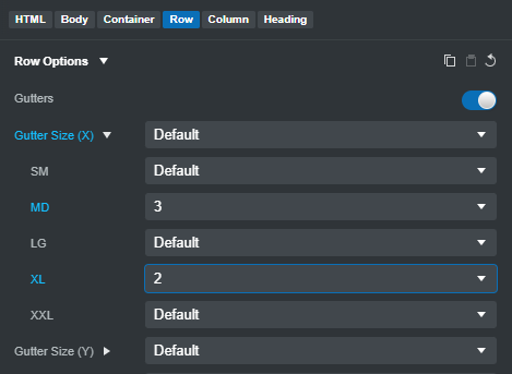
You can set them all in bss, click on the row and then look at the row options
rumede
July 5, 2022, 11:00am
7
Okay, thank you, i have an other questions to the css-variables.
Here is a list of css-variables for alerts:
An here is an example:
--#{$prefix}alert-padding-y: #{$alert-padding-y};
What thas --#($prefix) means, is that the uncompiled version of the variable? And how i have to use this varialbe? like
--bs-alert-padding-x?
I’m not sure about the {$prefix}. It doesn’t show in any of the files for bootstrap 5.1.3
The documentation you are looking at is 5.2 so it could be a new ‘feature’
rumede
July 5, 2022, 12:23pm
9
rumede:
#{$prefix}
I think that the prefix is a value for the Value of “bs-”. But i dont know hat the “#” has for a function…
I think you could be correct.
Lookin at this article, there seems to be quite a few changes coming to 5.2
It’s the biggest release since v5 itself—Bootstrap v5.2.0-beta1 is here! This release features redesigned docs, CSS variables for all our components, responsive offcanvas, new helpers and utilities, refined buttons and inputs, and lots of...
rumede
July 5, 2022, 1:49pm
11
Thank you… One more question: There is a CSS variable for the border-radius of alerts:
in my custom.scss i call:
But nothing works. How i have to adress this variable?
rumede
July 5, 2022, 2:34pm
13
oh i see, thank you… But can you tell me, why this here doesent work?
:root {
    --bs-alert-border-radius: 0px;
}
or
:root {
    --bs-font-sans-serif: 'Roboto', system-ui, -apple-system, "Segoe UI", Roboto, "Helvetica Neue", Arial, "Noto Sans", "Liberation Sans", sans-serif, "Apple Color Emoji", "Segoe UI Emoji", "Segoe UI Symbol", "Noto Color Emoji";   // system-ui, -apple-system, "Segoe UI", Roboto, "Helvetica Neue", Arial, "Noto Sans", "Liberation Sans", sans-serif, "Apple Color Emoji", "Segoe UI Emoji", "Segoe UI Symbol", "Noto Color Emoji" !default;
}
Your scss can be something like this
$borderRadius: 0;

.alert {
  border-radius: #{$borderRadius};
}

$fontSansSherif: 'Roboto', system-ui, -apple-system, "Segoe UI", Roboto, "Helvetica Neue", Arial, "Noto Sans", "Liberation Sans", sans-serif, "Apple Color Emoji", "Segoe UI Emoji", "Segoe UI Symbol", "Noto Color Emoji";
:root {
    --bs-font-sans-serif: #{$fontSansSherif};
    --bs-body-font-family: var(--bs-font-sans-serif);
}
rumede
July 5, 2022, 3:35pm
15
This code doesnt work in my custom.css
Here is the complete Code of my custom.css
/*
    Theme Name: RuMeDe Alpha Template
    Theme URI:
    Author: Reto Ulrich
    Author URI: https://rumede.ch
    Description: Full Size Editing-Template, Customized Theme based on Bootstrap V5
    Version: 1.0
    License: GNU General Public License v2 or later
    License URI: http:((www.gnu.org/licenses/gpl-2.0.html
*/


// Global variables

$borderRadius: 0;

.alert {
  border-radius: #{$borderRadius};
}

$fontSansSherif: 'Roboto', system-ui, -apple-system, "Segoe UI", Roboto, "Helvetica Neue", Arial, "Noto Sans", "Liberation Sans", sans-serif, "Apple Color Emoji", "Segoe UI Emoji", "Segoe UI Symbol", "Noto Color Emoji";
:root {
    --bs-font-sans-serif: #{$fontSansSherif};
    --bs-body-font-family: var(--bs-font-sans-serif);
}


// X-Small devices (portrait phones, less than 576px)
// No media query for `xs` since this is the default in Bootstrap

// Include any default variable overrides (though functions won't be available)
// @import "custom_variables";


// Small devices (landscape phones, 576px and up - .sm)
@media (min-width: 576px) {

}

// Medium devices (tablets, 768px and up - .md)
@media (min-width: 768px) {

}

// Large devices (desktops, 992px and up - .lg)
@media (min-width: 992px) {

}

// X-Large devices (large desktops, 1200px and up - .xl)
@media (min-width: 1200px) {

}

// XX-Large devices (larger desktops, 1400px and up - .xxl)
@media (min-width: 1400px) {

}


// Include the bootstrap default
@import "../node_modules/bootstrap/scss/bootstrap";

// Add additional custom code
@import "custom_extended-parts";