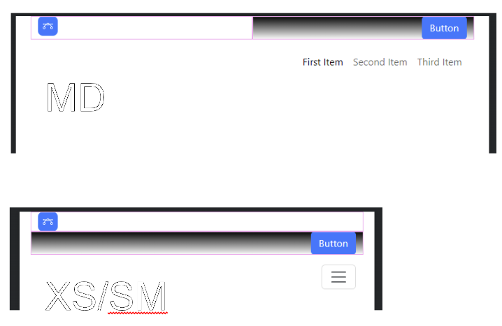
Hi,
is it possible to keep the 2 columns beside each other also at size XS/SM?
I mean the content (logo / button) in each column is very tiny and it doesn’t “need” to break here…
Project file: Microsoft OneDrive
Any ideas?
Thank you!
Rom
Hi,
is it possible to keep the 2 columns beside each other also at size XS/SM?
I mean the content (logo / button) in each column is very tiny and it doesn’t “need” to break here…
Project file: Microsoft OneDrive
Any ideas?
Thank you!
Rom
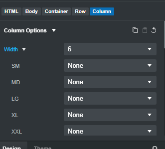
just make sure each column has col-6 not col-md-6
<div class="row">
    <div class="col-6"></div>
    <div class="col-6"></div>
</div>
Worked well! Thank you Richard! I really have to learn more about the BS grid system 
A good place to start: Grid system · Bootstrap v5.3