Hi, Brand Noob here. So I bought this because I thought it would be primarily drag and drop. But not 20 seconds into trying to customize a template to meet my needs, I find I cannot drag and drop. The following image and paragraph elements are both children to a container. But whenever I try to drag the paragraph so it can sit to the right of the image, it refuses to drop it there. Help?
That’s truly one of the more basic things to learn with CSS. I would highly suggest you get some knowledge under your belt before working with BSS as it’s Not a typical drag and drop app. If that’s what you’re looking for then you’ll need to go to something like Wix or Weebly (spelling) that are total drag and drop apps for the most part. This app requires that you have some knowledge to work with HTML and CSS/CSS3 in order to do the styling you want your site to have.
There are a lot of great sites with tutorials and online classes available cheap and free too.
Lots more if you do some searches in Google
I appreciate that. However, I have a decent amount of HTML experience, and a fair amount of familiarity with CSS sheets. I guess I was hoping for a few tips of things to look at, rather than a lecture on how Noobish I am. I did give that caveat right from the start. Regardless, after about an hour of trial and error, I finally figured out a way to force it by adding a new row and a new column within the container. But even after that, it was not terribly intuitive how to drag the paragraph from where it was and into a column. More trial and error finally got me where I needed to go. I was hoping just for a tip or two based on the many users’ experience here to help me avoid all that trial and error.

I guess the biggest tip would be to do the tutorials to get more acquainted with the app. It sounds like that could help you a lot. Sorry if all the time I took to type and find links for you seemed like a lecture. Try the tutorials and get more acquainted with CSS and CSS3 as they play an integral part in using this app.
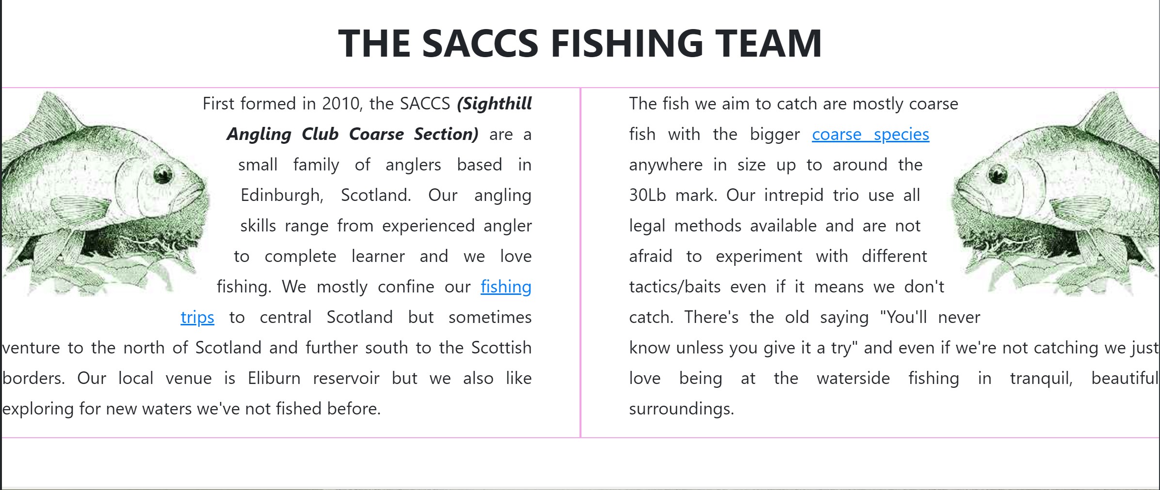
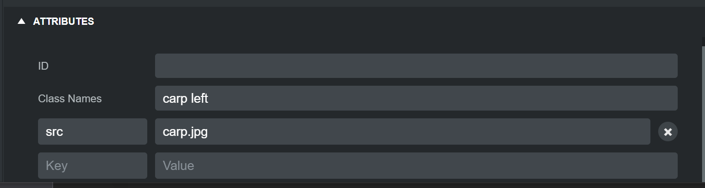
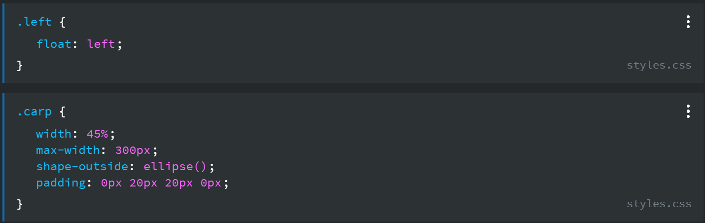
The area inside the pink lines are a row with 2 columns. Inside the left colum is a paragraph with the carp image dragged to just before the first letter. The carp image is given 2 classes of carp and left in the attributes panel
with the following CSS
You can see it on my fishing website
We’ve not caught many fish this year 
1 Like
More on shape-outside on the MDN website.
Hello Brand new “Noob” who I’m happy to see took my advice and bought BSS. This is your fellow single-malt appreciating, beer buddy from Facebook 
There are two ways to make a paragraph sit “next” to an image. One is by putting the image and paragraph each in their own responsive columns (which you figured out.) The other is by using the “old school” method of setting the display and float properties.
So if your image is “inside” your <p> component, then you need to go to the Options panel on the upper right, scroll down to the section Responsive Display, select the image and set Display to “inline-block” and then Set Float to “left”. Then, you can add a Bootstrap helper class to the image (like mr-2 or mr-3 to give it a little right margin between the text and the image. You would add the helper class in the Attributes panel, which is below the HTML panel at the bottom of the screen under the website workspace. You’d just type it in the field that says Class Names.
Don’t get discouraged. Like I said, there’s a learning curve with this software, and you’re going to need to brush up on your CSS, study a bit about Bootstrap (W3 Schools is great for that) and WATCH the tutorial videos. They will help a lot. I would have responded to this sooner, but I was on a 20 hour coding tear yesterday, and slept the entire day away Tuesday.
Like I said, you can always send me a FB message if you need help right away.
Clever solution with the ellipse. At first I thought you might have used a clipping path. But that’s nice, down and dirty and simple!
MANY thanks to ALL in this thread.
P-Ninja: that part about the float is also extremely helpful to me, as it lets me know how I can address future issues without forcing columns. As you know, it is the responsive website capabilities that I am not at all familiar with. I first did my own HTML back in 2000, and since then have definitely not kept up to all the great, new stuff. And using this tool, with the ability to see the generated code as I build, is certainly going to help me learn.
Thanks again,
Rainman
As you get accustomed to the Bootstrap framework, which is based on CSS flexbox, you will find it’s a far better, easier and more powerful way to position components on pages as opposed to using floats and positions like inline-block, or tables, and positioning things with absolute pixel values. Flexbox lets you do all sorts of clever things with positioning.
There is a lot more to learn to fully take advantage of Flexbox, but the basic layout model of Bootstrap which is sections, containers, rows and columns is very simple and logical. Containers can be fixed width, or fluid (the full width of the screen.) Rows can contain up to 12 columns, and columns have numerous options, all of which can be set through the visual UI, without writing any code. You can change column widths, order, offset, set the position of components within them, center columns within rows, or have them spread, or move to the start or end of the row. You can even add rows to columns to make “sub-columns” (like the Russian toy… the doll with smaller dolls inside each subsequent doll.
And then, via media queries, you can easily change the look and layout on different size screens. Welcome to the wonderful world of responsive web design. It’s a lot to learn, but so much more powerful and fun to build websites this way.