Before you attempt to build this website, I would recommend you watch the video tutorials (that are accessible by clicking the Tutorials link at the top of the forum,) and then I would build one of those tutorial website pages alongside the video as it’s playing. It would be best if you had a second monitor to play the video on, so you can have the Bootstrap Studio program open in your main monitor. If you only have one monitor, then I would watch the video on your phone, and build the page alongside the video.
By doing this, you will get a general idea of how to create a page layout in Bootstrap Studio. Based on your post, it does not appear as though you have any experience building a responsive website using the Bootstrap framework. Setting up the page as depicted in your image is quite easy.
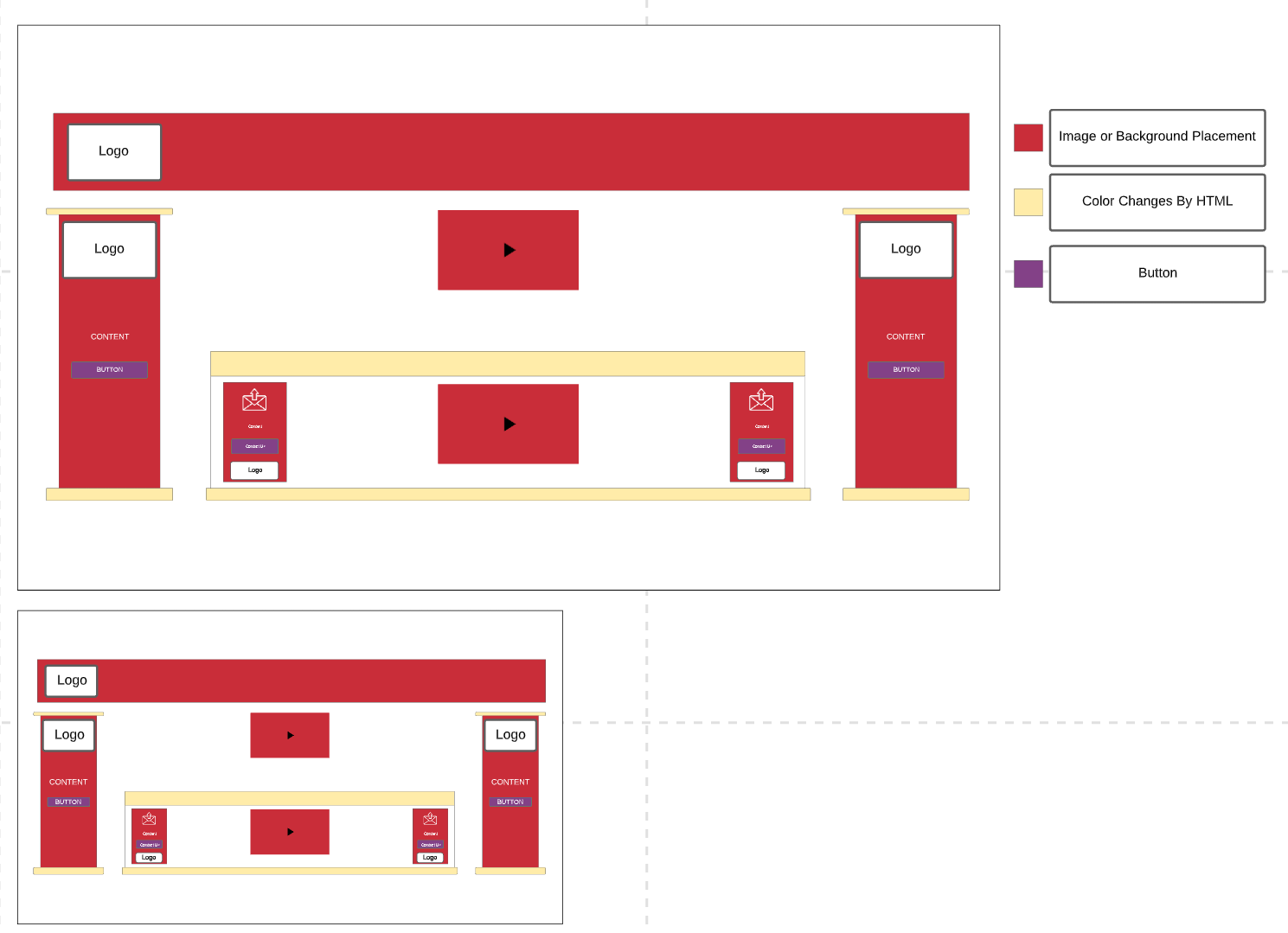
I presume the top area with the logo on the left side is meant to be where your main navigation menu will reside, so that is simply a matter of adding one of the premade Navigation components to your page (like Navigation Clean.) You would then add a Section underneath the navigation (this would generally be a Header, but could also be a Main section, or just a basic Div, and inside this you would place a container. This gives your page a semantic structure for search engines to understand.
Once you’ve added your section and container, you would add a row, and then three columns. The column widths would be adjustable at different screen sizes (breakpoints) via the options panel. I’m not sure what the red boxes with the black arrows are meant to represent (buttons? videos?) The center column would then have a row added to it, and inside that would be more columns to create the areas with the mail icons, the buttons and the logos.
This is a very simple layout, and could be setup in about 5 minutes if you understand how the Bootstrap grid system (which is based on CSS flexbox.) If you are unfamiliar with Bootstrap and flexbox, you have a lot of learning to do before you can even attempt to build this page. As @jo-r mentioned, without knowing the level of your web development experience, it’s hard to advise you on how to do this. For a complete novice, building this page will entail hours of reading, practicing, learning Bootstrap, Flexbox, and the general use of the program. For someone who is fully versed in Bootstrap and CSS, this layout can be assembled in minutes. The areas you have designated to “color changes by HTML” make no sense. What are they? Borders? Boxes? Whatever they are, color changes are not done through HTML, they’re done by CSS. You assign classes to the the HTML components (boxes, borders, etc), and those classes are assigned colors via CSS, and the classes are given different colors at different breakpoints using media queries.
Very few things in website design today are given fixed dimensions or static positions because websites need to be responsive now. The whole point of using a program like Bootstrap Studio to build your website is so that you don’t have to deal with figuring out how to change heights, widths, and positions. It’s all done via classes assigned at the different screen sizes (XS, SM, MD, LG, XL) and widths and heights adjust dynamically via flexbox, which is what the Bootstrap grid model is based on.
You may need to take some online classes in Bootstrap, or consider hiring someone to build your basic layout (like a template) and then try and teach yourself from there.
 Thanks for the feedback and help.