enrico
October 25, 2022, 6:40pm
1
Hi,
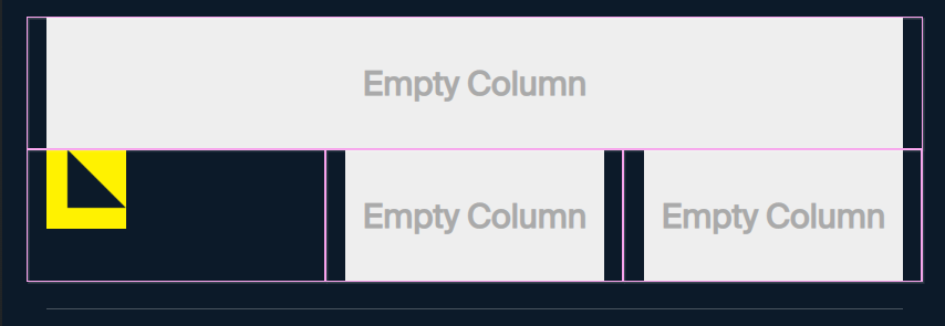
For example, this is for desktop
If I use the mobile version, the first column becomes the second.
How can I fix it?
Thank you in advance,
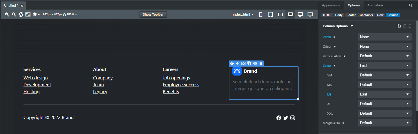
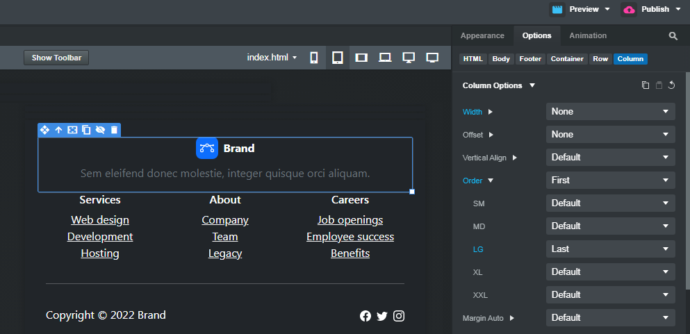
There’s nothing wrong with the component. You need to read the BSS documentation on the Bootstrap Grid , and learn how the Bootstrap Grid system works.
Bootstrap columns reflow sequentially as you reduce the screen width unless you change the order through the Option panel > Column Options > Order
In the Footer Dark Multi Column component, the fourth column (with the brand in it) is set to be the last column on screen sizes LG and above.
And the first column on screen sizes XS to MD
1 Like