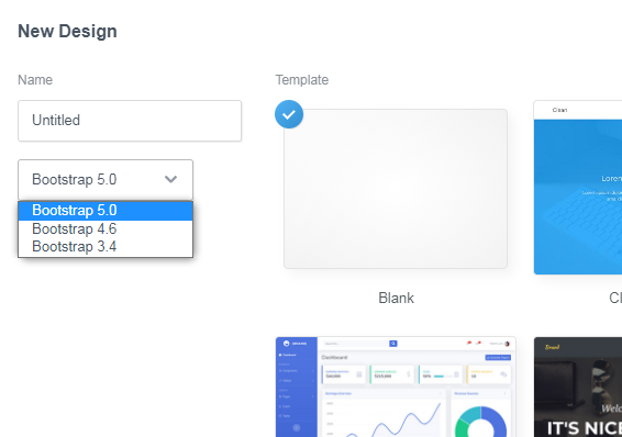
After Custom Option for Custom Component release, I wondering about can I create full website without depending bootstrap?
I know bootstrap studio is website design tool with bootstrap as default, but if that idea can fullfill, I think we can do what ever we want without limit.
I think people whom website performance is their priority will love it!
I guess you don’t have to use Bootstrap to create a website in Bootstrap Studio. You can write (or import) any ordinary CSS and HTML, or write all your own custom CSS and use only the non-Bootstrap HTML components (divs, paragraphs, lists, headings, etc.) Then you’d just delete the Bootstrap files after exporting your website.
But if you want a responsive site, you would have to implement some sort of responsive grid system (CSS Flexbox, CSS grid, or some other CSS framework), and forgo all the Bootstrap utility classes, and anything dependent on Bootstrap’s javascript.
Frankly, I wouldn’t see any point to buying Bootstrap Studio if you’re not interested in using Bootstrap. It’s a nice visual editor, but without bootstrap, it’s just saving you the process of writing your own HTML, and there are tons of free and paid visual HTML editors out there. Just Google “free visual HTML editor.”
Yes, ofcourse, if we remove bootstrap as dependency we need do that manually
But, with remove bootstrap as dependency, we can create Bootstrap Studio become Tailwind Studio, Foundation Studio or my own studio editor, but we still need create custom option manually for all them utility classes.
I for one see no need for it either. It’s called Bootstrap Studio for a reason. I don’t understand why people come in and post their very first post asking to change the app. Seriously you people have to just read the title of the program.
As for when you remove the BS files, the reason that things change is because you didn’t replace the classes or ID’s etc. with comparable alternatives to BS. You can’t just throw the files in that you want to use and expect them to work without connecting them to anything. It’s nothing wrong with the app, it’s 100% user error on that.
Also, if it’s Tailwind and/or Foundation or others you’re looking for, then try another app. There are a good handful of them out there that already do what you want them to do. Have some respect for the developers who have made “Bootstrap” Studio when you come to the forum for the first time, don’t ask the developers to change something at such a huge level.
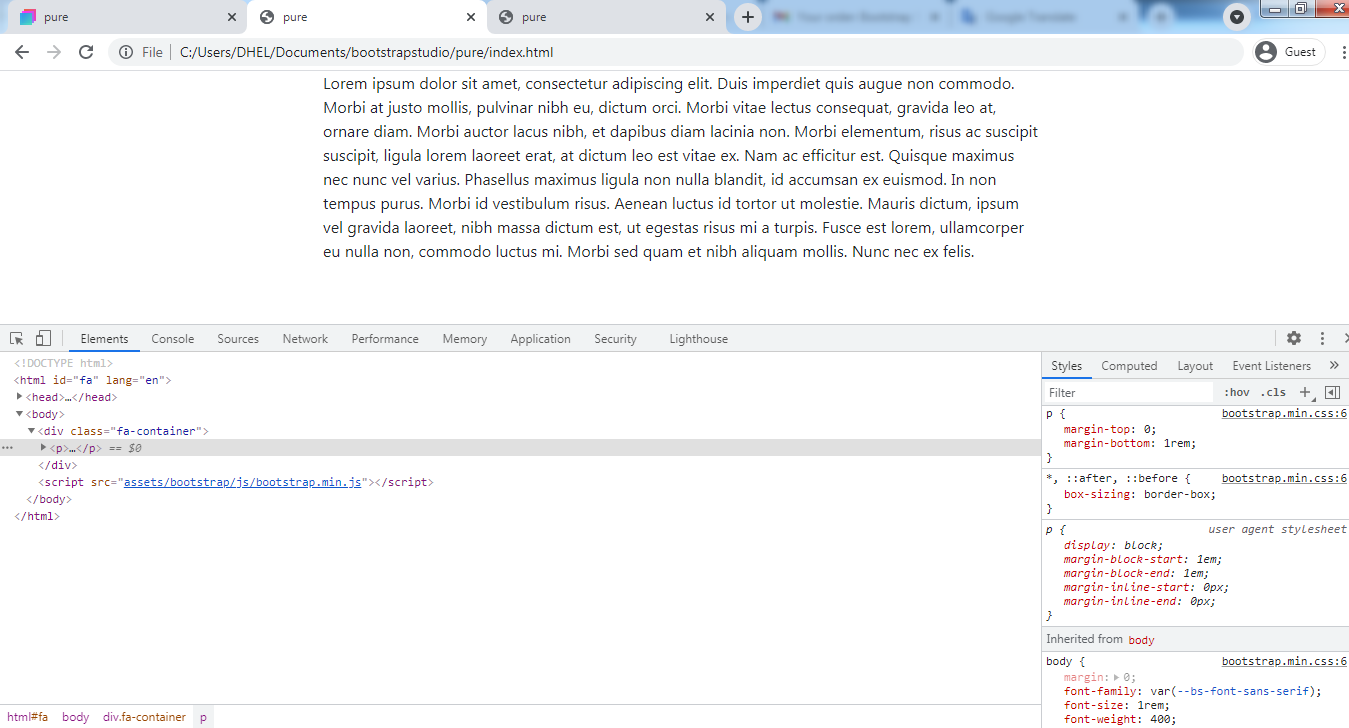
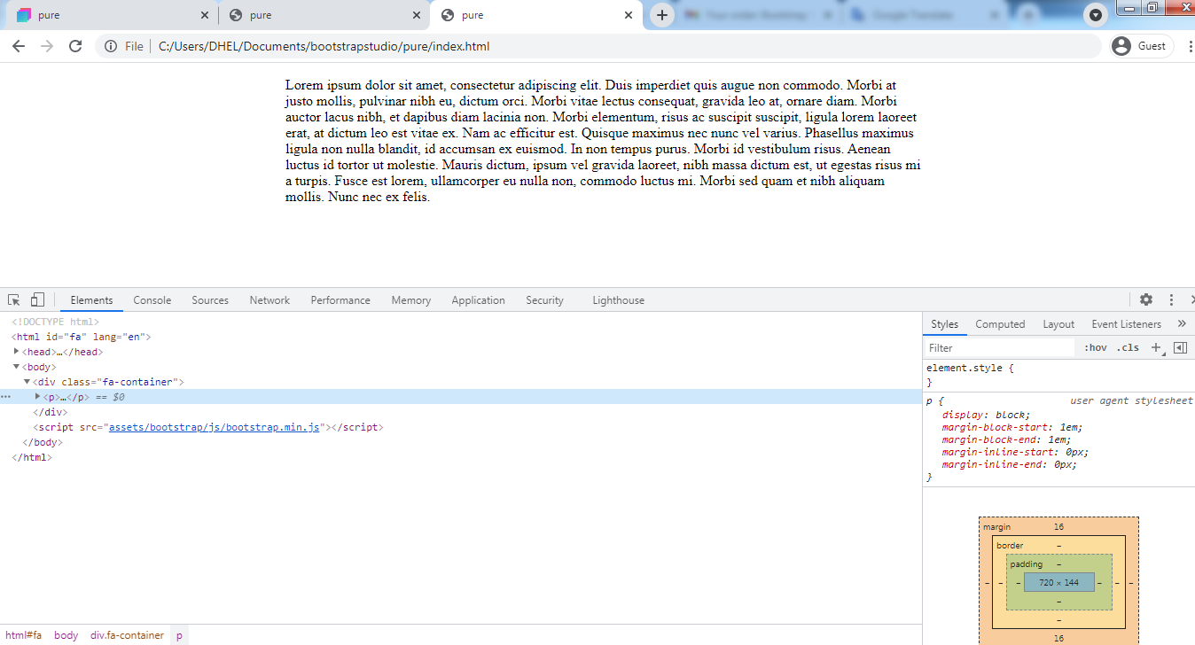
As we can see, bootstrap give default style for all simple html tag
I want if I found it, but I love with User Interface of Bootstrap Studio for editing all posibble option we can adjust, until now nothing can beat this
Feature that I love
After I buy bootstrap studio at 2018, I love it because I still use bootstrap on my project. but recenly I need to remove bootstrap on my project for performance purposes. so I can’t use bootstrap studio anymore
But, after I know Bootstrap Studio add new feature “Custom Option for Custom Component”, I think I can use it again if I can remove bootstrap as dependency
In Bootstrap 5 you can make your own utilities, you can take the utilities from tailwind and add them to bootstrap 5 and have your bootstrap-tailwind css library if you wish
The result is Website with Bootstrap + Tailwind library.
What if we want to create website with just Tailwind library, Foundation library or our own library?
Pros : we can create lightweight site with minimal css file size with powerfull drag n drop feature and intuitive option panel
Con : we need to create custom option to all custom component that we want to use
The text looks different after you deleted the Boostrap CSS file because you failed to add the necessary CSS rules for the font-family, line-height, etc… in your custom CSS.
If you’re not going to use the bootstrap.min.css file, you will need to create your own CSS rules to replace every rule that Bootstrap uses. If you do not declare a font-family, then the HTML will default to whatever the browser’s default font settings are (probably Times or Serif in this case.)
Basically, it sounds like you want Bootstrap Studio to be Pinegrow (which is a far more expensive program with a higher learning curve.) This is not going to happen because Bootstrap Studio is built by (and for) people who want to use Bootstrap to build websites.
FYI - you’re not the first person to post this suggestion in the Forum. Every couple of months, a new Bootstrap Studio user suggests that the developers change Bootstrap Studio to support a different framework, and their answer is always the same. Not gonna happen.
If you bought Bootstrap Studio, it should be because you like the Bootstrap framework. Otherwise, what’s the point?
So, our result discussion is no need to add new option to remove bootstrap as dependency. we just need to import our library to replace bootstrap as a dependency.
You can improve the performance of your Bootstrap-based website by either creating a custom Bootstrap file from the start that only has the CSS classes you need, or you can remove all the unused CSS classes from your Bootstrap file after export. But this is a tedious process for a fairly small performance gain. You’re talking about a difference of a few kilobytes of data. Even on a 3G connection, this isn’t going to make more than a few milliseconds of difference. On 4G, it would be unnoticable.
My latest project got 34kb in total size, with 8kb css and 24kb html + js and svg
Please take a look my latest project, how do you feel when visit my site and browse on it, I know it still need a lot of improvement, but so far I’m happy with that.
What’s slowing your page down far more than superfluous CSS or JS code in Bootstrap is the massive, unoptimized images on the page. You’re using images than are far larger than they need to be. Shrinking them down on the page with CSS is bad practice. That’s the second biggest obstacle to your site loading quickly. The biggest slowdown on your page is the Google font.
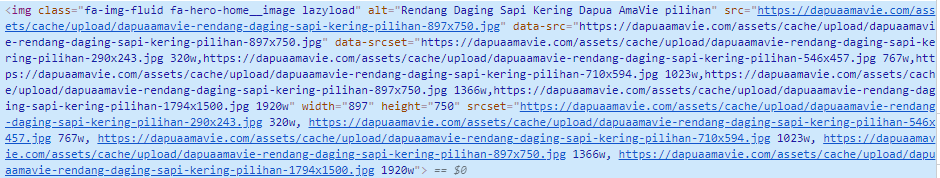
I already use exact size image for desktop and use responsive img tag for load small image on mobile, and use lazyload image to load the real size image.
and big image is request from designer for the client need. so i need to use it.
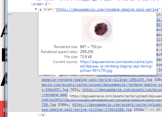
I’m on a desktop computer and your images are huge compared to what they need to be. They aren’t the exact size at all. Open your site and right click most any image and you’ll see the menu option to open the image on a new tab (browser tab) and you’ll then see what size they really are.
You can also see the size by mousing over the images in BSS where you will see the thumbnail of the image and the width and height of the image.
You can see easily if looking at the images on the Articles page. All of those are more than twice the size needed. The food images on the home page and menu pages could be smaller as well.
Just some thoughts on viewing the site.
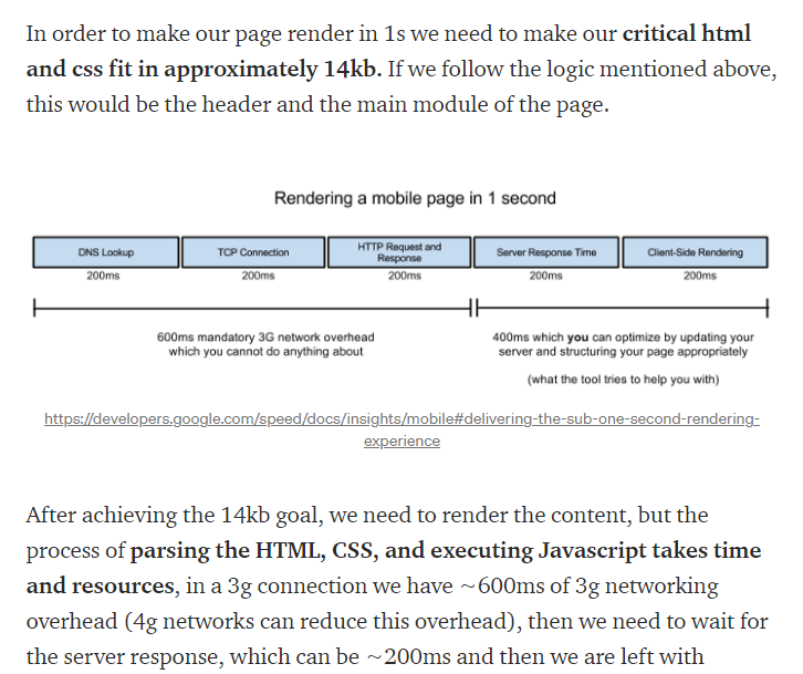
Check your site with Google page speed insights. https://developers.google.com/speed/pagespeed/insights/
It will tell you exactly where you slowdowns are coming from. Overall your site is quite fast, but using the proper sized images will make a noticable difference.
Designing website for high-resolution displays is (at least for now) a trade-off between page-load speed and user experience. Page load speed definitely affects page rank. User experience can effect bounce rate, but it’s a gray area. So there are a few options to consider…
Does the detail in the image warrant the use of supporting high resolution displays? If the image is of a product, let’s say a very high-end, expensive bicycle, and it has text on it that describes particular features on the bicycle that someone would really want to see up close, then I would say a high res image would be justified. Using a standard resolution on a hi res display would result in blurry text, and unclear features on the bicycle.
But if the image is something where fine details are not especially crucial, but the speed of the website is, it might be a better choice to forgo using an extremely high resolution image to save a 1/2 to 1 second on the page load.
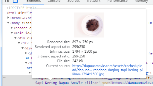
The below image is essentially the difference you’d see looking at your website on the vast majority of mobile devices, tablets and laptops in use today, vs looking at it on a 27" retina display.
From 5 feet away, your could barely tell the difference. Up close you would see it. Now consider that for mobile users, you’re loading a 1794 x 1500 pixel image on a screen that is probably 360 x 640 pixels. A phone at that resolution with a retina display would only require your image to be 1440 x 1204. Exported as a jpg at high quality (60) from Photoshop, that’s a file size difference of 236k vs 155k, almost a 35% reduction.
But if your client really MUST have the highest resolution image, then you can always use media queries to query the display being served, and select the appropriate image.
This is a great tool for compress your images. Your big picture can the size be reduced with 70%
Try with 12 color and a dithering at 0.9 mozJPEG visit the squoosh.app here

