Hi, guys. This might be a stupid question but I did many times testing it still can’t fix. Hope someone can help me.
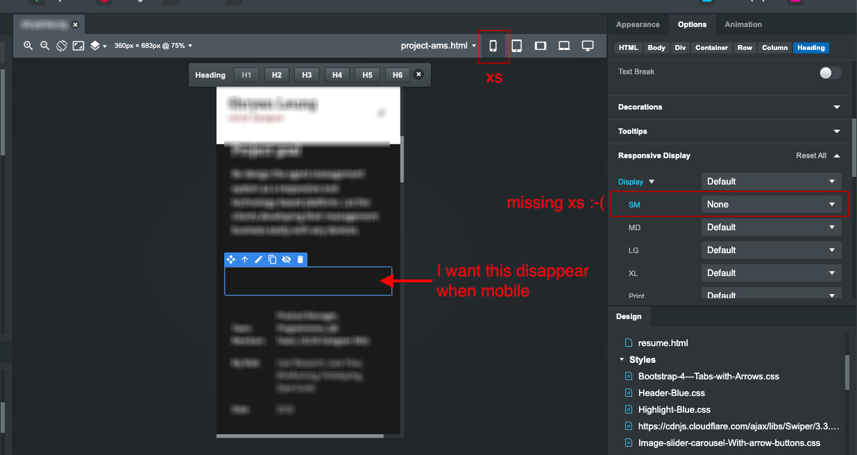
I want the column to disappear when the screen is small, it did well on a small tablet but on mobile, it still appears… Any way can make it disappear on the mobile version? There no choice of XS…
Thanks!!
Bootstrap 4 was Bootstrap’s first “mobile first” version of Bootstrap, so XS is considered the “default” size on any Bootstrap 4x website.
In your attached image, In the Responsive Display panel where you see the word “Display” in blue, the dropdown directly to the right of that (the first one) is the XS responsive display setting.
1 Like
@printninja, thank you so much! It works. I was spending many times on it, so stupid