if you look at this site https://mt0723.bss.design/ how can I make the 2 feature rows not overlap on the top and so there is a space between the image and first row, and also make the hero image shrink at the screen display gets smaller? Thanks
I was messing around with the Developer Console and removed the class “position-relative” and the style “top: -50px” from the main div and replaced it with class mt-5 to add a margin between the image and the content.
I’m not sure if that’s what you’re looking for, but it moved the cards down below the image.
Edit:
I noticed the cards overlapping in mobile and desktop view, and added to the bottom row class “mt-2 mt-lg-5” this fixed the issue.
thank you so much, i will try it later when I get home. Here is the link to the file if you are inclined to modify that, no worries if not Site.bsdesign - Google Drive
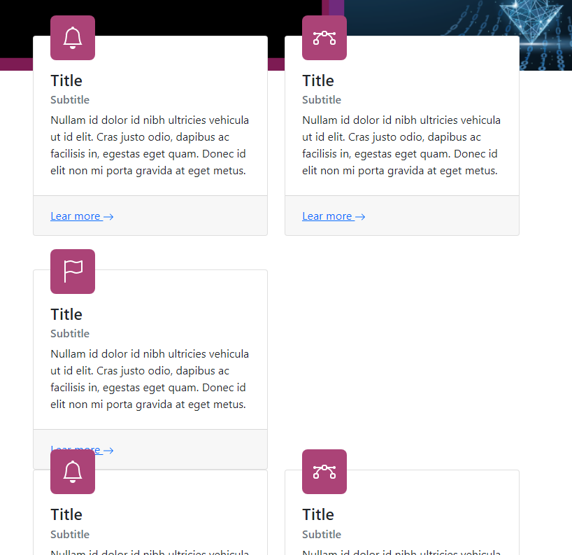
Would you like all of the cards to be in the same row?
So there isn’t a card missing?
It looks like
XX
XO
XX
XO
X - Card
O - Open space
On MD Screen sizes?
yes, or to be honest whatever you think is best. I am a backend dev, and a terrible front end designer. I really appreciate your help. but yes, I think what you said is correct.
1 Like
I’ll create a file for both and upload both for you.
I’ll add the links to this post.
1 Like
1 Like
Personally, I think the way the cards are in the original link you sent are fine the way they are; being where the icon position is. Placing it above like that made me think it was a separate component from the card.
However, I can make the cards look near identical to the ones found in this recent link.
But I will attempt to make both for you and you can use either or in your build.
looks good, do you have the binary file I can download? did you make this, I did not see a template like this in the available list.
Here’s the First fix Changed Icon Position & Added Margin
and The Second Changed Icon Position to Above Card & Added Margin
Took me a moment to make sure it was working fine before adding them to Google Drive.
downloaded. those both look great, now I have to decide which is better. I’ll get back to this tonight.
1 Like
I’m glad you like both designs!
If you need anymore help, don’t hesitate to ask!
@jeffm
I shared in the online library, search for jeffm
Not going to lie, I noticed you posted that link 
My bad! But I recreated it too for him to download.
1 Like

Another suggestion, instead of using multiple rows with auto column width, I would use a single row with column size targeted by the screen width. that way, at small and medium screen size, we don’t get a row with two columns, but the second row only has one item.
not good
So I will do something like this
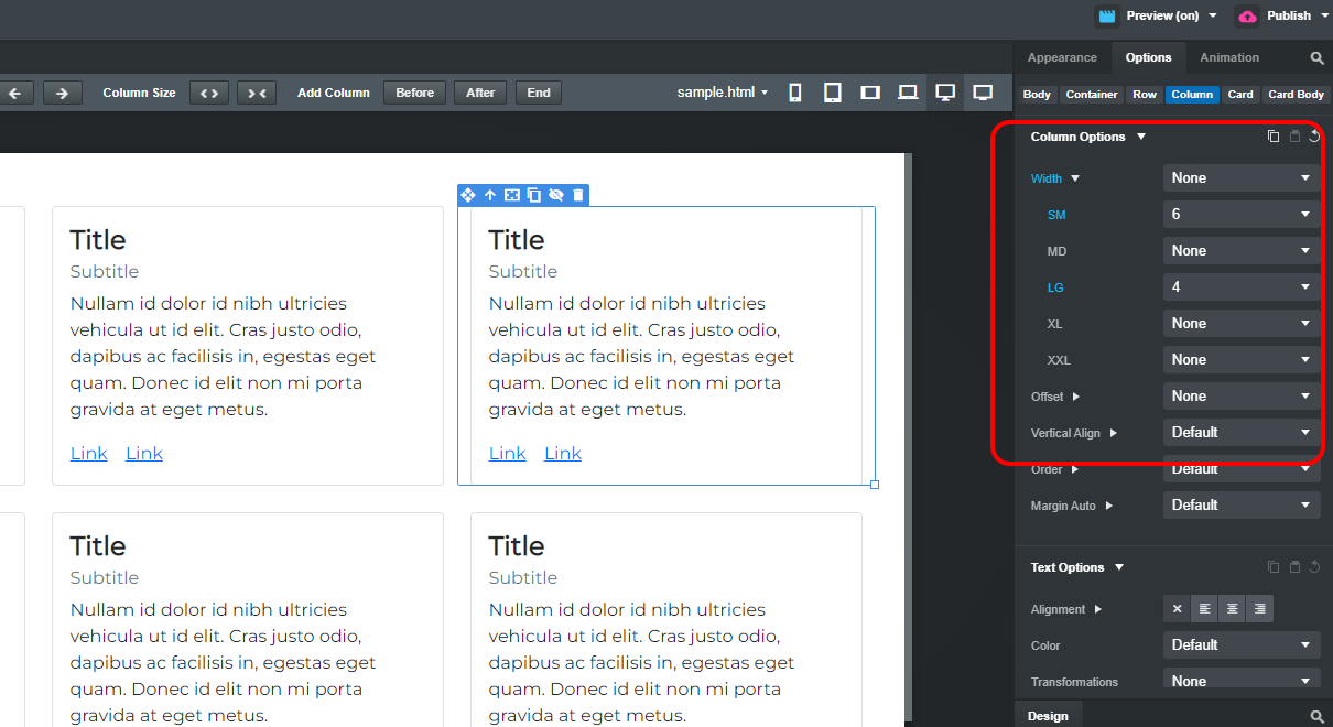
See at the options, I set the size for Small and Large.
All the best.