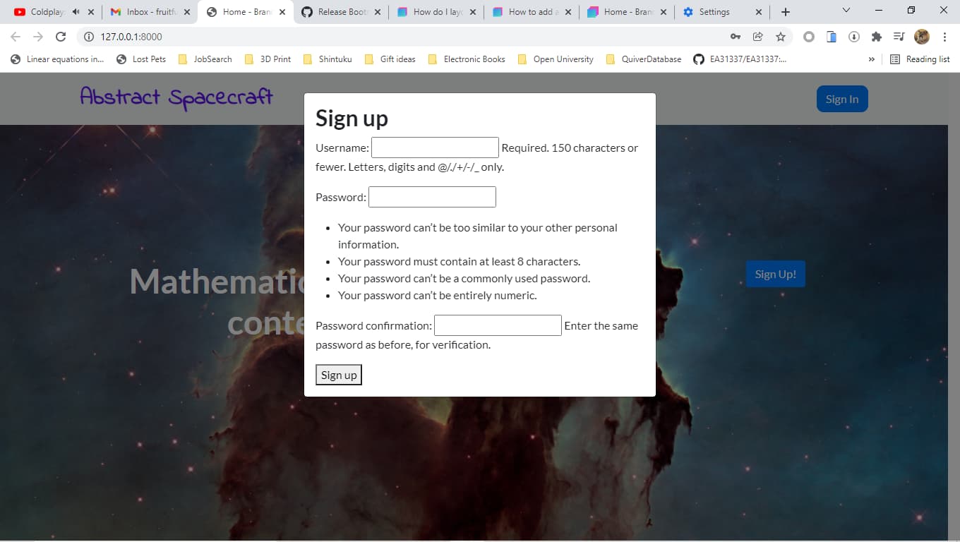
Here is a screenshot:

As you can see the result doesn’t look right. What I did is this:
sign_up_form.html:
<h2>Sign up</h2>
<form method="post">
  {% csrf_token %}
  {{ form.as_p }}
  <button type="submit">Sign up</button>
</form>
This included into sign_up.html via a Jinja2-style include (for Django-ran website):
{% load static %}
<!DOCTYPE html>
<html>
<head>
<meta charset="utf-8"/>
<meta content="width=device-width, initial-scale=1.0, shrink-to-fit=no" name="viewport"/>
<title>
Home - Brand
</title>
<link href='{% static "bootstrap\css\bootstrap.min.css" %}' rel="stylesheet"/>
<link href="https://fonts.googleapis.com/css?family=Lato:300,400,700,300italic,400italic,700italic" rel="stylesheet"/>
<link href="https://fonts.googleapis.com/css?family=Indie+Flower&display=swap" rel="stylesheet"/>
<link href="https://cdnjs.cloudflare.com/ajax/libs/font-awesome/4.7.0/css/font-awesome.min.css" rel="stylesheet"/>
<link href="https://cdnjs.cloudflare.com/ajax/libs/simple-line-icons/2.4.1/css/simple-line-icons.min.css" rel="stylesheet"/>
<link href="https://cdnjs.cloudflare.com/ajax/libs/animate.css/3.5.2/animate.min.css" rel="stylesheet"/>
</head>
<body>
<nav class="navbar navbar-light navbar-expand bg-light navigation-clean">
<div class="container">
<a class="navbar-brand" href="#" style="font-size: xx-large;font-family: 'Indie Flower', serif;color: var(--bs-indigo);">
<strong>
Abstract Spacecraft
</strong>
</a>
<button class="navbar-toggler" data-bs-target="#navcol-1" data-bs-toggle="collapse">
</button>
<div class="collapse navbar-collapse" id="navcol-1">
<a class="btn btn-primary ms-auto" href="sign_in" role="button" style="border-radius: 10px;">
Sign In
</a>
</div>
</div>
</nav>
<header class="text-center text-white masthead" style='background: url({% static "img\accounts\pillars_of_creation.jpg" %}) center / cover repeat;height: 679px;'>
<div class="container">
<div class="row" style="height: 457px;">
<div class="col-xl-9 mx-auto position-relative" style="height: 110px;">
<h1 class="mb-5">
Mathematicians, get paid for the content you create.
</h1>
</div>
<div class="col-md-10 col-lg-8 col-xl-7 mx-auto position-relative" style="height: 299px;">
{% include "sign_up_form.html" %}
</div>
</div>
</div>
</header>
<section class="text-center bg-light features-icons">
<div class="container">
<div class="row">
<div class="col-lg-4">
<div class="mx-auto features-icons-item mb-5 mb-lg-0 mb-lg-3">
<div class="d-flex features-icons-icon">
<i class="icon-screen-desktop m-auto text-primary" data-bss-hover-animate="pulse">
</i>
</div>
<h3>
Fully Responsive
</h3>
<p class="lead mb-0">
This theme will look great on any device, no matter the size!
</p>
</div>
</div>
<div class="col-lg-4">
<div class="mx-auto features-icons-item mb-5 mb-lg-0 mb-lg-3">
<div class="d-flex features-icons-icon">
<i class="icon-layers m-auto text-primary" data-bss-hover-animate="pulse">
</i>
</div>
<h3>
Bootstrap 4 Ready
</h3>
<p class="lead mb-0">
Featuring the latest build of the new Bootstrap 4 framework!
</p>
</div>
</div>
<div class="col-lg-4">
<div class="mx-auto features-icons-item mb-5 mb-lg-0 mb-lg-3">
<div class="d-flex features-icons-icon">
<i class="icon-check m-auto text-primary" data-bss-hover-animate="pulse">
</i>
</div>
<h3>
Easy to Use
</h3>
<p class="lead mb-0">
Ready to use with your own content, or customize the source files!
</p>
</div>
</div>
</div>
</div>
</section>
<section class="showcase">
<div class="container-fluid p-0">
<div class="row g-0">
<div class="col-lg-6 my-auto order-lg-1 showcase-text">
<h2>
Fully Responsive Design
</h2>
<p class="lead mb-0">
When you use a theme created with Bootstrap, you know that the theme will look great on any device, whether it's a phone, tablet, or desktop the page will behave responsively!
</p>
</div>
</div>
<div class="row g-0">
<div class="col-lg-6 my-auto order-lg-1 showcase-text">
<h2>
Updated For Bootstrap 4
</h2>
<p class="lead mb-0">
Newly improved, and full of great utility classes, Bootstrap 4 is leading the way in mobile responsive web development! All of the themes are now using Bootstrap 4!
</p>
</div>
</div>
<div class="row g-0">
<div class="col-lg-6 my-auto order-lg-1 showcase-text">
<h2>
Easy to Use & Customize
</h2>
<p class="lead mb-0">
Landing Page is just HTML and CSS with a splash of SCSS for users who demand some deeper customization options. Out of the box, just add your content and images, and your new landing page will be ready to go!
</p>
</div>
</div>
</div>
</section>
<section class="text-center bg-light testimonials">
<div class="container">
<h2 class="mb-5">
What people are saying...
</h2>
<div class="row">
<div class="col-lg-4">
<div class="mx-auto testimonial-item mb-5 mb-lg-0">
<h5>
Margaret E.
</h5>
<p class="font-weight-light mb-0">
"This is fantastic! Thanks so much guys!"
</p>
</div>
</div>
<div class="col-lg-4">
<div class="mx-auto testimonial-item mb-5 mb-lg-0">
<h5>
Fred S.
</h5>
<p class="font-weight-light mb-0">
"Bootstrap is amazing. I've been using it to create lots of super nice landing pages."
</p>
</div>
</div>
<div class="col-lg-4">
<div class="mx-auto testimonial-item mb-5 mb-lg-0">
<h5>
Sarah W.
</h5>
<p class="font-weight-light mb-0">
"Thanks so much for making these free resources available to us!"
</p>
</div>
</div>
</div>
</div>
</section>
<section class="text-center text-white call-to-action" style='background:url({% static "img\accounts\bg-masthead.jpg" %}) no-repeat center center;background-size:cover;'>
<div class="overlay">
</div>
<div class="container">
<div class="row">
<div class="col-xl-9 mx-auto position-relative">
<h2 class="mb-4">
Ready to get started? Sign up now!
</h2>
</div>
<div class="col-md-10 col-lg-8 col-xl-7 mx-auto position-relative">
<form>
<div class="row">
<div class="col-12 col-md-9 mb-2 mb-md-0">
<input class="form-control form-control-lg" placeholder="Enter your email..." type="email"/>
</div>
<div class="col-12 col-md-3">
<button class="btn btn-primary btn-lg" type="submit">
Sign up!
</button>
</div>
</div>
</form>
</div>
</div>
</div>
</section>
<footer class="bg-light footer">
<div class="container">
<div class="row">
<div class="col-lg-6 text-center text-lg-start my-auto h-100">
<ul class="list-inline mb-2">
<li class="list-inline-item">
<a href="#">
About
</a>
</li>
<li class="list-inline-item">
<span>
⋅
</span>
</li>
<li class="list-inline-item">
<a href="#">
Contact
</a>
</li>
<li class="list-inline-item">
<span>
⋅
</span>
</li>
<li class="list-inline-item">
<a href="#">
Terms of Use
</a>
</li>
<li class="list-inline-item">
<span>
⋅
</span>
</li>
<li class="list-inline-item">
<a href="#">
Privacy Policy
</a>
</li>
</ul>
<p class="text-muted small mb-4 mb-lg-0">
© Brand 2021. All Rights Reserved.
</p>
</div>
<div class="col-lg-6 text-center text-lg-end my-auto h-100">
<ul class="list-inline mb-0">
<li class="list-inline-item">
<a href="#">
<i class="fa fa-facebook fa-2x fa-fw">
</i>
</a>
</li>
<li class="list-inline-item">
<a href="#">
<i class="fa fa-twitter fa-2x fa-fw">
</i>
</a>
</li>
<li class="list-inline-item">
<a href="#">
<i class="fa fa-instagram fa-2x fa-fw">
</i>
</a>
</li>
</ul>
</div>
</div>
</div>
</footer>
<script src="https://cdn.jsdelivr.net/npm/bootstrap@5.1.3/dist/js/bootstrap.bundle.min.js">
</script>
<script src='{% static "js\bs-init.js" %}'>
</script>
</body>
</html>
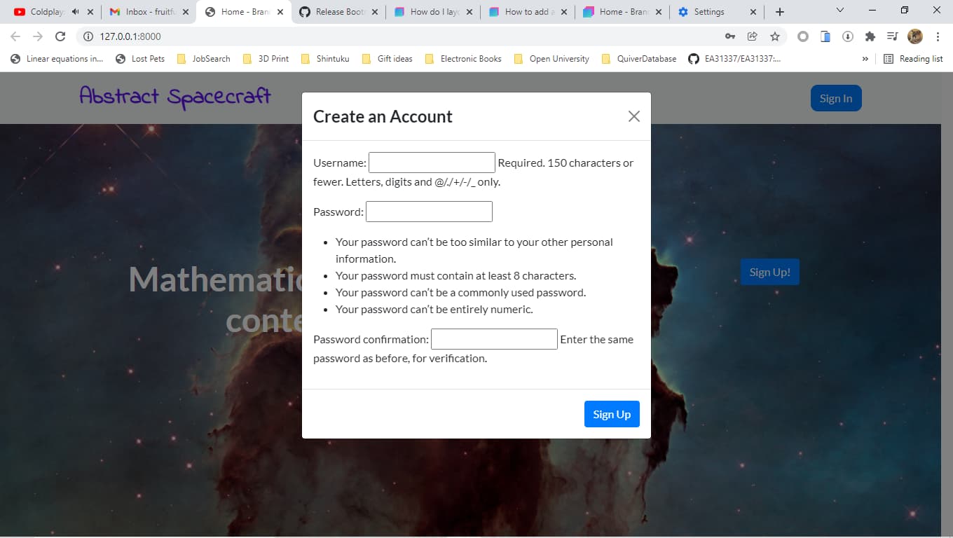
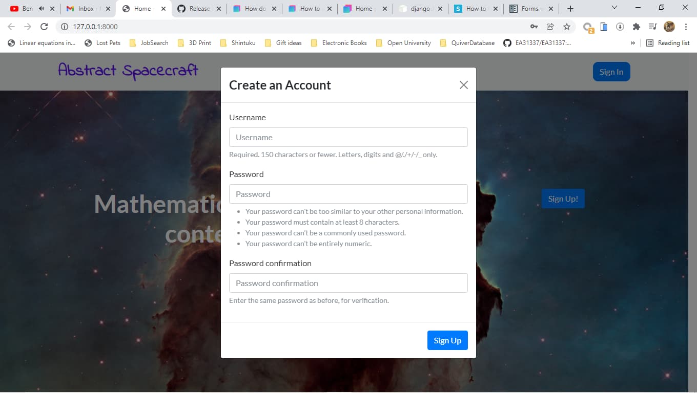
Things I will try:
- Expanding full form into
sign_up.htmltemplate (i.e. not simply Jinja2-included) - Putting the form into a BSS Modal box.
What else might I try?