I’m having this pictured issue:
How do I make the page size match the image?
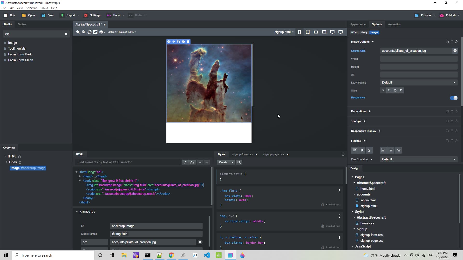
Like this
body {
  background-image: url(assets/img/accounts/pillars_of_creation.jpg);
  background-position: center center;
  background-repeat: no-repeat;
  background-attachment: fixed;
  background-size: cover;
  background-color: #464646;
}

/* For mobile devices */
/* The same picture but a little smaller */

@media only screen and (max-width: 767px) {
  body {
    background-image: url(assets/img/accounts/pillars_of_creation_mobile.jpg);
  }
}
@kuligaposten why can’t BSS handle this common task?
You can do it in the appearance panel, when you are happy with the result you can extract the element style to a CSS class via the three dots in the styles panel.
BSS handle it easy for you a few click and you are finish
@kuligaposten I see that now, but how do you get BSS to make the @media only lines?