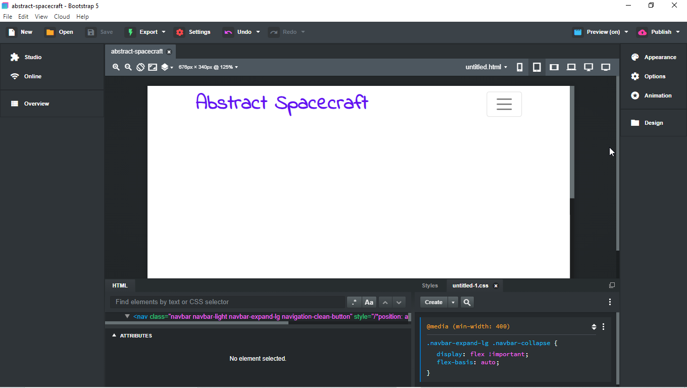
I tried editing that style by adding a New Stylesheet and changing the number 992px to 450px, and that didn’t do anything.
Does someone have a boilerplate (with nice screensize breakpoints) they can give me? It’s for now an open source project - I’m moving code from Bitbucket to Github for easier deployment to heroku mainly.
I think the solution was to check “liquid” on the relevant containers in the options, and then to select an element, Goto Styles > Create Dropdown > Create CSS Block. Then you Click the … in the style and “Add Media Query”.
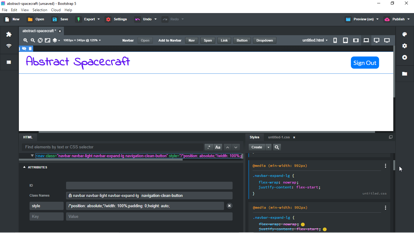
If you target the navbar part of your nav (sometimes it’s the nav, you’ll know when you have the right part of it) you’ll see more Options for your nav such as sticky/fixed/etc., Text Color, Expanded (this is where you tell it what breakpoint you want it to expand), Smart Active State that lets your nave show the active button/link/tab when on that page, Fluid as you already know, and such. This is also where you would change your Background color for the Dark vs. Light, and when you do, you change the Text color to the corresponding color at that time.
Hope that helps, lots of nice settings in the nav area of the Options tab.