How to achieve "Perfect" 100vh 1 by 2 grid?

Hello fellows! Once more I hope I can get some help from you guys!

I’m creating a page with several sections and each one is a 1 by 2 responsive grid, which means: 1 row and 2 columns, side-by-side on landscape mode and “block” stacked when on portrait mode.
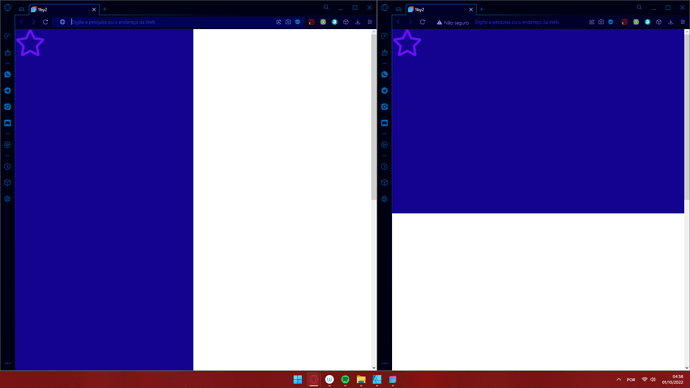
I need them to be always at 100vh x 100vw together no matter what is contained inside them, so each: W:50vw H:100vh on landscape and H:50vh W:100vw on portrait . I can make both columns behave just as I need them to, but if I add a single element, it pushes the entire Column further or short from 100vh and messes everything up.

Is there a way to add elements, paddings, margins whilst keeping the correct proportions? I tried: Media Query, Object-fill:Contain, Vw and Vh, Percentages, Fluid Containers and a lot of other settings and I can’t make it.

If the question is too imprecise or “foggy”, I apologize in advance but that is how I am able to explain at the moment. Let me know what I can do to help the help!

Cheers buds!

All is well when nothing is on it:


As soon as I add an “Icon” or something, it pushes down and removes the proportions that I wanted of 50/50 when they are on top of each other.

Firstly, realize that “landscape mode” and “portrait mode” are somewhat arbitrary terms. If I’m understanding correctly, you want the columns to switch from inline (side-by-side) to stacked whenever the viewport becomes wider than it is tall, but this isn’t how Bootstrap responsiveness works.

Bootstrap uses pre-defined breakpoints based on the viewport width in pixels…

XS < 576px
SM > 576px
MD > 768px
LG > 992px
XL > 1200px
XXL > 1400px

You must choose at which breakpoint you want your layout to change from horizontal to vertical. You don’t necessarily have to use the predefined Bootstrap pixel widths - you could change them to whatever you want with SASS, but you DO have to choose a number, at least for the purposes of this example.

It might be possible to use Javascript to dynamically query the size of the viewport and switch the layout “on the fly” but it would be a totally different approach that’s beyond my pay grade, and the scope of this example.

So, moving on… to do what you want to do, here’s the basic concept…

First you need set the height of both the HTML and Body of your website to 100%. Select the HTML in the Overview panel, go to the Attributes panel and enter h-100 in the Class Names field. Do the same for the Body.

Next, don’t bother with columns for this. Just drag two divs into your Body, and to make everything easier to see, give them different background colors (ex bg-primary on the first div, and bg-info on the second div.)

Now, add the following CSS to your project…

.perfect-col {
  overflow: auto;
  padding: 1rem;
  height: 50%;
  width: 100%;
}

@media (min-width: 992px) {
  .perfect-col {
    height: 100%;
    width: 50%;
  }
}

(You can change the name of the class from .perfect-col to whatever you want. That’s just what I picked for this example.)

Go the Attributes panel and in the Class Names field, add the perfect-col class to both of your divs.

Last, go to the Overview panel and select the Body. Then go to the Options > Flexbox settings and change the Flex Container to Flex at the XS size, and change the Direction to Column at the XS size, and Row at the LG size.

Now you should be able to add whatever contents you want to your divs, and they will always take up half of height and all of the width below 992 pixels, and all of the height and half of the width from 992 pixels and up. If you want to change the breakpoint to MD instead of LG, you’ll have to change the CSS media query from 992 to 768, and the flex direction on the Body from LG to MD.

NOTE: if you put more content in the div than can be displayed by the viewport, a scrollbar will appear. If you don’t want to see the excess content, you would change the rule overflow: auto; to overflow: hidden;

This should be enough to get you started.
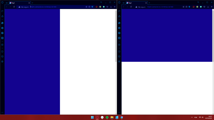
You can do it with CSS grid like this

HTML

<div class="grid-container">
	<div class="grid-item">
		...
	</div>
	<div class="grid-item">
		...
	</div>
	<div class="grid-item">
		...
	</div>
	<div class="grid-item">
		...
	</div>
</div>

CSS

.grid-container {
  display: grid;
  grid-template-columns: 1fr;
  grid-template-rows: 1fr;
  gap: 0px 0px;
  grid-auto-flow: row;
  min-height: 100vh;
}

@media (min-width: 768px) {
  .grid-container {
    grid-template-columns: 1fr 1fr;
  }
}

.grid-item {
  min-height: 100vh;
  padding: 1.5rem;
}

.grid-item:nth-of-type(2n) {
  background: #0051ba;
}

I followed the instructions and basically worked, just please help me understand a few issues at hand:
1- The Navbar becomes vertical at LG
2- From now on, every “div” element that I add is added to the equation and becomes fluid alongside all other divs.

A solution that I found to that is adding both DIVs into a section and applying the flexbox settings at the “section” itself rather than on the “body”. But if I did something wrong I want to learn as much as I can.

Thank you for your reply. I am taking my time to test all the answers to this topic as my ultimate goal is to REALLY learn the program. I never added classes before, only styles!

Also: The navbar does not follow the rest of the website. Do you know why is that?

Here is an example with CSS grid.
Have a look if it’s what you want

The example I gave you was not really for use on a website. It was more of an explanatory example, to give you a basic idea of how you could create the specific layout you showed in your pictures using a bit of custom CSS.

When you placed your Navbar before the two divs, it became a child of the Body, and inherited the flexbox behavior that was applied to the Body. Putting the two Divs in a Section and applying the flexbox settings to the Section instead of the body is essentially the correct solution.

If you really want to “learn the program,” and use custom CSS to create unconventional layout behavior (meaning different from the normal behavior of Bootstrap’s grid system) you first need to learn how CSS (Cascading Style Sheets) works. Although it’s not a mandatory prerequisite for using Bootstrap Studio, learning CSS comprehensively goes a long way towards allowing you to build websites just how you want with this software.

It splits differently from what I originally intended to, but nonetheless this is a great material for me to study the CSS code! I am going to eventually try to dive deeper in the CSS Grid area. Thank you very much for your reply and answer, also helps me tons! You @kuligaposten and @printninja are the saviors of this forum!

1 Like

@Lucas_2022

This site can help you with the CSS Grid

1 Like