Hi,
I’m new to BSS, and one thing I just can’t find is where to change the hover color on a button. Is it somewhere in Appearance or Options menu or someplace else?
Have an amazing day, where we again make a difference for each other.
Hi,
I’m new to BSS, and one thing I just can’t find is where to change the hover color on a button. Is it somewhere in Appearance or Options menu or someplace else?
Have an amazing day, where we again make a difference for each other.
Hiya @Klientbutikken and welcome to the forums!
You need to edit the CSS to change things like hover and active etc.
Bootstrap provides limited built-in options for changing the button styling.
Select your button, go to the Options panel and under Button Options you’ll see Style. The default button background color is Primary, but you can change it to any of the other pre-defined colors (Secondary, Success, Info, etc…) from the particular Bootstrap theme you’ve chosen. Bootstrap themes are set by going to the top menu File > Settings > Bootstrap > Theme.
If you want a custom color all your own, As @jo-r pointed out, you have to change the CSS to affect the button characteristics. Editing CSS seems complicated at first, but once you get the hang of it, it’s not too bad. (LEARNING CSS, on the other hand, is a fair amount of work, but it’s highly recommended if you want to get the most out of Bootstrap Studio, and become a good web developer.)
To customize the hover styling, you would select the button and then look in the Styles panel for the CSS class(es) that affect the styling, and then change the class(es) as desired.
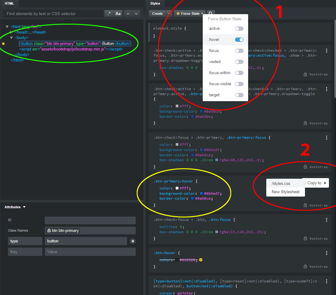
Here’s a simple example on how to change the hover color of a button (refer to the image below):
I’ve added a button to a blank page, and selected it. This causes it to be highlighted in a square box within the HTML panel (which I’ve circled in green.)
Then I’ve gone to the Styles panel and (1) clicked the dropdown menu called Force State and set the state to hover (circled in red.)
With the hover state selected, you can see the class (circled in yellow) that is responsible for the color of the button when you hover over it. In this case, the class is .btn-primary:hover
Then, by (2) clicking the three vertical dots to the right of the class, I’ve brought up the menu (also circled in red) that allows me to duplicate the stock Bootstrap CSS class .btn-primary:hover in a custom CSS stylesheet of my choosing (in this case, styles.css) Custom CSS style sheets will override the stock CSS styles.
From this point, you’d go to to the Design Panel, expand the Styles options and double click styles.css to open that style sheet in the Styles editor, wherein you’d see your recently duplicated .btn-primary:hover class. Then, by clicking on the small colored square next to background-color, you will bring up the color-picker, and you can change the color to whatever you want. (You would probably also want to change the border color as well.) The #0b5ed7 is a hexadecimal (or HEX) color value, which is how colors are generally set in CSS, but you can also use RGB values (HEX can be changed to RGB in the color picker.) In this case, #0b5ed7 is actually the same as rgb(11,94,215).
The whole process probably seems very involved when it comes to something so seemingly simple as changing a button color, but once you get used to writing CSS, it’s really a snap. You can even forgo the Bootstrap button classes and create your own custom classes with your own button styling, or create your own color theme using SASS, but this is more advanced, and beyond the realm of this basic example. If you want to learn more about CSS, I’d suggest starting with a site like W3 schools, or the official Bootstrap documentation.
Hi @printninja, Thanks a lot for your thorough explanation. It helped me all the way. And I understand much more about how to style the different elements.
Have an awesome day!