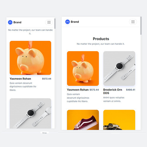
After many attempts I can’t get the mobile version to show the products like the tablet version, in the tablet version, it shows the products in 2 columns and the mobile version in 1 column, honestly I don’t know what else to do, I have read and copied the code , but I can’t do it. Sorry for the inconvenience who could help me.
Why would you do that? Its not ux friendly, lol.
It should be 1 card for mobile, idek why would you want to change that, if this is a client reason, tell him or her that this is a bad idea.
1 Like
reflow-product-list.ref-cards .ref-products {
  --ref-products-per-row: 2 !important;
I try to overide this css rule :")
it works on my old project Mamie R' - intipLink
Coincidentally, I am looking to do something similar to your project, because I decided to make web applications, there are some things that your project has that I would like to implement in mine.
1 Like
Then just try it :")
Resolved issue.
Thanks to @dickykreedz
1 Like
