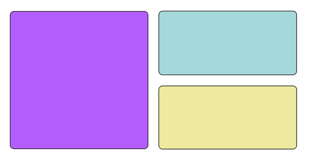
Hi, I would like to know how to create this “bento” style box design. It would be to make in 2 columns in desktop mode and one column in mobile mode.
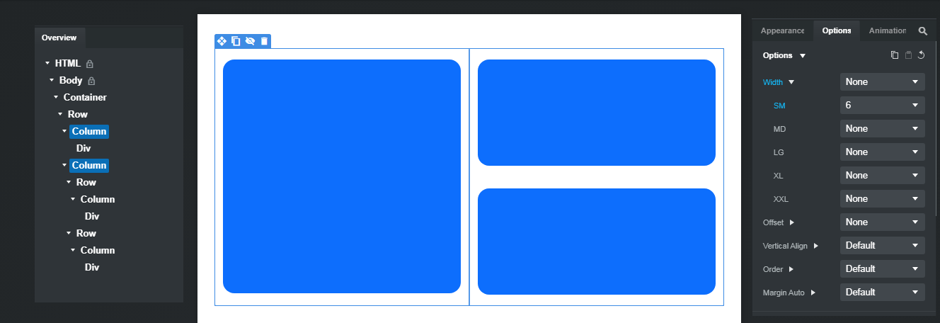
Refer to the Overview panel in the image below for the basic layout.
Add a Container. Add a Row inside the Container. Add two Columns inside the Row. Select the two Columns (they are highlighted in blue in my example). In the Options panels, expand the Width settings and set Options > Width > SM to 6. This will make all your Columns stack vertically below SM, and sit side-by-side from SM to XXL.
In the right Column, add two Rows, and a Column inside each Row. Then add content into your Columns. For the purposes of this explanation, I have just placed Divs with some utility classes applied and inline height settings so you can see the Columns.
I recommend you read the Bootstrap Studio Documentation. Read the official Bootstrap documentation, and watch the tutorial videos on Bootstrap Studio’s YouTube channel.
Without a basic understanding of how the program works, and the Bootstrap grid system, you will have a difficult time trying to build websites with this software.
3 Likes