How can I fix that issue in Bootstrap?
I’m new and need a little help.
Thanks,
Poul Erik
Hiya Per! Welcome to BSS!
This can be done a few ways actually. One being that you make sure all items are in separate columns and assign them widths according to the screen size.
Another would be to set the row (in the options panel you’ll find the settings for them) to allow X number of columns can be shown per row
Those are the 2 I used the most, but I’m sure there are other ways too.
The key would be to use Columns for each of the 3 sections and of course going Mobile First and setting the column width to accommodate your needs per screen size.
you could try to mess with the flexbox direction
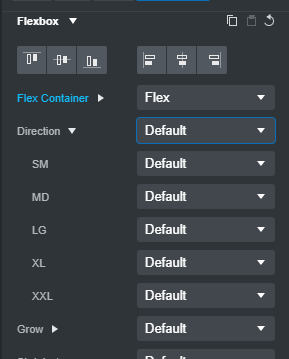
if you click the arrow next to the direction, you’ll be given a few options on what to do when the screen is SM MD LG XL or XXL
so for Phone it’s mostly the SM or XS but XS is not in the choices
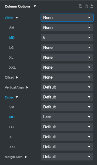
Create your two columns with a class of col-md-6, making your first column contain the image
Then set the order of the image column to MD > Last
This will have it show it on the right on desktop and to the top on mobile
Example here: