Dears, I have a navbar containing a brand box and a menu (hamburger) button when the window width becomes smaller. When decreasing the window width, the brand box and the button box at some point collide, and the button is thrown to a second line. I would like instead that the button overlaps the brand box. I have joined in attachment some screenshots that illustrate my issue.
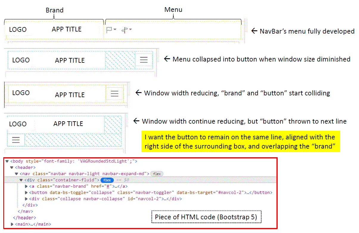
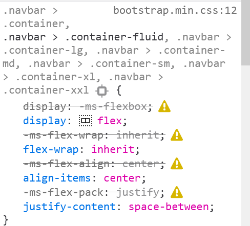
I have tried to use “ms-auto” class beside navbar-toggler, which just positionned the button on the right when thrown to the second line, but there is still a second line. I tried also to keep the height of the whole surrounding box constant, and increase the Z-index of the button, but that was not successful either.
Of course, I googled, and of course, did not find anything relevant, hence my post here.
Thanks a lot in advance for support.
Bye,