What is the best way to set a two-column row at the XS breakpoint to be 1 column and have the second column appear 1st for the XS breakpoint? see video
Thanks
What is the best way to set a two-column row at the XS breakpoint to be 1 column and have the second column appear 1st for the XS breakpoint? see video
Thanks
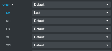
Have your image column as your first column
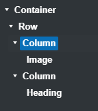
then in the order set sm to last
Thank you @richards !
I had to play around with it and ended up with the following… See video…
Thanks again
cj
Bootstrap is a mobile-first framework, so you should design your layout at the XS size, meaning, put your columns in the order you want them to display on mobile, and then change the order as desired as you go up to the larger screen sizes.
Thank you for the awesome tip and reminder, @printninja; it helps improve my mental model. Now I understand why there is no XS in the options. The mobile design becomes the base design to be adjusted as you progress through the different form factors.
Why do the XS and SM change when I set the MD breakpoint width to 6? see video…
Do you know any good resources to help understand the mobile-first and bootstrap options settings to control element placement? I’m interested in learning the mobile-first design workflow.
Thanks again!
It’s a bit hard to explain because you need to understand what all the various flexbox properties do.
Basically, if you keep adding columns to a row, they will keep lining up next to each other and become less and less wide until they reach a certain minimum width at which point the last column will shift down under the others, and take up the full width of the row.
You can try this by setting your view to XS, adding an empty row and then start adding columns. You’ll be able to add three and then when you add the fourth, it will move under the first three. If you change the view to the SM breakpoint, you’ll see that fourth column moves back up and all four columns will again be next to each other.
Now, while you’re still at the SM breakpoint view, select the four columns and set their width at the SM size to 3. The four columns will still stay next to each other because Bootstrap uses multiples of 12 for column widths and 4 x 3 = 12.
Now, If you change the view back to XS, you’ll see all four columns will take up the full width of the row, and stack on top of each other. This is because once you set the width of the columns to a specific value at the SM breakpoint, it removed the default behavior of the columns at the XS size (which is to line up next to each other.) Now their new default behavior is to take up the full width of the row.
It’s a little more complicated that how I’ve explained it, but hopefully this gives you the general idea.