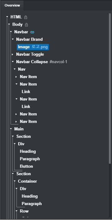
If you have this feature, it will be more readable.

If you have this feature, it will be more readable.

Interesting idea. But I think it would be better implemented with some sort of background shading perhaps? Each child level in tree could have a slightly lighter gray background for example.
I like this idea.
An alternative could be to hilite the hierarchy, and only that hierarchy (including all children) that you are hovering over. So for example, referring to the above screenshot, if you hover over the section "Navbar Collapse" all child items (including Navbar Collapse itself) would have a different background so you could quickly identify all children of the selected parent.
I think readability is really important. You can also improve your work efficiency. Really good ID.
Yes, if the tag is separated in any form, the working environment will be better
You're onto something, definitely something that would make it a ton easier to navigate that list.
I must be weird, I dont' find it difficult to navigate the list really. I could use "something" I think, but I think all those lines would just be busy noise in my sight more than it would be helpful. I would prefer that the indenting was a little more indented and that would fix it 100% for me. Maybe just a few more spaces indenting would be good enough for me, the lines would be overkill for me. Just talking for myself here now, not that it's a bad idea. :)
I would prefer that things like this would be toggle-able so we can decide if we want to use it or not.