any idea how to solve ?
Blog (demo-project-9198.bss.design)
Blog (demo-project-9198.bss.design)
go to about link (image not responsive)
any idea how to solve ?
Blog (demo-project-9198.bss.design)
Blog (demo-project-9198.bss.design)
go to about link (image not responsive)
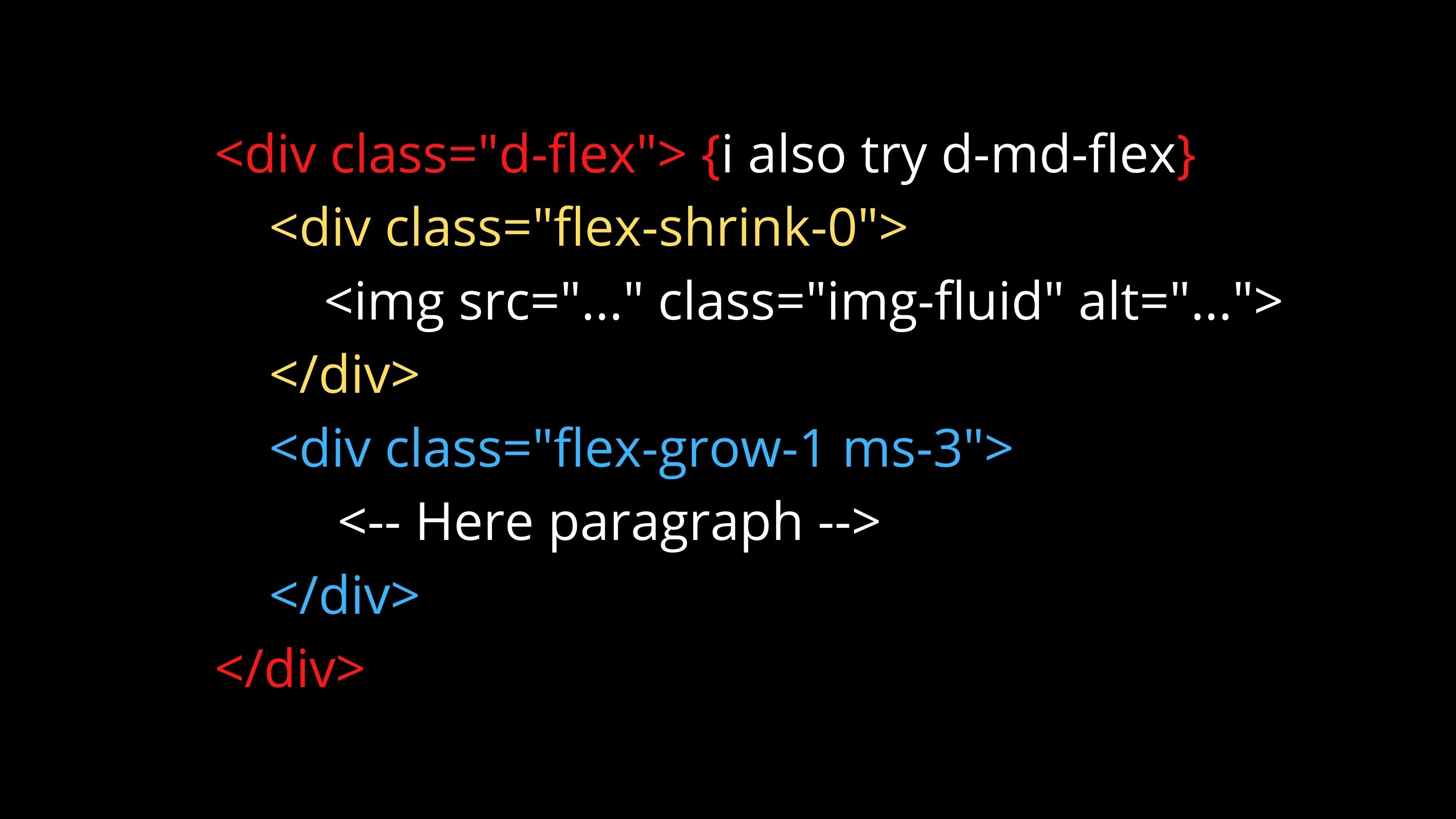
Try removing d-flex from the div inside the col-md-6 (demo @ 2nd link)
The code on your link isn’t the same as your screen shots
You have all your code in the flex-shrink-0 div
Also you would need to put a width constraint on the image, if you look at the source code for the bootsrap doc page, you will see that they have height and width set on the svg placeholder
If you’re just trying to make an image responsive, you don’t need to add much of anything codewise to the image. In the Options panel there is a slider button that will make it responsive for you.
You will however, need to position it how you want it and style it to your liking.
/***
its working when i set image width thanks
