Hi forum,
How to implement Excel type grid for part of form with horizontal scrollbar?
Essentially, this is to allow for more than 12 columns of data but keeping BSS resizing intact.
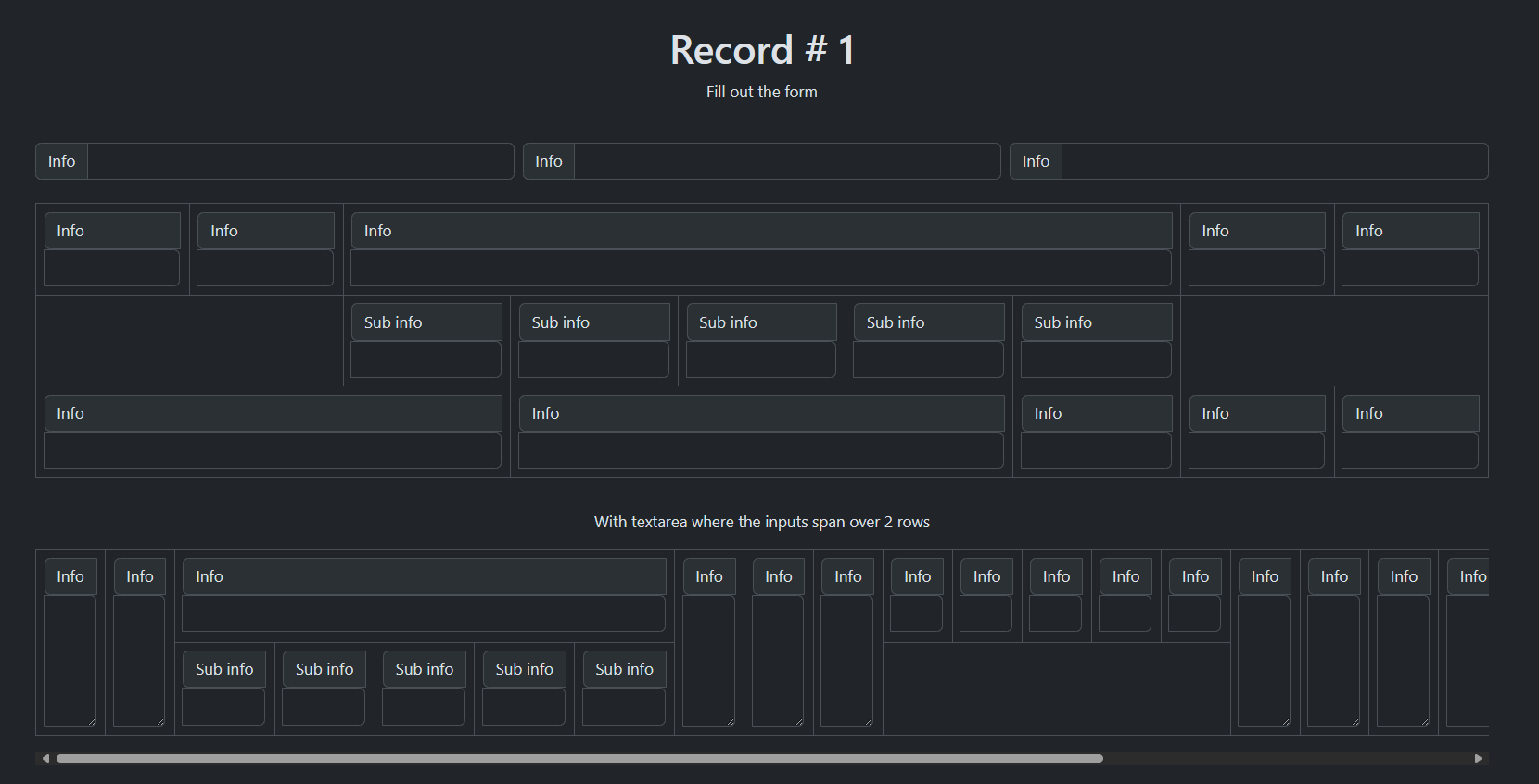
I saw the “trick” posted by @ klwillis years ago, as a way to essentially get more columns, but as can be seen by the design linked below, a number of the columns wrap to the next line.
For example, keeping all of these “Info Col-XXL” columns in the same line, without wrapping. There are 2 rows here, the top with the 3 input groups, and the second row with all the Columns (and sub columns in one case) that should not be wrapping below.
(above the first row, is a NAV row that should not scroll)
Basically, something like an iframe for that 2nd row?
https://quiet-bar-4014.bss.design/
I tried making that 2nd row div as “table-responsive”, but that didn’t do anything.
Note: Those 5 sub-columns should all be within (or under) the Info Col-XXL-5
I also tried
#theExcelLikeGridRow {
overflow-x: auto;
}
but that doesn’t allow the horizontal expansion, with scrollbar, either.
You can do it with a table like this
Ah, table-responsive. Yeah, that’s what I was guessing needed to be done, but for some reason I couldn’t get it to work - the extra columns would wrap instead of staying on the same line and causing the scrollbar to appear.
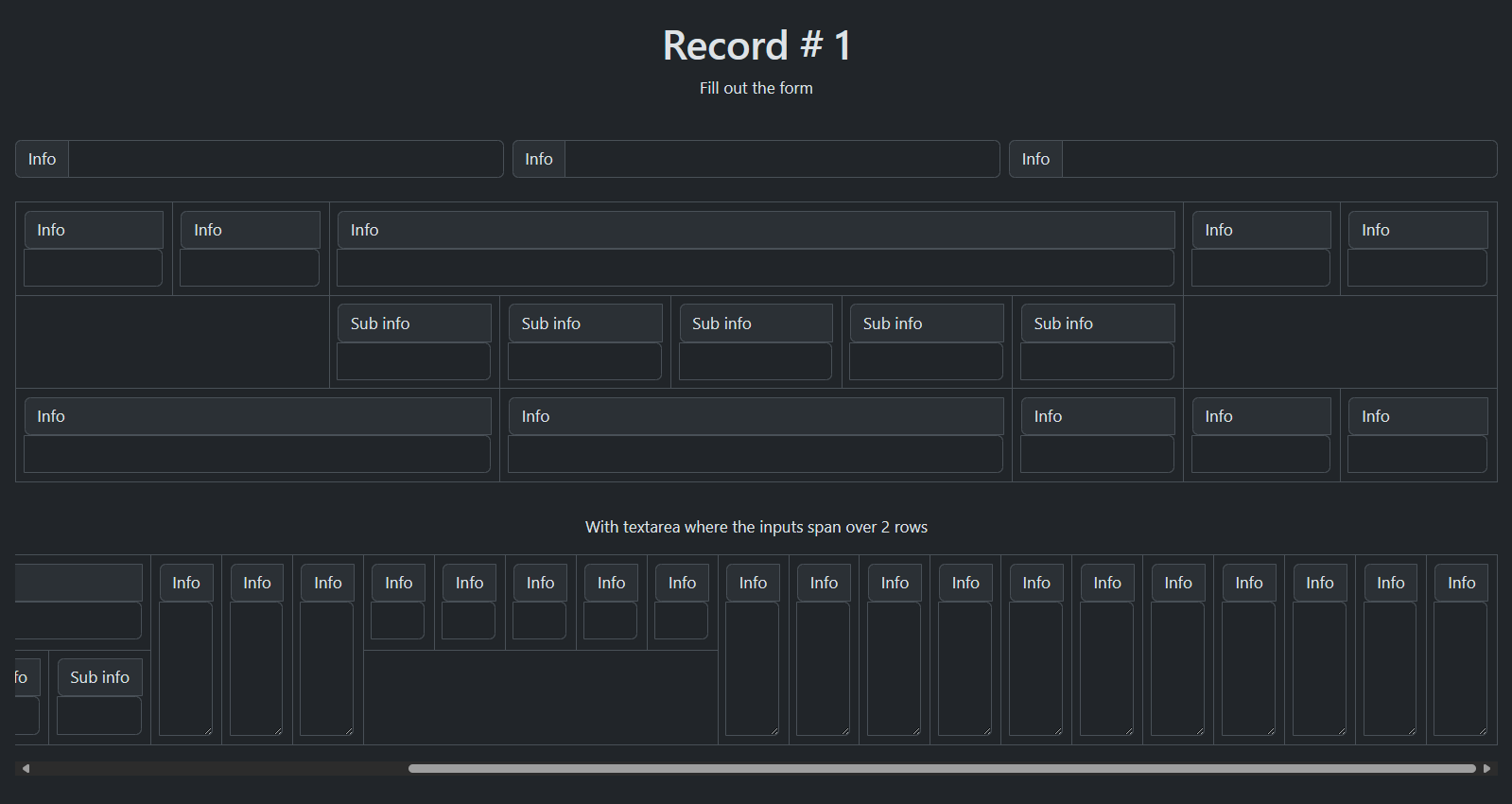
This is a crude look at what I was hoping to achieve (with the horizontal scrollbars to account for many columns that should be wider than here):
For Columns, there is (for example) - Col-XXL-1, Col-XXL-2, Col-XXL-3 etc. to control how big each column is.
What’s the best way to control the size of each “Table Cell” component (making some larger than others to account for content size), while still allowing for responsiveness?
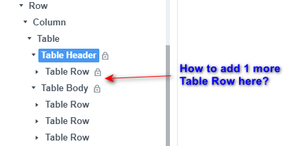
Oh, I think I see…it’s done with rowspan and colspan to control width (colspan) or height (rowspan).
Ok, remaining question…since the Table Header is locked, how to add the 2nd Table Row?
Is the only way by Custom Code?
You can download a custom table component here
With the custom table component you can have more than one table row in the header by duplicate the table row
1 Like
With the cutom table component added to BSS, I’m still not able to insert a new TR within the THEAD, even though the lock icon is no longer there.
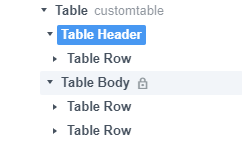
I tried dragging a Table Row from with Studio (components) as well as copying and pasting from the existing single Table Row already in the Table Header.
Neither would add the 2nd Table Row.
Do I still need to do custom code with this?
Thoughts?
if you right click the table row in the table header you can duplicte the table row
oh geez, i didn’t see that option 
interesting behavior from BSS though, a duplicate works but a copy/paste doesn’t.
anyway, thanks again!!
Sorry kuligaposten one last question if you don’t mind…
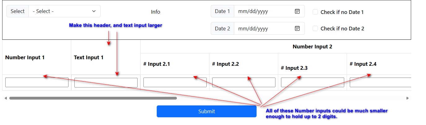
https://young-union-0450.bss.design/
How to make the Text Input (& it’s header) larger? And all the rest of the Number Input’s (& their headers) smaller.
I know I can “hard code” a width in pixel size, but then that destroys the responsiveness, correct?
I see in your example that some of the inputs (& their headers) are colspan 3: https://ancient-term-0254.bss.design/
However, in this case, one row is in the Table Header, and one row is in the Table Body.
Is there a way, aside from hard-coding the pixel size, to make that one header and input larger (25-50% larger) and then all the rest of the number inputs and their headers no bigger than necessary to handle 2 digits (along with the side number up/down arrow built into number inputs)?
This will primarily be used in XXL and XL screen sizes, with LG being the “smallest” ever to use this (i.e. no cell phone or tablet).
You can do something like this.
(it’s tables with no table-header)
1 Like
Ah, ok…got it. Simply leave out the table-headers.
Many thanks!