This is my first post here. I've just begun using Bootstrap Studio and I'm basically really impressed with it. Previously, I have used Serif WebPlus which is now discontinued and their programmers refused to allow it to make responsive websites.
So here I am with Bootstrap Studio. I am learning a lot about coding and the extent of making an impressive website with this program. However, I have hit a roadblock with a smartphone problem and after trying for many days, I've decided to come to the forum and pick the minds of the skilled individuals here.
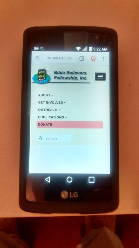
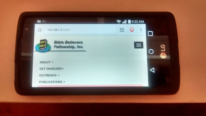
As you can see by the pictures, the entire menu can be seen in the portrait mode of the smartphone and it can be scrolled. In the landscape mode, the items below the Publications cannot be seen and cannot be scrolled down to view. I am using using Fixed To Top on the header and maybe that is the problem, but I want the header to remain visible at all times.
Any ideas how to fix this problem or is this a problem with Bootstrap? I hope that someone can steer me in the right direction. Thanks.