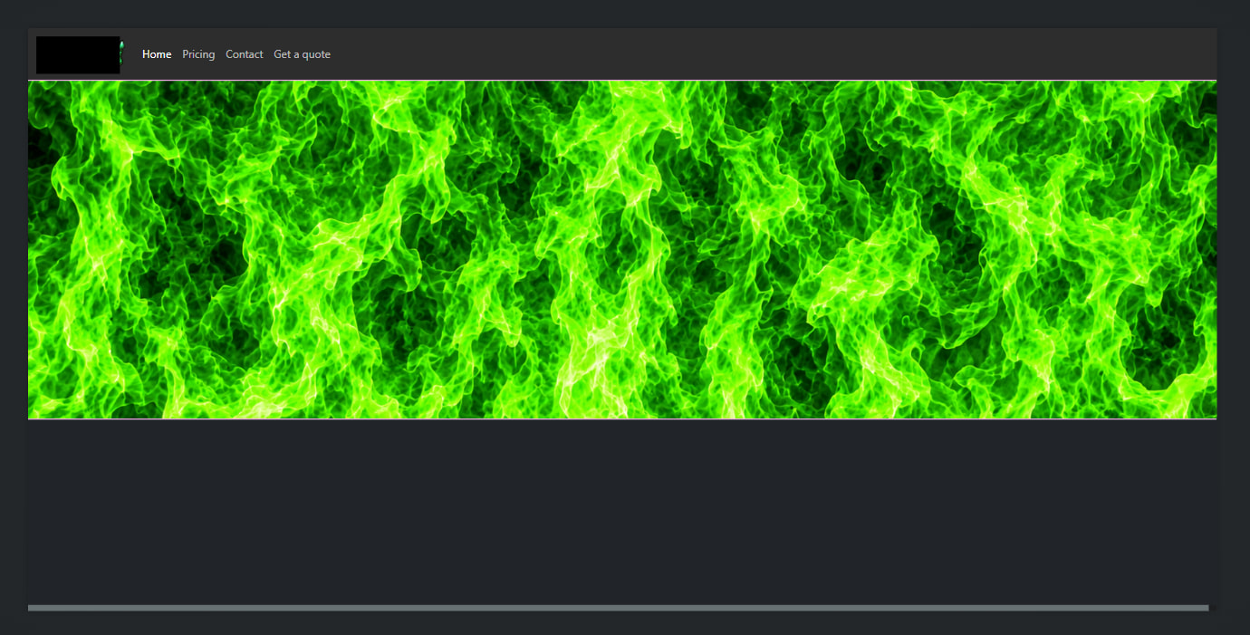
Depending on how you want the images to behave in terms of responsiveness, there are two ways to do this. The simplest (and preferred way) is to make the fire graphic the background image of the top-most parent element. Then you can place standard Bootstrap layout components (Container > Row > Column > Image) inside that element. The other way is you can put both images inside your column and use CSS rules to position and “stack” them, but this is not really considered best practice.
So right now, your problem is if you put your logo image inside the column with your fire image, they just end up side-by-side, when what you want is something like this…
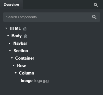
With an overview that looks something like this…
But when you look at that overview, you see the logo, but not the fire image. Why? Because we’ve made the fire image the background of the Section component by writing a little CSS, and adding the class to the Section component through the Attributes > Class Names panel.
Background images can behave in a few different ways. They can take up a fixed height. The can stretch or shrink. They can repeat or they can get cropped depending on the rules we give them.
So the first thing I did was take your fire graphic and adjusted the size in Photoshop to measure 1920 x 545 pixels. 1920 pixels in width is the size of a typical wide-screen 1080p monitor. The height is arbitrary. you could make it whatever height you want.
I then saved the file as fire.jpg and imported into BSS. You can save as webp, or optimize it from within BSS. That’s not really important for now. I found a quick image online to use as placeholder logo, sized it in Photoshop, saved it as logo.jpg, and imported that as well.
Next, I created the following CSS rule and classes in my styles.css stylesheet…
.hero-wrapper {
  background-image: url("fire.jpg");
  background-size: cover;
  background-repeat: no-repeat;
  background-position: top center;
  height: 55vw;
  max-height: 545px;
}
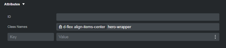
Then I selected the Section component in the Overview panel, went to the Attributes panel and entered my CSS class in the Class Names field.
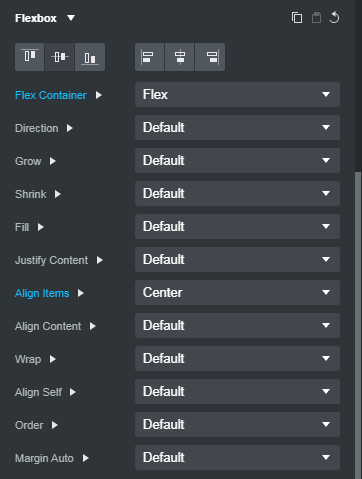
And you’ll also notice that there are some Bootstrap locked classes as well… d-flex and align-items-center. How did they get there? I added them through the Options > Flexbox settings.
Since Bootstrap is a mobile-first framework, you should have your workspace set to the XS size when you’re building your pages. This way, when you apply the Flexbox options, you ensure they will take effect at all breakpoints from XS through XXL. If you are viewing your website at a larger breakpoint (XL for example) and make changes to the Flexbox settings while your workspace is set to XL, the Flexbox settings will not affect the sizes below XL because they are breakpoint-specific. This is a common “gotcha” that many people miss.
Now the only thing left to do is select your image, go to the Options Panel > Image Options and make sure you switch the Responsive to “on.” This will ensure your logo image shrinks if the screen width is narrower than the logo width. Without this, if the image is wider than the width of a screen on a small device like an iPhone 5 the image will “overflow” and you’ll end up with a horizontal scroll bar at the bottom. Of course you’ll also need to fill in the image Width, Height and Alt values, but they’re not important for the purposes of this explanation.
So when you look at the CSS, you may wonder what each rule is doing.
background-image: url(“fire.jpg”) - This tells the class what image to use for the background
background-size: cover - this tells it to cover the entire width and height. There are other options like contain or 100%. You can try entered then and see how they affect the image.
background-repeat: no-repeat - this tells us that if the height or width were to grow larger than the images native size to not “tile” the image multiple times. It’s not really needed with the background size set to cover.
background-position: top center - this tells us the image should originate from the top, and always be in the center.
height: 55vw - this determines the height of the Section. It allows it to shrink down on smaller screen (in this case, below the LG breakpoint.) You can change the value and see how it affect when the image starts to shrink and by how much.
max-height: 545px - this ensure the fire doesn’t grow any taller than its native size of 545 pixels. If you disable it, you’ll see that the image can get taller and taller as the browser width increases.