Hello, to all!
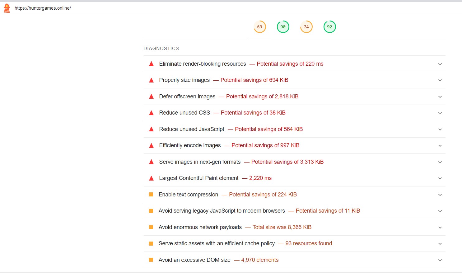
I have been trying to get better results with Lighthouse, but as you can see on the screenshot it shows so many items that it doesn’t seem to be my fault according to what I read about them. Does any of does have a way of being fixed?
There are many task you can do, i.e use image compression, use minified js and css, etc. Most of them can done in bss.
Thank You, for your reply.
Who is at fault? all I did was to take some of bootstrap components and filled them with content…
Just taking components and hoping for optimality is certainly not wise. Bootstrap studio has provided features to help with optimization; for example optimizing images to WEBP or JPEG compression, removing unused CSS, filling in attributes for example for forms and images.
Errors are almost always your fault if you’re the one building the website. It’s very easy to use websites builders to create websites that don’t follow best practices, or that have poor SEO, or poor speed scores. Bootstrap Studio does a lot to ensure the websites you create will work properly, and “obey the rules.” The built-in Check For Issues tool does a pretty good job of letting you know when there are glaring mistakes, but it doesn’t catch everything, and it can report things as issues that actually aren’t. Ultimately, it’s up to you to “dot all your i’s and cross all your t’s.”
When you use a website builder like Bootstrap Studio, there is an assumption that you’ve got a basic understanding of the fundamental “do’s” and “don’ts” of web development. For example, your images should have the width and height sizes set so that the layout doesn’t shift when the page loads.
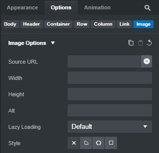
It appears most of your images are missing these sizes.
If the browser knows the size of the image coming before it’s downloaded from the server, it leaves the appropriate space for it. Then it doesn’t have to re-render the page once the image has been delivered. This reduces the page loading time.
Another example of a mistake you can make that BSS won’t report is images that are larger than they need to be. The Hunter Games logo in your Navbar has an intrinsic size of 223 x 227 pixels, but the rendered size is only 60 x 60 pixels. The OMEN LAPTOPS image has an intrinsic size of 930 x 512 pixels, but the rendered size is only 628 x 346 pixels. Because of the way Bootstrap handles fluid images, they get reduced to the dimensions of the container, but there’s no reason for the intrinsic size to be larger than the largest size it will display on the website. When you do this, you’re slowing down the loading of your page. If you reduce the intrinsic resolution of your images to the size they will display at (and save them as webp when possible), the files sizes will be smaller, your page will load faster, and Lighthouse won’t complain. This should be the case with ALL your images.
Some of the things Lighthouse complains about are trivial, and can generally be ignored. For instance, a common error that appears in Accessibility is “Background and foreground colors do not have a sufficient contrast ratio.” This is not something that BSS will ever considered an issue because you have total latitude in deciding what colors to make your text and background. Lighthouse uses a contrast algorithm to decide what is “sufficient” without taking into account that you may deliberately want there to be low contrast.
Lighthouse will often display an error like Reduce Unused JavaScript, despite some of their own scripts (ex. Google Tag Manager) being the cause! And the amount of savings is often so small that the reduction would make no practical difference in page load. The same often occurs with CSS. A potential savings of say, 30kb, would be imperceptible on a 4G or broadband connection.
Keep in mind that Lighthouse is an evaluation tool with its own eccentricities. Lighthouse is not gospel, nor should you feel that it is the final word in your website being “correct.” I consider many of the things it complains about to be non-issues. You don’t need to score perfect 100s across the board to have a functional, well ranking website. I’ve seen many WordPress websites with Performance scores of 30, that load horrifically slow STILL rank #1 on search in their local areas.
I thought that by having the image responsive there was no need to size it, as it will display differently according to user device anyway…
It will. But you still don’t want the image’s intrinsic resolution to be larger than the largest size it will be on the website. That just makes the file needlessly larger in size, which slows down the page loading speed.
Adding the width and height dimensions is not about responsiveness. It’s about efficiency. By defining the initial width and height, when the browser is rendering the page for the first time, it knows to leave a space that is the specific dimension you’ve defined. This way, when the image downloads from the server, it just “falls into place.” If the browser doesn’t know what size to expect, it will before forced to re-render the page each time a new image is downloaded. This is called “layout shift” in the Lighthouse report.
I thank you immensely for your well put explanation! I will be adding the dimensions as quickly as I can.