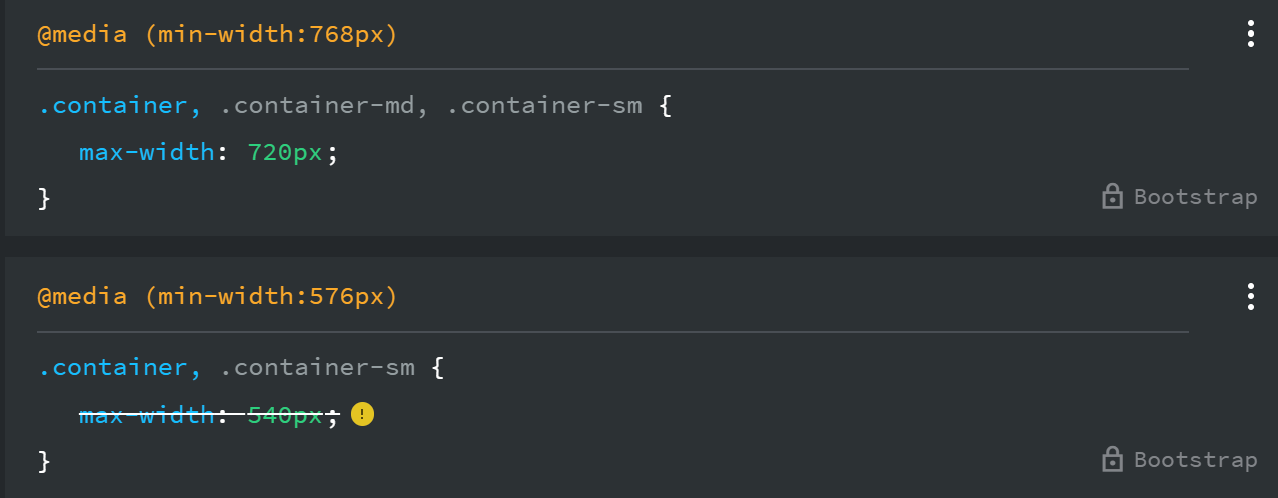
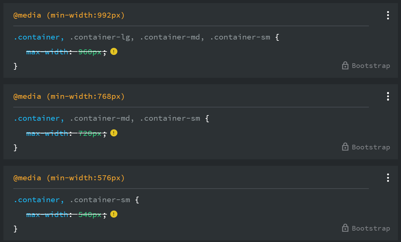
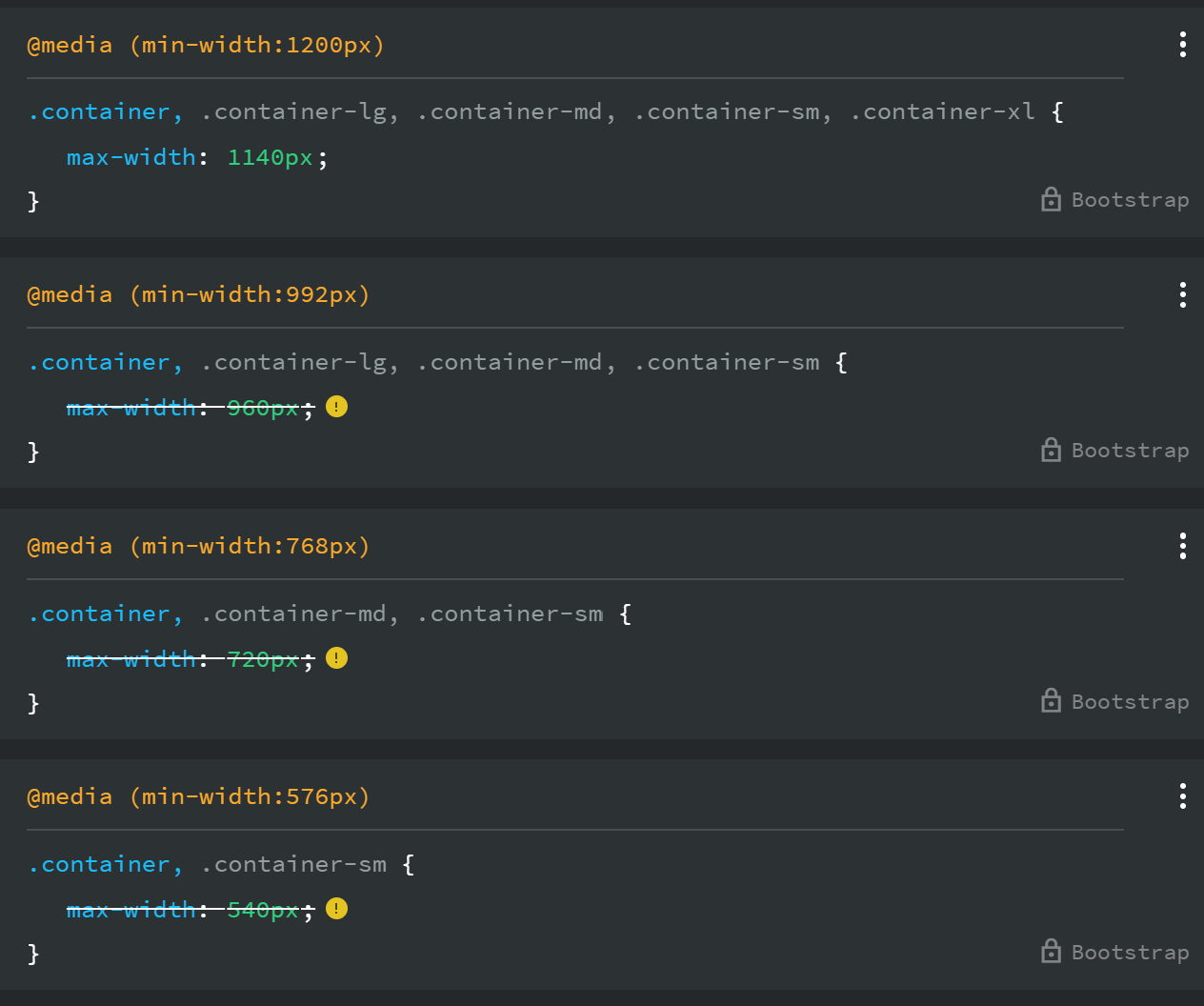
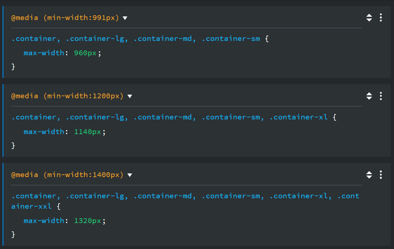
So for a normal .container, the 992px media query is the LG breakpoint, and 960px is the correct max-width there. Then at 1200px, the 1140px rule overrides it for XL. That part is standard Bootstrap.
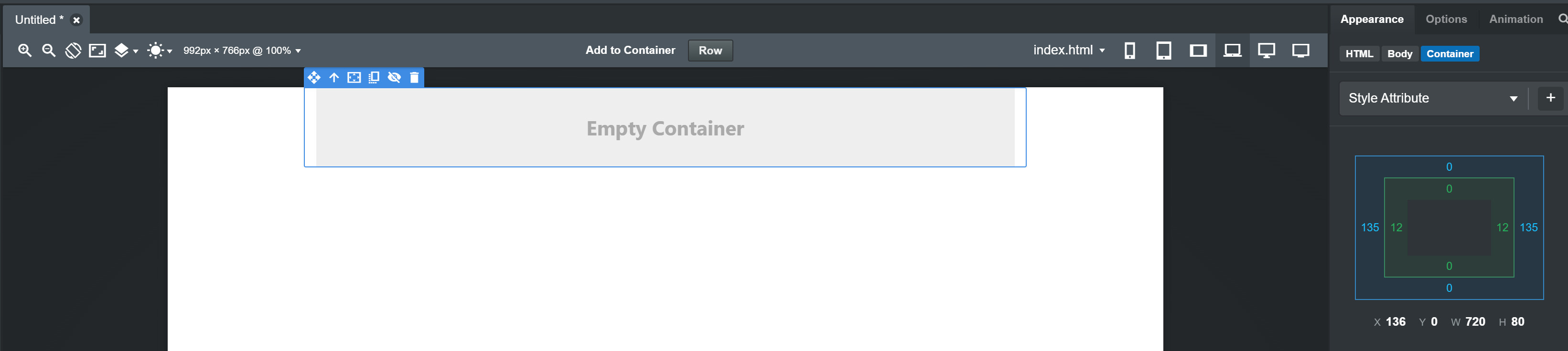
Your correct with the above so I’ve dropped a container into a blank page and set the view to LG as shown in the screenshot. If you select the container and look at the appearence tab the width is only 720px. It should be 960px.
Your preview window in Bootstrap Studio is probably too narrow. Try clicking the “Fit to Canvas” button in the toolbar, select LG, and the width should be 960. If it still doesn’t fit, just shrink the left sidebar.
@kuligaposten Tried that and it still doesn’t work. Also tried a reinstall and still the same. It’s not my css file either as all I’ve done to test it is drop a container on a blank page.