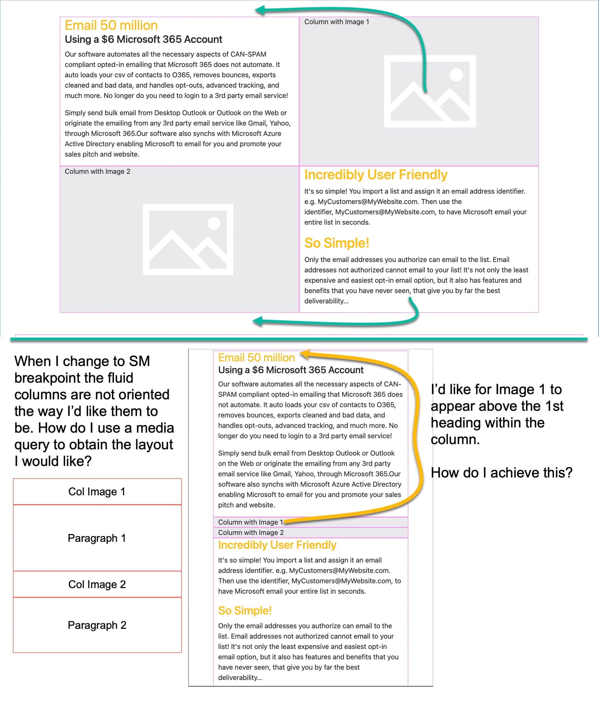
I think this is done with a media query, but I’m unsure how. Could someone guide me through getting this done?
Thank you,
CJ
I think this is done with a media query, but I’m unsure how. Could someone guide me through getting this done?
Thank you,
CJ
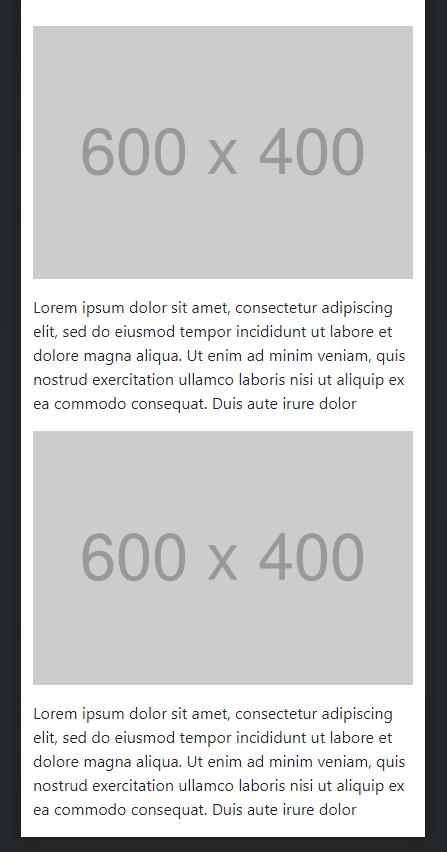
No media queries are needed. You just need to use four columns. Two of the columns will have images, and two will have text.
Start at the XS size. Add four columns into a row. Go to the Option panel expand the Width setting and set the Width on all the columns at the MD size to 6. Next, put the images and text in each of the columns so they are in the order you want (of course the images should be set to fluid, and I would add the mb-3 utility class to both images.) Your layout should look like this…
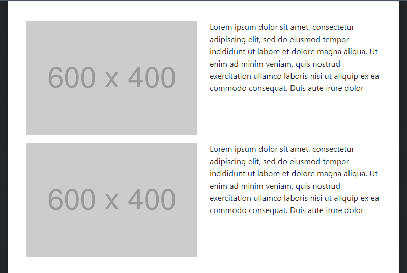
When you view the website at the SM breakpoint, the order should stay the same, and the layout should look the same except the images will be larger and the text wider.
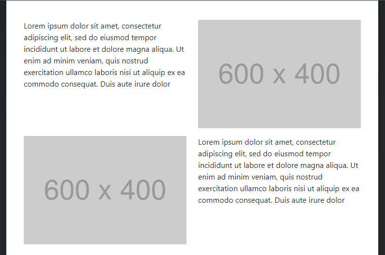
Now when you go up to the next breakpoint on the view (MD) the layout will shift and should look like this…
Now all you have to do is select the second column (upper right), go to the Options panel, go to Order, expand the settings and change the MD setting from Default to First.
Your website should now look like this…
Done.
This is awesome! Thank you so very much.
I got through the steps as you described, and my screens looked the same, but after the last step, when I go back to the MD size the columns are not in the order they should be in. Take a look at the video to see what I see. Do you get the same?
@printninja, this shows the steps I’m taking and the results.
What am I doing wrong?
When you get to the order part (screenshot of your video)
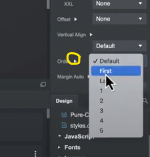
Click on the dropdown arrow highlighted in yellow and choose the order of MD
You are currently selecting the order for every screen size from mobile up
Awesome help @printninja and @richards! I was able to complete the task with your help. Thanks again.
Here is a 1-minute video showing how to achieve the MD Column order First…
Thanks,
CJ